 |
VOOZH | about |
|
VOOZH | about |
Data Visualization is an interdisciplinary discipline concerned with the visual depiction of data. When the data is large, such as in a time series, it is a very effective manner of communicating. This representation may be thought of as a mapping between the original data and visual components from an academic standpoint. It is the most important step for knowing about the data and it defines the root of a machine learning model. It defines Exploratory Data Analysis (EDA) which contains three main analyses i.e. Univariate analysis, Bivariate analysis and Multivariate analysis.
This article explains what is Data Visualization, its type, Defines the value of Data Visualization and the implementation of exploratory data analysis techniques using univariate and bivariate analysis.
Data visualisation assists corporate stakeholders in analysing sales figures, marketing initiatives, and product interests. Based on the study, they may concentrate on the areas that demand attention in order to boost earnings, making the firm more productive. Also, Visuals are easier for the human brain to understand than tabular reports. Decision-makers may quickly become aware of fresh data insights and take the right actions to achieve organisational success thanks to data visualisations.
Visualizing the data aids in the detection of inaccuracies in the data. If the data tends to recommend the wrong actions, visualisations can assist uncover erroneous data earlier, allowing it to be deleted from the study. Also, the dashboard’s created using a visual’s aim is to convey stories. Data visualisation may help the user’s target audience digest material in a single glance by developing important graphics. Always make an effort to tell the tale in the simplest way possible, without using overly elaborate images.
Data visualisation entails working with large amounts of data that will be transformed into useful graphics utilising widgets. To do this, we need the greatest software solutions for managing many sorts of data sources, such as files, online API data, database-maintained sources, and others. So, Organizations must select the finest data visualisation technology to satisfy all of their needs. The tool should offer interactive visual creation, flexible connecting to data sources, merging data sources, automated data refresh, sharing visuals with others, secured access to data sources, and export widgets. These tools enable you to create the greatest visualisations for your data while also saving your company time.
Image 1
Univariate analysis is the most basic type of data analysis in data visualization. “Uni” signifies “one,” thus the data has one variable. Its primary goal is to describe and plot visuals like histograms, bar graphs etc analyzing one variable only. It does not concern with causes or relationships (unlike regression), and It collects data, summarises it, and looks for patterns in the data.
Image 2
Bivariate analysis is the type of data analysis in data visualization in which “Bi” signifies “two,” thus the data has two variables and the objective of determining their empirical relationship. Bivariate analysis can be useful in evaluating basic association hypotheses. Bivariate analysis can assist assess how much simpler it is to know and forecast the value of one variable (perhaps a dependent variable) when the value of the other variable is known(potentially the independent variable).
Image 3
Univariate Analysis is applied when only one variable in the data needs to be analyzed using Bar graphs, histograms, Frequency distribution tables, etc. There are no causes or effects. In R, during the univariate analysis, the feature/variable selected for analysis comes on the y-axis, and the count feature/variable comes on the x-axis automatically.
Bivariate analysis proves to be more analytical than Univariate Analysis. Bivariate analysis is the proper form of analytic approach when the data set comprises many variables/features using Point graphs, Violin charts, Scatter plots etc., and users want to compare the two variables/features, and from that comparison, the machine learning model & further business data-driven decisions are made.
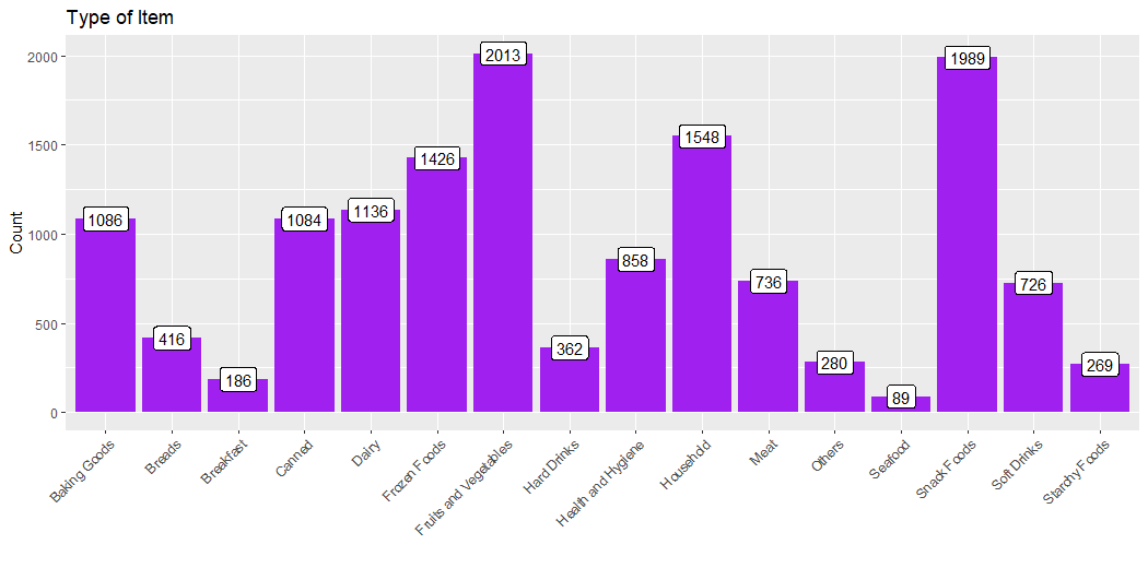
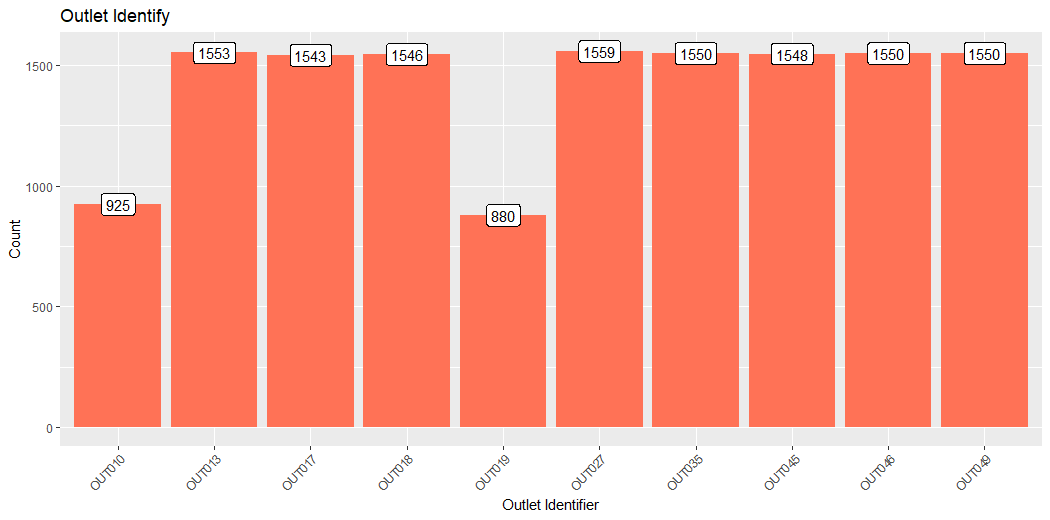
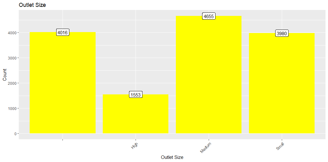
The Big Mart dataset has 1559 products spread across ten locations in various cities. Each product and store has its own set of characteristics. It has a total of 12 features. Item Identifier(is a unique product ID assigned to each distinct item), Item Weight(includes the product’s weight), Item Fat Content(describes whether the product is low fat or not), Item Visibility(mentions the percentage of the total display area of all products in a store allocated to the particular product), Item Type(describes the food category to which the item belongs), Item MRP(Maximum Retail Price (list It comprises of an alphanumeric string of length 6, Outlet Establishment Year (which specifies the year in which the business was formed), and Outlet Size (which specifies the size of the store) (tells the size of the store in terms of ground area covered), Outlet_Location_Type(which specifies the size of the city where the store is located), Outlet_Type(describes if the outlet is only a food store or a supermarket) and Item_Outlet_Sales(describes the Item’s sales at a certain outlet).
# Installing Packages
install.packages("data.table")
install.packages("dplyr")
install.packages("ggplot2")
install.packages("cowplot")
# Loading required packages
library(data.table) # Used for data reading and processing
library(dplyr) # Used to manipulate data
library(ggplot2) # Used for generating visualizations
library(cowplot) # Used to combine multiple plots
# Reading the required datasets
train_data = fread("Training_data.csv")
test_data = fread("Testing_data.csv")
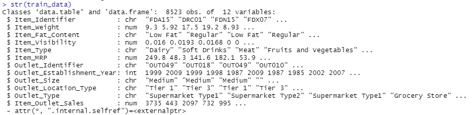
# Structure of Training Data
str(train_data)
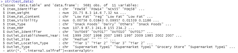
# Structure of Testing Data
str(test_data)
# Combining Training and Testing Datasets
# For Data Visualization
test_data[,Item_Outlet_Sales:= NA] # Adding NA values to Dependent variable(Item_Outlet_Sales) in the test data
comb_traintest = rbind(train_data, test_data)
# Performing Missing Values Treatment

## Checking for NA values in Item_weight

missing_values = which(is.na(comb_traintest$Item_Weight))

for(j in missing_values){

product = comb_traintest$Item_Identifier[j]

comb_traintest$Item_Weight[j] = mean(comb_traintest$Item_Weight[comb_traintest$Item_Identifier == product], na.rm = T)

}

## Replacing 0 with mean in Item Visibility

index = which(comb_traintest$Item_Visibility == 0)

for(j in index){

product = comb_traintest$Item_Identifier[j]

comb_traintest$Item_Visibility[j] = mean(comb_traintest$Item_Visibility[comb_traintest$Item_Identifier == product], na.rm = T)

}
The structure of the test data is output defining type of features and values in test data.
In R, ggplot2 is a widely used package for implementing Data Visualization techniques. Different charts and plots are available within the ggplot2 package and the aesthetics(x-axis, y-axis, color, fill, size, labels, alpha, shape, line width, line type) of the graphs, and plots can be defined. Let’s get hands-on with the implementation part of Univariate Analysis:
# Univariate Analysis
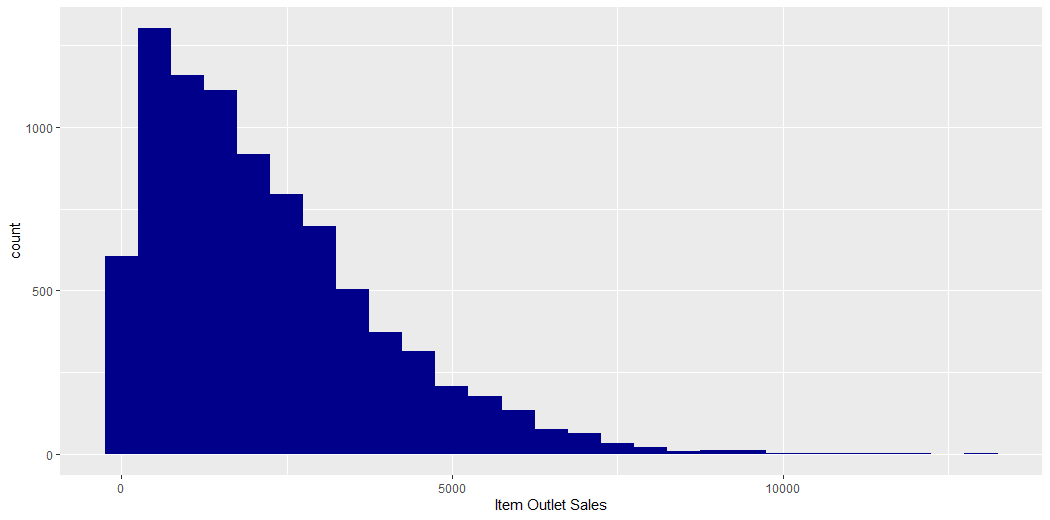
ggplot(train_data) + geom_histogram(aes(train_data$Item_Outlet_Sales), binwidth = 500, fill = "darkblue") +
 xlab("Item Outlet Sales")
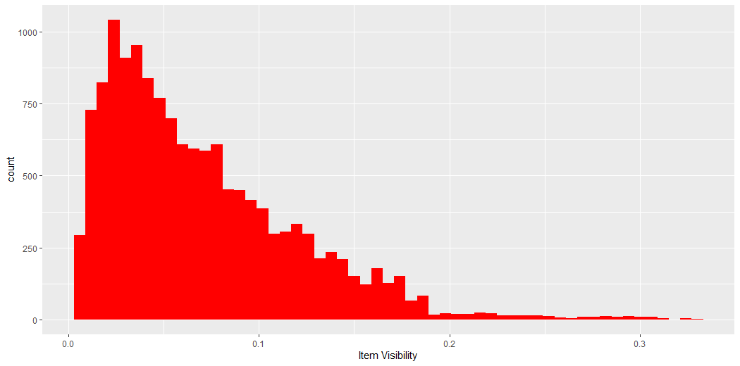
v2 = ggplot(comb_traintest) + geom_histogram(aes(Item_Visibility), binwidth = 0.006, fill = "red") +
xlab("Item Visibility")
v2
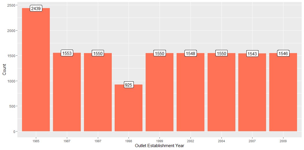
v3 = ggplot(comb_traintest %>% group_by(Outlet_Establishment_Year) %>% summarise(Count = n())) +
geom_bar(aes(factor(Outlet_Establishment_Year), Count), stat = "identity", fill = "coral1") +
geom_label(aes(factor(Outlet_Establishment_Year), Count, label = Count), vjust = 0.5) +
xlab("Outlet_Establishment_Year") +
theme(axis.text.x = element_text(size = 8.5)) +
xlab("Outlet Establishment Year")
v3
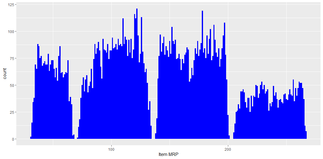
v4 = ggplot(comb_traintest) + geom_histogram(aes(Item_MRP), binwidth = 1, fill = "blue") +
v4
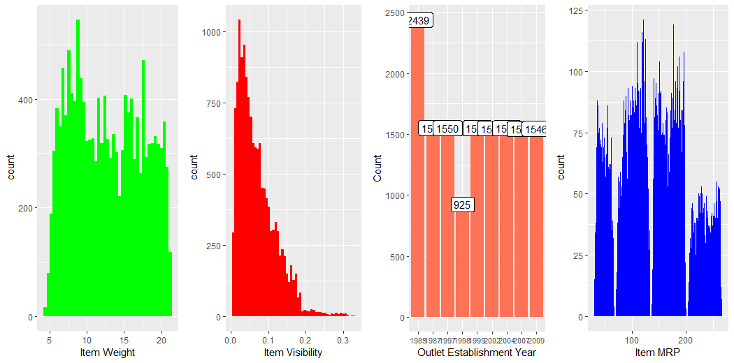
plot_grid(v1, v2, v3, v4,nrow = 1) # plot_grid() from cowplot package
v5 = ggplot(comb_traintest %>% group_by(Item_Type) %>% summarise(Count = n())) +
 geom_bar(aes(Item_Type, Count), stat = "identity", fill = "purple") +
 xlab("") +
 geom_label(aes(Item_Type, Count, label = Count), vjust = 0.5) +
 theme(axis.text.x = element_text(angle = 45, hjust = 1))+
 ggtitle("Type of Item")
v5
v6 = ggplot(comb_traintest %>% group_by(Outlet_Identifier) %>% summarise(Count = n())) +
geom_bar(aes(Outlet_Identifier, Count), stat = "identity", fill = "coral1") +
geom_label(aes(Outlet_Identifier, Count, label = Count), vjust = 0.5) +
theme(axis.text.x = element_text(angle = 45, hjust = 1)) +
ggtitle("Outlet Identify") +
xlab("Outlet Identifier")
v6
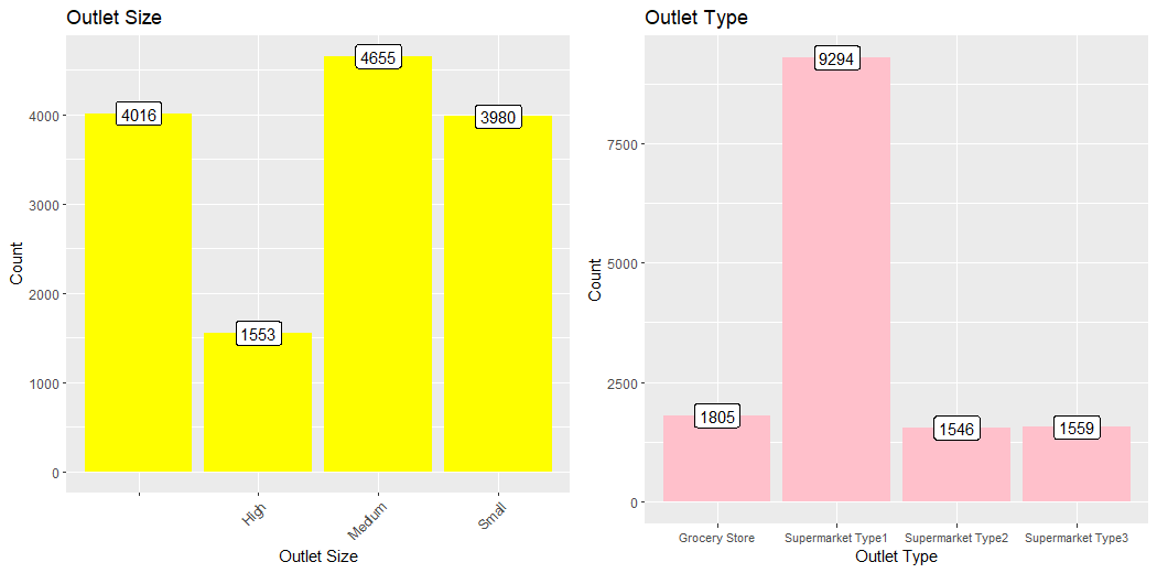
v7 = ggplot(comb_traintest %>% group_by(Outlet_Size) %>% summarise(Count = n())) +
geom_bar(aes(Outlet_Size, Count), stat = "identity", fill = "Yellow") +
geom_label(aes(Outlet_Size, Count, label = Count), vjust = 0.5) +
theme(axis.text.x = element_text(angle = 45, hjust = 1)) +
ggtitle("Outlet Size") +
xlab("Outlet Size")
v7
next_row = plot_grid(v5, v6, nrow = 1)
plot_grid(v7, next_row, ncol = 1)
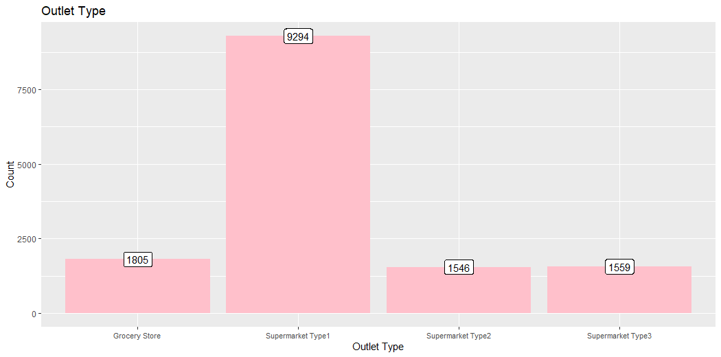
v8 = ggplot(comb_traintest %>% group_by(Outlet_Type) %>% summarise(Count = n())) +

geom_bar(aes(Outlet_Type, Count), stat = "identity", fill = "Pink") +

geom_label(aes(factor(Outlet_Type), Count, label = Count), vjust = 0.5) +

theme(axis.text.x = element_text(size = 8.5)) +

ggtitle("Outlet Type") +

xlab("Outlet Type")

v8
plot_grid(v7, v8, ncol = 2)
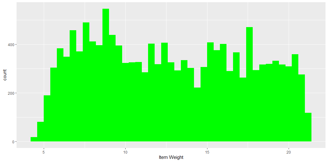
This plot describes the count of the Weight of Items.
This plot describes the count of the Outlet Sales of Items.
This plot describes the count of the Visibility of Items.
This plot describes the count of the Outlet Establishment Year.
This plot describes the count of the MRP of Items.
This plot describes the count of the Weight of Items, Visibility of Items, Establishment Year of Outlets, MRPs of Items and Compares them.
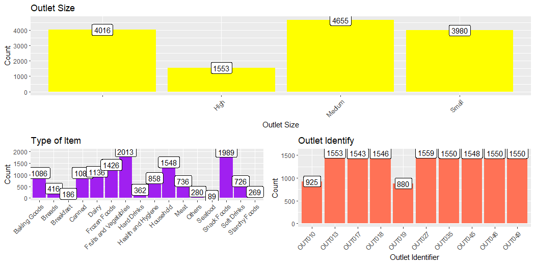
This plot describes the count of Type of Items.
This plot describes the count of the Identifier of Outlet.
This plot describes the count of the Size of the Outlet.
This plot describes the count of the Size of the Outlet, Type of Items, and Identifier of Outlets, and Compares them.
This plot describes the count of the Type of Outlets.
This plot describes the count of the Size of Items, Type of Outlets and Compares them.
Let’s get hands-on with the implementation part of Bivariate Analysis:
# Bivariate Analysis
train_visdata = comb_traintest[1:nrow(train_data)]
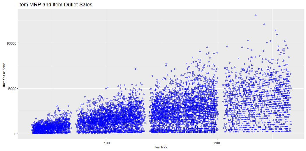
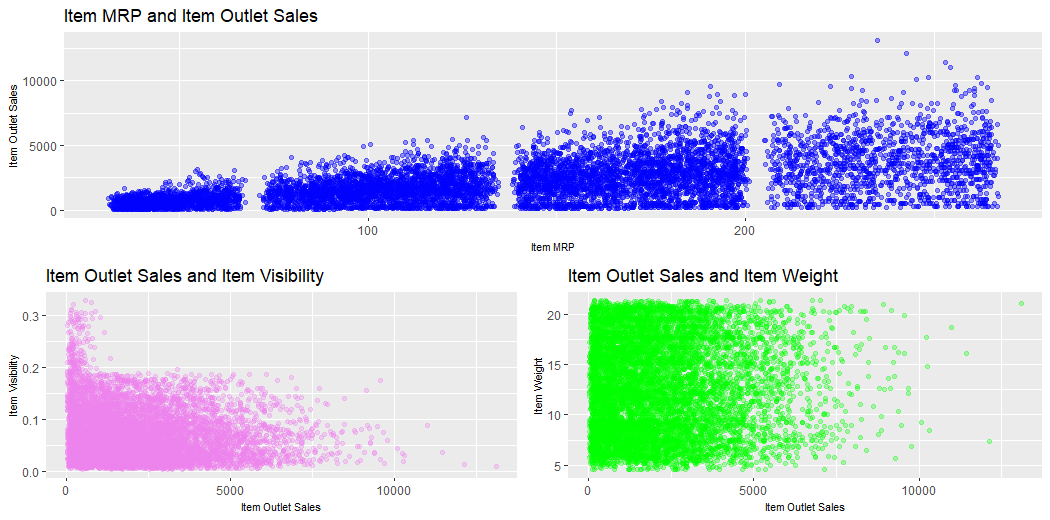
## Comparing Item_MRP & Item_Outlet_Sales
v9 = ggplot(train_visdata) + geom_point(aes(Item_MRP, Item_Outlet_Sales), colour = "blue", alpha = 0.4) +
## Comparing Item_Outlet_Sales & Item_Visibility
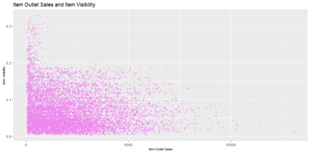
v10 = ggplot(train_visdata) + geom_point(aes(Item_Outlet_Sales, Item_Visibility), colour = "violet", alpha = 0.3) +

theme(axis.title = element_text(size = 8.6)) +

ggtitle("Item Outlet Sales and Item Visibility") +

xlab("Item Outlet Sales") + ylab("Item Visibility")

v10
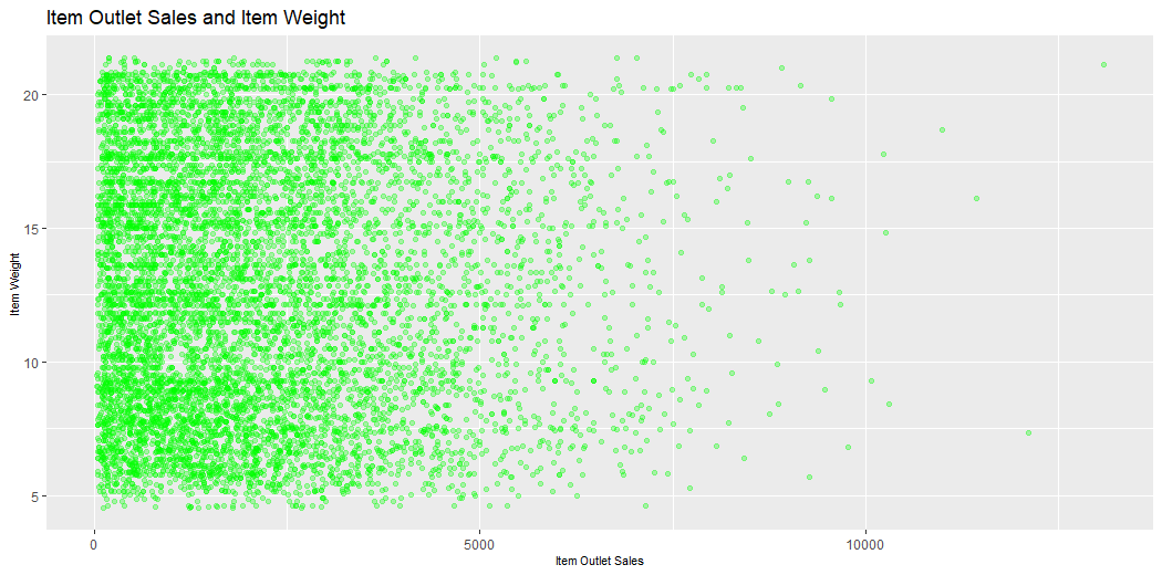
## Comparing Item_Outlet_Sales & Item_Weight
v11 = ggplot(train_visdata) + geom_point(aes(Item_Outlet_Sales, Item_Weight), colour = "green", alpha = 0.3) +

theme(axis.title = element_text(size = 8.5)) +

ggtitle("Item Outlet Sales and Item Weight") +

xlab("Item Outlet Sales") + ylab("Item Weight")

v11
next_row_2 = plot_grid(v10, v11, ncol = 2)
plot_grid(v9, next_row_2, nrow = 2)
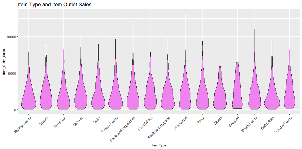
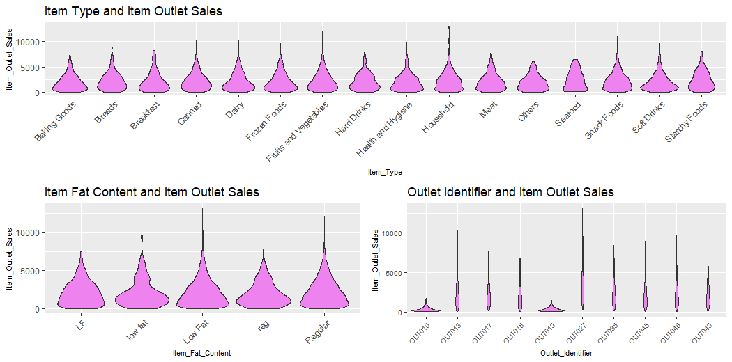
## Comparing Item_Type & Item_Outlet_Sales
v12 = ggplot(train_visdata) + geom_violin(aes(Item_Type, Item_Outlet_Sales), fill = "violet") +

theme(axis.text.x = element_text(angle = 45, hjust = 1),

axis.text = element_text(size = 9),

axis.title = element_text(size = 8.6)) +

ggtitle("Item Type and Item Outlet Sales")

v12
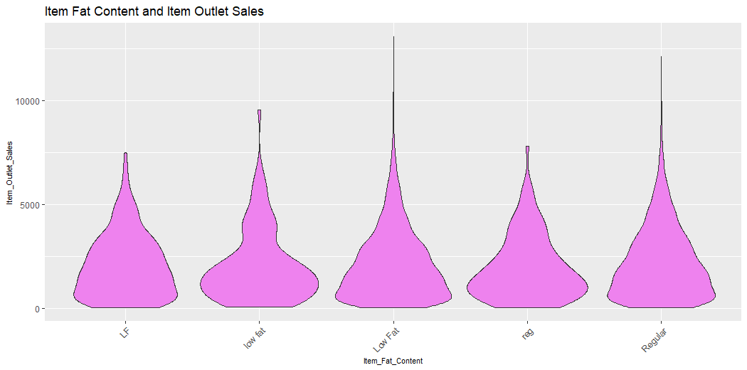
## Comparing Item_Fat_Content & Item_Outlet_Sales
v13 = ggplot(train_visdata) + geom_violin(aes(Item_Fat_Content, Item_Outlet_Sales), fill = "violet") +
theme(axis.text.x = element_text(angle = 45, hjust = 1),
axis.text = element_text(size = 9),
axis.title = element_text(size = 8.6)) +
ggtitle("Item Fat Content and Item Outlet Sales")
v13
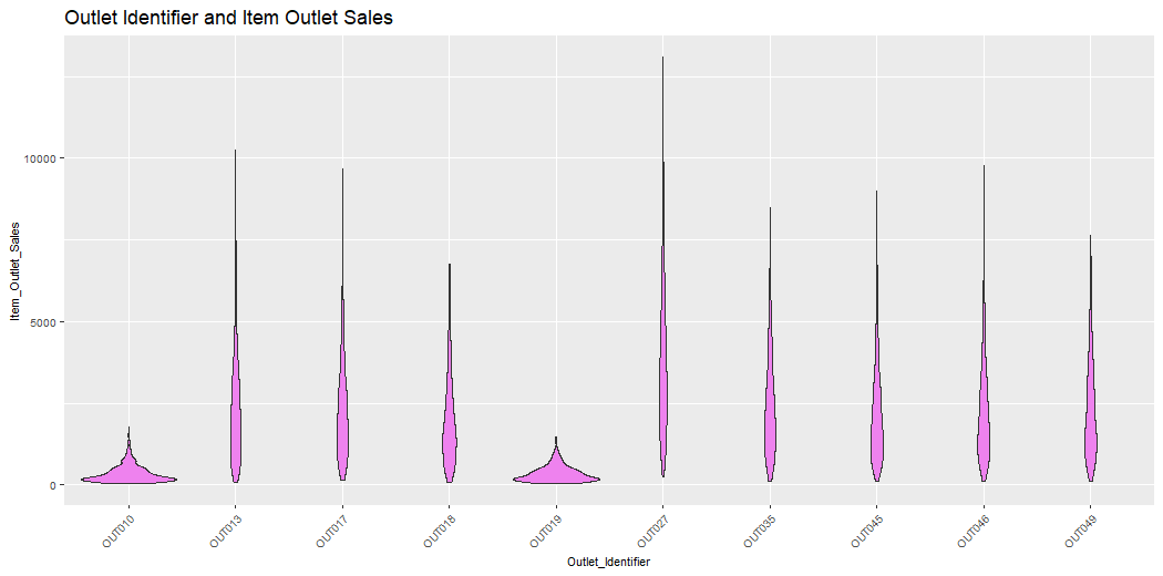
## Comparing Outlet_Identifier & Item_Outlet_Sales
v14 = ggplot(train_visdata) + geom_violin(aes(Outlet_Identifier, Item_Outlet_Sales), fill = "violet") +

theme(axis.text.x = element_text(angle = 45, hjust = 1),

axis.text = element_text(size = 7.5),

axis.title = element_text(size = 8.6)) +

ggtitle("Outlet Identifier and Item Outlet Sales")

v14
next_row_3 = plot_grid(v13, v14, ncol = 2)
plot_grid(v12, next_row_3, ncol = 1)
This plot describes the MRP of Items and Sales of Outlet.
This plot describes the Sales of Outlets and the Visibility of Items.
This plot describes the Sales of Outlets and the Weight of Items.
This plot describes the MRP of Item and Sales of Outlets, Item Outlet Sales and Visibility of Items, Item Outlet Sales and Weight of Items and Compares them.
This plot describes the Outlet Sales of Items and Types of Items.
This plot describes the Fat Content of Items and Sales of Outlets of Items.
This plot describes the Identifier of Items and Sales of Outlets of Items.
This plot describes the Type of Item and Sales of Outlet, Fat content of Items and Sales of Outlet, Identifier of Outlets and Sales of Outlets of Items.
In this article, we looked at Data Visualization in detail. I discussed its working idea, discussed its types, explained the Univariate and Bivariate Analysis & when to use it and finally Implemented Data Visualization in R, plotting various graphs like histograms, point charts, violin charts etc.
I recommend that you experiment with data visualisation and fine-tune the settings while choosing the style of the figure for the plot. I’m particularly curious about your expertise with data visualisation (univariate and bivariate analysis) and how you’ve tweaked parameters to create various graphics.
Was this article useful to you? Please share your thoughts/opinions in the space below.
Images 1, 2 and 3 are by Pixabay and Pexels.com.
GPT-4 vs. Llama 3.1 – Which Model is Better?
Llama-3.1-Storm-8B: The 8B LLM Powerhouse Surpa...
A Comprehensive Guide to Building Agentic RAG S...
Top 10 Machine Learning Algorithms in 2026
45 Questions to Test a Data Scientist on Basics...
90+ Python Interview Questions and Answers (202...
8 Easy Ways to Access ChatGPT for Free
Prompt Engineering: Definition, Examples, Tips ...
What is LangChain?
What is Retrieval-Augmented Generation (RAG)?
Edit
Resend OTP
Resend OTP in 45s
.png)