 |
VOOZH | about |
|
VOOZH | about |
This article was published as a part of the Data Science Blogathon.
One can view numbers and play with numbers if they are statisticians to get some valuable insights from the raw data, but in the real world do we know whether our stakeholders are that much into statistics? Majorly answers will be straight “no”, to give your series of knowledge and insights a storytelling nature, we need to provide it in the form of Data Visualization hence converting your numeric data into insightful graphs/plots/charts.
In this article, our focus will be primarily on multi-dimensional data. I have dedicated my previous article solely to one-dimensional data; that’s why focusing on N-D data is more important in enterprise case studies.
Starting with importing the relevant libraries like NumPy (handling mathematical calculations), pandas (DataFrame manipulations), matplotlib (The OG visualization library closest to python interpreter and “C” development), and last but not least- seaborn (built on top of matplotlib it give way more options and better look and feels comparative).
To explore higher dimensional data and the relationships between data attributes, we’ll load the file Diabetes.csv. It’s from Kaggle.
Inference: We will be using two datasets for this article, one will be the diabetes patients dataset, and another one is the height and weight of the persons. In the above output, we can see a glimpse of the first dataset using the head() method.
Python Code:
import numpy as np
import pandas as pd
import matplotlib.pyplot as plt
import seaborn as sb
df_original = pd.read_csv(“diabetes.csv”)
#print(df_original.head())
cols = [c for c in df_original.columns if c not in [“Pregnancies”, “Outcome”]]
df = df_original.copy()
df[cols] = df[cols].replace({0: np.NaN})
print(df.head())
Inference: Removing the missing or junk values from the dataset is always the priority step. Here we are first replacing the 0 value with NaN as we had 0 as the bad data in our features column.
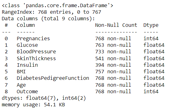
df.info()
Output:
Inference: Now we can see that in some of the columns, there are a few Null values like Skin thickness, Insulin, BMI, etc.
So, surprisingly no one it’s useful to view the data. Straight up by using head, we can see that this dataset is utilizing 0 to represent no value – unless some poor unfortunate soul has a skin thickness of 0.
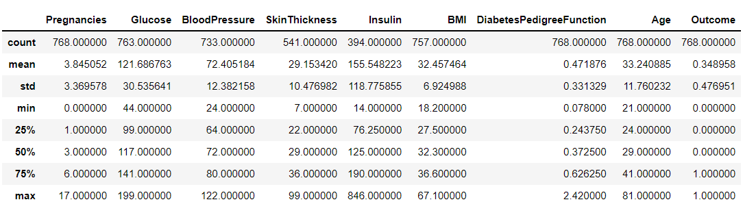
If we want to do more than expect the data, we can use the described function we talked about in the previous section.
df.describe()
Output:
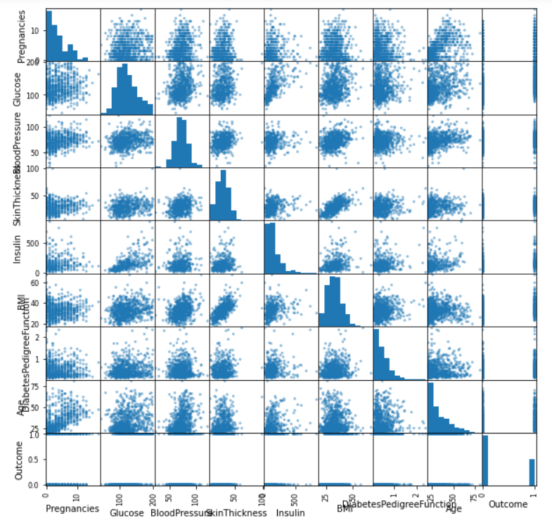
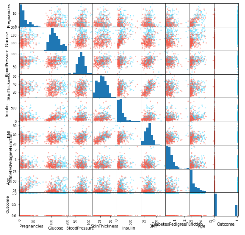
Scatter Matrix is one of the best plots to determine the relationship (linear mostly) between the multiple variables of all the datasets; when you will see the linear graph between two or more variables that indicates the high correlation between those features, it can be either positive or negative correlation.
pd.plotting.scatter_matrix(df, figsize=(10, 10));
Output:
Inference: From the above plot, we can say that this plot alone is quite descriptive as it is showing us the linear relationship between all the variables in the dataset. For example, we can see that skin Thickness and BMI is sharing linear tendencies.
Note: Due to the big names of columns, we are facing a bit issue while reading the same though that can be improved (out of the scope of the article).
df2 = df.dropna()
colors = df2["Outcome"].map(lambda x: "#44d9ff" if x else "#f95b4a")
pd.plotting.scatter_matrix(df2, figsize=(10,10), color=colors);
Output:
Inference: The scatter plot gives us both the histograms for the distributions along the diagonal and also a lot of 2D scatter plots off-diagonal. Not that this is a symmetric matrix, so I just look at the diagonal and below it normally. We can see that some variables have a lot of scattering, and some are correlated (ie, there is a direction in their scatter). This leads us to another type of plot i.e., correlation plot.
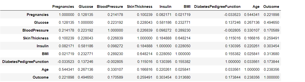
Before going into a deep discussion with the correlation plot, we first need to understand the correlation and for that reason, we are using the pandas’ corr() method that will return the Pearson’s correlation coefficient between two data inputs. In a nutshell, these plots easily quantify which variables or attributes are correlated with each other.
df.corr()
Output:
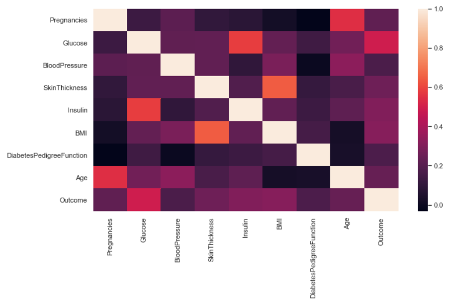
sb.set(rc={'figure.figsize':(11,6)})
sb.heatmap(df.corr());
Output:
Inference: In a seaborn or matplotlib supported correlation plot, we can compare the higher and lower correlation between the variables using its color palette and scale. In the above graph, the lighter the color, the more the correlation and vice versa. There are some drawbacks in this plot which we will get rid of in the very next graph.
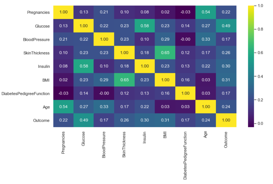
sb.heatmap(df.corr(), annot=True, cmap="viridis", fmt="0.2f");
Output:
Inference: Now one can see this is a symmetric matrix too. But it immediately allows us to point out the most correlated and anti-correlated attributes. Some might just be common sense – Pregnancies v Age for example – but some might give us a real insight into the data.
Here, we have also used some parameters like annot= True so that we can see correlated values and some formatting as well.
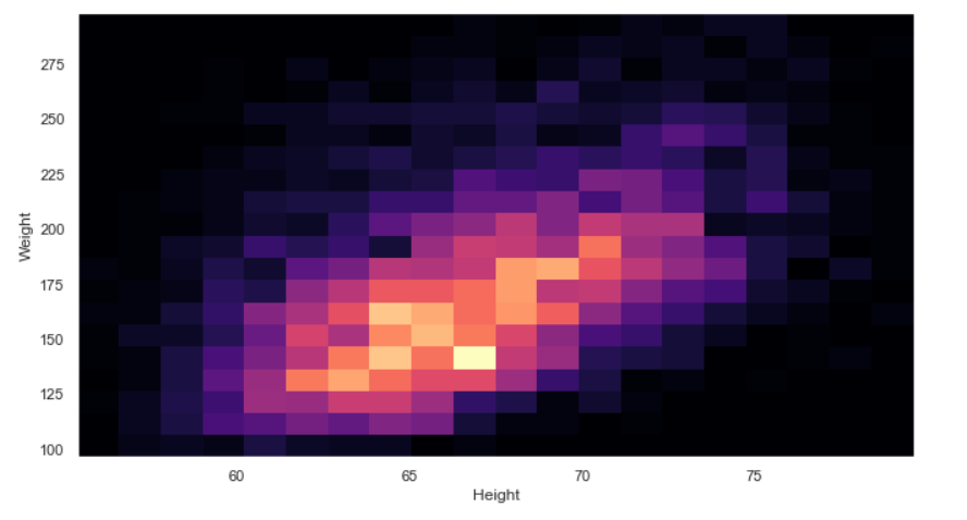
2D Histograms are mainly used for image processing, showing the intensities of pixels at a certain position of the image. Similarly, we can also use it for other problem statements, where we need to analyze two or more variables as two-dimensional or three-dimensional histograms, which provide multi-dimensional Data.
For the rest of this section, we’re going to use a different dataset with more data.
Note: 2-D histograms are very useful when you have a lot of data. See here for the API.
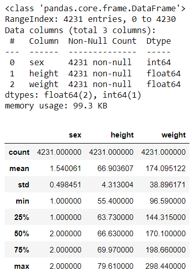
df2 = pd.read_csv("height_weight.csv")
df2.info()
df2.describe()
Output:
plt.hist2d(df2["height"], df2["weight"], bins=20, cmap="magma")
plt.xlabel("Height")
plt.ylabel("Weight");
Output:
Inference: We have also worked with one-dimensional Histograms for multi-dimensional Data, but that is for univariate analysis now if we want to get the data distribution of more than one feature then we have to shift our focus to 2-D Histograms. In the above 2-D graph height and weight is plotted against each other, keeping the C-MAP as magma.
Bit hard to get information from the 2D histogram, isn’t it? Too much noise in the image. What if we try and contour diagram? We’ll have to bin the data ourselves.
Every alternative comes into the picture when the original one has some drawbacks, Similarly, in the case with 2-D histograms it becomes a bit hard to get the information from it as there is soo much noise in the graph. Hence now, we will go with a contour plot
Here is the resource that can help you deep dive, into this plot. The contour API is here.
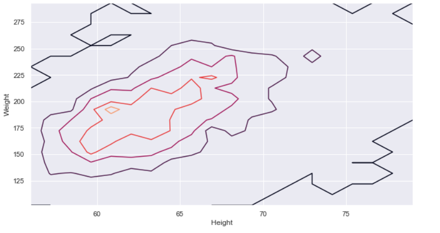
hist, x_edge, y_edge = np.histogram2d(df2["height"], df2["weight"], bins=20)
x_center = 0.5 * (x_edge[1:] + x_edge[:-1])
y_center = 0.5 * (y_edge[1:] + y_edge[:-1])
plt.contour(x_center, y_center, hist, levels=4)
plt.xlabel("Height")
plt.ylabel("Weight");
Output:
Inference: Now we can see that this contour plot which is way better than a complex and noisy 2-D Histogram as it shows the clear distribution between height and weight simultaneously. There is still room for improvement. If we will use the KDE plot from seaborn, then the same contours will be smoothened and more clearly informative.
From the very beginning of the article, we are primarily focussing on data visualization for the multi-dimensional data, and in this journey, we got through all the important graphs/plots that could derive business-related insights from the numeric data from multiple features all at once. In the last section, we will cover all these graphs in a nutshell.
Here’s the repo link to this article. I hope you liked my article on the Data visualization guide for multi-dimensional data. If you have any opinions or questions, then comment below.
Connect with me on LinkedIn for further discussion.
The media shown in this article is not owned by Analytics Vidhya and is used at the Author’s discretion.
GPT-4 vs. Llama 3.1 – Which Model is Better?
Llama-3.1-Storm-8B: The 8B LLM Powerhouse Surpa...
A Comprehensive Guide to Building Agentic RAG S...
Top 10 Machine Learning Algorithms in 2026
45 Questions to Test a Data Scientist on Basics...
90+ Python Interview Questions and Answers (202...
8 Easy Ways to Access ChatGPT for Free
Prompt Engineering: Definition, Examples, Tips ...
What is LangChain?
What is Retrieval-Augmented Generation (RAG)?
Edit
Resend OTP
Resend OTP in 45s