
Data Visualization and Dashboards with Excel and Cognos
Keep adding new skills with 10,000+ programs for $239 (usually $399). Save now.
Data Visualization and Dashboards with Excel and Cognos
This course is part of multiple programs.
Instructors: Sandip Saha Joy
242,628 already enrolled
Included with
Ask Coursera
4,492 reviews
Recommended experience
4,492 reviews
Recommended experience
What you'll learn
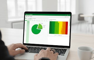
Create basic visualizations such as line graphs, bar graphs, and pie charts using Excel spreadsheets.
Explain the important role charts play in telling a data-driven story.
Construct advanced charts and visualizations such as Treemaps, Sparklines, Histogram, Scatter Plots, and Filled Map Charts.
Build and share interactive dashboards using Excel and Cognos Analytics.
Skills you'll gain
Tools you'll learn
Details to know
See how employees at top companies are mastering in-demand skills
Build your subject-matter expertise
- Learn new concepts from industry experts
- Gain a foundational understanding of a subject or tool
- Develop job-relevant skills with hands-on projects
- Earn a shareable career certificate
There are 4 modules in this course
Learn how to create data visualizations and dashboards using spreadsheets and analytics tools. This course covers some of the first steps for telling a compelling story with your data using various types of charts and graphs. You'll learn the basics of visualizing data with Excel and IBM Cognos Analytics without having to write any code.
You'll start by creating simple charts in Excel such as line, pie and bar charts. You will then create more advanced visualizations with Treemaps, Scatter Charts, Histograms, Filled Map Charts, and Sparklines. Next you’ll also work with the Excel PivotChart feature as well as assemble several visualizations in an Excel dashboard. This course also teaches you how to use business intelligence (BI) tools like Cognos Analytics to create interactive dashboards. By the end of the course you will have an appreciation for the key role that data visualizations play in communicating your data analysis findings, and the ability to effectively create them. Throughout this course there will be numerous hands-on labs to help you develop practical experience for working with Excel and Cognos. There is also a final project in which you’ll create a set of data visualizations and an interactive dashboard to add to your portfolio, which you can share with peers, professional communities or prospective employers.
In this module, you will be introduced to the basics of charts and the Excel functions that are used to create basic charts and pivot chart visualizations. By learning how to manipulate these features and creating visualizations, you will begin to understand the important role charts play in telling a data-driven story.
What's included
6 videos5 readings2 assignments
6 videos•Total 31 minutes
- Course Intro•4 minutes
- Introduction to Charts•5 minutes
- Interview: Using Visualizations to Tell a Data Story•4 minutes
- Creating Basic Charts in Excel (Line, Pie, and Bar Charts)•5 minutes
- Introduction to Creating Pivot Tables in Excel•8 minutes
- Using the Excel PivotChart Feature •6 minutes
5 readings•Total 77 minutes
- Helpful Tips for Course Completion•2 minutes
- Optional Hands-on Labs on Excel Basics•40 minutes
- Excel Keyboard Shortcuts•5 minutes
- Hands-on Lab 1: Creating Basic Charts•20 minutes
- Summary and Highlights•10 minutes
2 assignments•Total 42 minutes
- Practice Quiz: Visualizing Data using Spreadsheets •12 minutes
- Graded Quiz : Visualizing Data using Spreadsheets •30 minutes
In this module, you will learn about creating advanced charts and visualizations and learn about the basics of dashboarding and how to create a simple dashboard using a spreadsheet.
What's included
5 videos4 readings4 assignments
5 videos•Total 31 minutes
- Creating Treemaps, Scatter Charts, and Histograms•8 minutes
- Creating Filled Map Charts and Sparklines•6 minutes
- Introduction to Dashboards•4 minutes
- Interview: Using Dashboards to Present Data Results•5 minutes
- Creating a Simple Dashboard using Excel•8 minutes
4 readings•Total 50 minutes
- Hands-on Lab 2: Creating Advanced Charts•10 minutes
- Summary and Highlights•10 minutes
- Hands-on Lab 3: Creating a Simple Dashboard with Excel•20 minutes
- Summary and Highlights•10 minutes
4 assignments•Total 44 minutes
- Practice Quiz: Creating Advanced Charts •8 minutes
- Practice Quiz: Creating Dashboards using Spreadsheets •12 minutes
- Graded Quiz: Updating Advanced Charts •12 minutes
- Graded Quiz: Creating Dashboards using Spreadsheets •12 minutes
In this module, you will be introduced to another dashboarding solution called Cognos Analytics. After registering with Cognos Analytics, you will then explore the platform capabilities by creating visualizations, building a simple dashboard, and discovering its advanced features. Optionally, you can explore Google Looker Studio to create visualizations and build dashboards.
What's included
4 videos11 readings4 assignments
4 videos•Total 25 minutes
- Cognos Analytics: Introduction and How to Sign Up•3 minutes
- Navigating in Cognos Analytics•8 minutes
- Creating a Simple Dashboard in Cognos Analytics•7 minutes
- Advanced Capabilities in Cognos Analytics Dashboards•7 minutes
11 readings•Total 263 minutes
- Hands-on Lab: Getting Started with Cognos Analytics•40 minutes
- Summary and Highlights•1 minute
- Hands-on Lab: Different Methods for Creating Dashboard Visualizations with Cognos Analytics •45 minutes
- Hands-on Lab: Advanced Dashboard Capabilities in Cognos Analytics•45 minutes
- Summary and Highlights•10 minutes
- About this optional lesson with Looker Studio•2 minutes
- (Optional) : Getting Started with Google Looker Studio•10 minutes
- Creating Visualizations in Reports using Looker Studio•10 minutes
- (Optional): Hands-on Lab: Creating and Configuring Visualizations in Reports with Google Looker Studio•60 minutes
- (Optional) Hands-on Lab: Advanced charts in Looker Studio•30 minutes
- Summary and Highlights•10 minutes
4 assignments•Total 38 minutes
- Practice Quiz: Getting Started with IBM Cognos Analytics•8 minutes
- Practice Quiz: Creating Dashboards with Cognos Analytics•10 minutes
- Practice Quiz: Creating and Configuring Visualizations with Google Looker Studio•8 minutes
- Graded Quiz: Creating Visualizations and Dashboards with Cognos Analytics •12 minutes
Congratulations! You have now completed the modules for this course. In this module, you will complete the final assignment that will be graded by the AI-Grading tool or your peers. In the first part of the final assignment, you will use the provided sample data to create some visualizations using Excel for the web. In the second part of the final assignment, you will create some visualizations and add them to a dashboard using Cognos Analytics or Google Looker Studio.
What's included
7 readings1 app item
7 readings•Total 321 minutes
- Final Project Overview•10 minutes
- Reading: Final Project Submission Guidelines And Deliverables•5 minutes
- Final Assignment - Part 1: Creating Visualizations Using Excel•45 minutes
- Final Assignment - Part 2a: Creating Visualizations Using Cognos Analytics•175 minutes
- Final Assignment - Part 2b: Creating Visualizations Using Google Looker Studio•75 minutes
- Congratulations and Next Steps•10 minutes
- Course Credits and Acknowledgements•1 minute
1 app item•Total 30 minutes
- AI Graded - Final Project: Submission and Evaluation•30 minutes
Earn a career certificate
Add this credential to your LinkedIn profile, resume, or CV. Share it on social media and in your performance review.
Instructors
Explore more from Data Analysis
- Status: Free Trial
Course
- Status: Free Trial
- Status: Free TrialL
Logical Operations
Course
- Status: Free Trial
Course
Why people choose Coursera for their career
Learner reviews
- 5 stars
77.71%
- 4 stars
17.16%
- 3 stars
2.77%
- 2 stars
1.20%
- 1 star
1.13%
Showing 3 of 4492
Reviewed on Jun 5, 2022
It is very constructive and very important course for the future of data analyst career. providing practical handin experience makes it the perfect self starter and motivational course. Thank you
Reviewed on Aug 10, 2022
Having taking the tutorial class, i can say it enriched me with alot of information about Data Analytics. Tools for visualization such as Excel and Cognos, gives important clearity about data.
Reviewed on Aug 13, 2021
This course was not easy, I have never used IBM Cognos before. I was nervous logging into it and making sure I am doing it right. I end up using 2 monitors to see what I am doing.
Frequently asked questions
To access the course materials, assignments and to earn a Certificate, you will need to purchase the Certificate experience when you enroll in a course. You can try a Free Trial instead, or apply for Financial Aid. The course may offer 'Full Course, No Certificate' instead. This option lets you see all course materials, submit required assessments, and get a final grade. This also means that you will not be able to purchase a Certificate experience.
When you enroll in the course, you get access to all of the courses in the Certificate, and you earn a certificate when you complete the work. Your electronic Certificate will be added to your Accomplishments page - from there, you can print your Certificate or add it to your LinkedIn profile.
More questions
Financial aid available,
¹ Some assignments in this course are AI-graded. For these assignments, your data will be used in accordance with Coursera's Privacy Notice.