
Excel Charts and Pivot Tables
Excel Charts and Pivot Tables
Included with
Ask Coursera
Recommended experience
Recommended experience
What you'll learn
Learn how to create and customize various types of charts in Excel to represent data effectively.
Master pivot tables to analyze and summarize large datasets for deeper insights.
Develop skills in creating advanced data visualizations like combination charts and gauge charts.
Understand how to add trendlines, error bars, and sparklines to enhance your Excel charts.
Skills you'll gain
Details to know
January 2026
3 assignments
See how employees at top companies are mastering in-demand skills
There are 2 modules in this course
Unlock the power of data visualization and analysis with Excel! In this course, you will learn how to create various types of charts and pivot tables to turn raw data into actionable insights. From basic column and pie charts to complex combination and gauge charts, you’ll gain the skills to represent data visually in a way that tells a compelling story. As you progress, you will also master pivot tables, including techniques for grouping, filtering, and creating multi-level data analysis to enhance your decision-making.
Throughout the course, you will follow a structured journey, first mastering Excel’s charting tools, including column, line, bar, and scatter charts. You’ll then delve into advanced chart options such as combination and gauge charts, and learn how to add trendlines and error bars for more in-depth analysis. The course also covers pivot tables in detail, where you will learn to structure and filter data, create calculated fields, and use slicers to make data analysis more dynamic. By the end, you will be capable of confidently navigating Excel’s powerful features and applying them to real-world data analysis tasks. This course is perfect for anyone looking to enhance their Excel skills for data visualization and analysis. It is suitable for beginners looking to learn the basics as well as intermediate users wanting to deepen their knowledge of Excel's advanced charting and pivot table functions. No prior advanced Excel knowledge is required, but familiarity with basic Excel functions is helpful. The course is designed to accommodate all skill levels. By the end of the course, you will be able to create and customize various chart types, build and update pivot tables, use slicers for interactive data filtering, and generate advanced visualizations that inform key business decisions.
In this module, we will guide you through creating and customizing different types of charts in Excel, such as column, line, pie, and scatter plots. You'll learn how to visualize your data to uncover trends, correlations, and insights while mastering advanced charting techniques like error bars, sparklines, and combination charts. By the end of this module, you will be able to create charts that clearly communicate your data's story and enhance your analytical reports.
What's included
15 videos1 reading
15 videos•Total 25 minutes
- Charts•2 minutes
- Column Chart•1 minute
- Line Chart•2 minutes
- Pie Chart•2 minutes
- Bar Chart•1 minute
- Area Chart•1 minute
- Scatter Plot•1 minute
- Data Series•2 minutes
- Axes•2 minutes
- Chart Sheet•1 minute
- Trendline•2 minutes
- Error Bars•1 minute
- Sparklines•3 minutes
- Combination Chart•1 minute
- Gauge Chart•3 minutes
1 reading•Total 10 minutes
- Full Course Resource•10 minutes
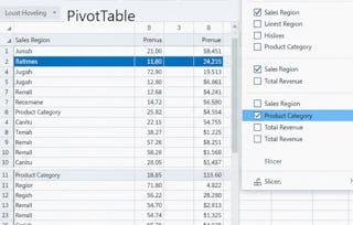
In this module, we will introduce you to the powerful world of pivot tables in Excel, teaching you how to quickly summarize and analyze large datasets. You'll learn how to group items, build multi-level tables, and use advanced features like pivot charts and slicers for interactive reporting. By the end of this module, you'll be equipped with the skills to turn complex data into insightful, actionable reports.
What's included
9 videos3 assignments
9 videos•Total 16 minutes
- Tables•2 minutes
- Pivot Tables•3 minutes
- Group Pivot Table Items•1 minute
- Multi-level Pivot Table•2 minutes
- Frequency Distribution•1 minute
- Pivot Chart•1 minute
- Slicers•2 minutes
- Update Pivot Table•2 minutes
- Calculated Field/Item•2 minutes
3 assignments•Total 90 minutes
- Data Analysis - Pivot Tables - Chart - Assessment•15 minutes
- Full Course Assessment•60 minutes
- Full Course Practice Assessment•15 minutes
Instructor
Explore more from Data Analysis
- Status: Free Trial
Course
- Status: Free Trial
Course
- Status: Free Trial
Course
- Status: Free Trial
Course
Why people choose Coursera for their career
Advance your career with an online degree
Earn a degree from world-class universities - 100% online
Frequently asked questions
Excel Charts and Pivot Tables are essential tools for anyone working with data. Charts allow you to create visual representations of your data, making trends and comparisons easier to understand. Pivot tables, on the other hand, help organize and analyze large datasets by summarizing and restructuring information. These tools are highly relevant in fields such as data analysis, finance, marketing, and business intelligence, where data-driven decisions are crucial.
This course covers the basics and advanced features of Excel’s charting and pivot table functionalities. You'll learn how to create different types of charts, such as column, line, pie, and scatter plots, to visualize your data effectively. Additionally, the course will guide you through creating pivot tables, grouping data, and using features like slicers and calculated fields to perform detailed data analysis.
After completing the course, you'll be able to create a wide range of Excel charts to visualize data clearly and analyze complex datasets using pivot tables. You'll also be able to customize charts with trendlines, error bars, and sparklines, and use pivot tables for grouping, summarizing, and filtering large datasets. These skills will enhance your ability to present and interpret data in any professional setting.
More questions
Financial aid available,