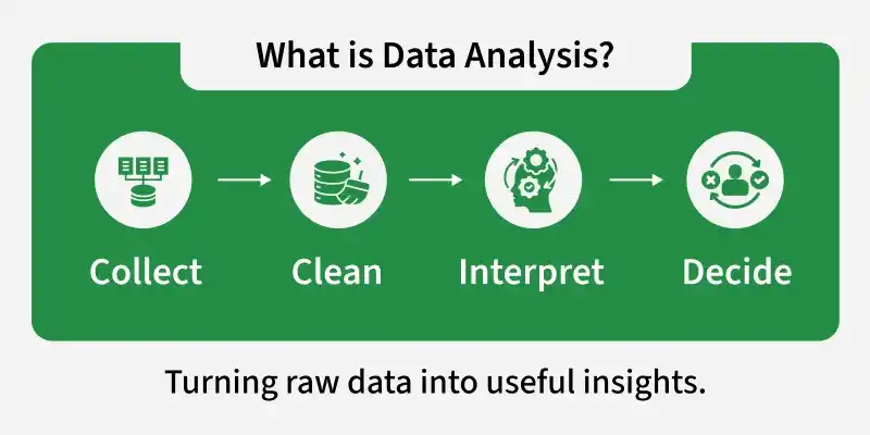
Data analysis is the process of examining and interpreting data to extract meaningful insights that can guide decision-making. Using R, a statistical programming language, makes this process efficient and reproducible.
Collect, clean and transform raw data into structured formats suitable for analysis.
Explore patterns, relationships and trends using statistical and graphical methods in R.
Visualize results effectively to communicate findings and support data-driven decisions.
Data analysis helps convert raw data into meaningful information that can support better understanding and decision-making. It allows individuals and organizations to examine data carefully and draw logical conclusions based on facts.
Improves Decision-Making: Provides clear information that supports better decisions based on facts instead of guessing.
Identifies Trends and Patterns: Shows common patterns or changes in data, such as which product sells more or when sales increase.
Improves Efficiency: Finds better ways to complete tasks and reduces time, cost and errors.
Supports Problem Solving: Identifies the cause of problems and suggests suitable solutions.
Enables Future Prediction: Uses past data to estimate what may happen in the future, such as predicting upcoming sales.
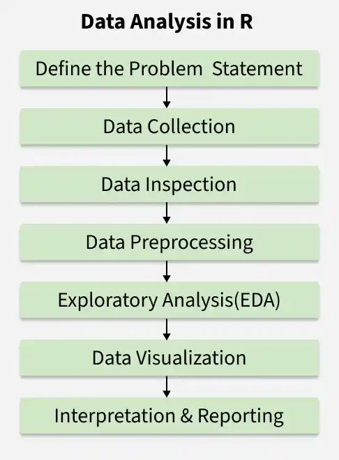
Steps for Data Analysis
Data analysis in R follows a structured approach to transform raw data into meaningful insights. Each step plays an important role in ensuring accurate and reliable results.
The first step is to clearly identify the objective of the analysis. A well-defined problem helps determine what data is needed and what type of analysis should be performed.
Identify the main question or objective.
Determine the scope and expected outcome of the analysis.
Decide the type of data and methods required.
2. Data Collection
After defining the problem, relevant data must be gathered from appropriate sources. Only data related to the objective should be collected.
Import data from CSV, Excel, databases or online sources in R.
Ensure the data is accurate and relevant to the problem.
Organize the dataset properly for further processing.
3. Data Inspection
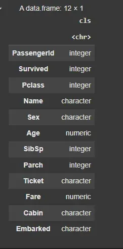
Before cleaning, it is important to understand the structure and content of the dataset. This helps identify potential issues.
View sample records using head() or tail().
Check structure and data types using str().
Generate summary statistics using summary().
4. Data Preprocessing
Raw data often contains missing values, duplicates or inconsistencies. Preprocessing prepares the data for accurate analysis.
Handle missing values and remove duplicates.
Detect and manage outliers or incorrect entries.
Convert variables into appropriate data types.
5. Exploratory Data Analysis (EDA)
After cleaning the data, analysis can begin to uncover patterns, trends and relationships. This step helps to understand the dataset and extract meaningful insights.
Calculate descriptive statistics such as mean, median, mode, standard deviation and variance.
Apply statistical tests or models to explore relationships and support conclusions.
6. Data Visualization
Visualization helps present findings in a clear and understandable manner. Graphs make patterns and trends easier to interpret.
Create bar charts, histograms or scatter plots.
Use visualization packages like ggplot2.
Highlight key insights through graphical representation.
7. Interpretation and Reporting
The final step is to interpret the results and communicate findings effectively. Clear reporting supports informed decision-making.
Summarize key findings and insights.
Draw conclusions based on the analysis.
Present results through reports, dashboards or presentations.
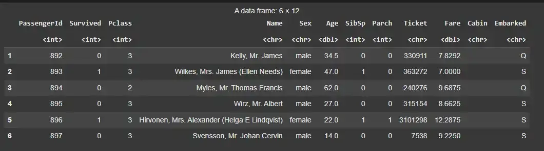
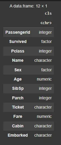
Performing Data Analysis Using Titanic Dataset
Here we will explore a real-world example of data analysis using the Titanic dataset. The Titanic dataset contains information about passengers aboard the RMS Titanic, including whether they survived, their age, gender, ticket class and more.
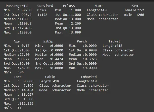
To get an overview of the data, we can use the summary() function. This will provide key statistics for each column, such as the minimum, maximum, mean and median values.
The dataset contains missing values (NA). To identify how many missing values are present, we can use the following code:
Output:
87
This indicates that there are 87 missing values in the dataset. We can either remove the rows containing missing values or fill them with the mean (for numerical columns) or mode (for categorical columns).
This will remove the rows with missing values, leaving us with a cleaner dataset.
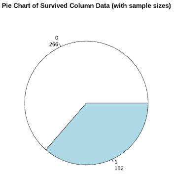
Step 6: Analyzing Survival Rate
Here we divide the data into two groups, those who survived and those who did not.
We can now analyze the number of survivors and non-survivors using a pie chart:
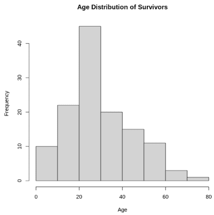
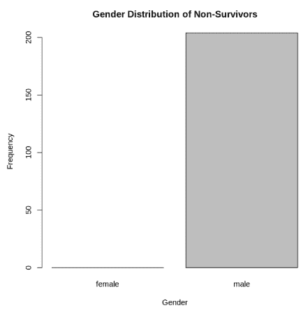
We can use a bar plot to analyze the distribution of survivors and non-survivors based on gender. This plot will help us understand the number of males and females who survived or did not survive, giving us insights into how gender might have influenced survival on the Titanic.
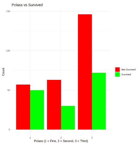
We can use a bar plot to analyze the distribution of survivors and non-survivors based on class. This plot will help us understand the number of passengers who survived or did not survive, giving us insights into how class might have influenced survival on the Titanic.
