 |
VOOZH | about |
|
VOOZH | about |
dotnet add package H.NotifyIcon.Uno --version 2.4.1
NuGet\Install-Package H.NotifyIcon.Uno -Version 2.4.1
<PackageReference Include="H.NotifyIcon.Uno" Version="2.4.1" />
<PackageVersion Include="H.NotifyIcon.Uno" Version="2.4.1" />Directory.Packages.props
<PackageReference Include="H.NotifyIcon.Uno" />Project file
paket add H.NotifyIcon.Uno --version 2.4.1
#r "nuget: H.NotifyIcon.Uno, 2.4.1"
#:package H.NotifyIcon.Uno@2.4.1
#addin nuget:?package=H.NotifyIcon.Uno&version=2.4.1Install as a Cake Addin
#tool nuget:?package=H.NotifyIcon.Uno&version=2.4.1Install as a Cake Tool
** This project is a continuation of the inactive base project to other platforms (WinUI/Uno.Skia.Wpf/Console) - ❤️ https://github.com/hardcodet/wpf-notifyicon ❤️ **
This is an implementation of a NotifyIcon (aka system tray icon or taskbar icon) for .Net 6 WPF/WinUI/Uno.Skia.WPF/Console platforms. It does not just rely on the Windows Forms NotifyIcon component, but is a purely independent control which leverages several features of the WPF/WinUI frameworks in order to display rich tooltips, popups, context menus, and balloon messages. It can be used directly in code or embedded in any XAML file.
👁 NuGet
👁 NuGet
👁 NuGet
👁 NuGet
Install-Package H.NotifyIcon.Wpf
Install-Package H.NotifyIcon.WinUI
Install-Package H.NotifyIcon.Uno
Install-Package H.NotifyIcon.Uno.WinUI
# If you need other platforms, you can use this Core library -
# it allows you to make NotifyIcon even in a console application.
Install-Package H.NotifyIcon
<Window
 xmlns:tb="clr-namespace:H.NotifyIcon;assembly=H.NotifyIcon.Wpf" // WPF
 xmlns:tb="using:H.NotifyIcon" // WinUI
 >
 <tb:TaskbarIcon
 ToolTipText="ToolTip"
 IconSource="/Images/TrayIcons/Logo.ico"
 ContextMenu="{StaticResource TrayMenu}"
 MenuActivation="LeftOrRightClick"
 TrayPopup="{StaticResource TrayStatusPopup}"
 PopupActivation="DoubleClick"
 TrayToolTip="{StaticResource TrayToolTip}"
 />
</Window>
Windows 11 introduces a new concept called Efficiency Mode.
Since, basically, this library is intended for applications to exist in the background with the ability to interact through TrayIcon, the library implements an API for this mode:
EfficiencyModeUtilities.SetEfficiencyMode(bool value)
WindowExtensions.Hide(this Window window, enableEfficiencyMode: true) // default value
WindowExtensions.Show(this Window window, disableEfficiencyMode: true) // default value
TaskbarIcon.ForceCreate(bool enablesEfficiencyMode = true) // default value
Example 1: 👁 image
<tb:TaskbarIcon>
 <tb:TaskbarIcon.IconSource>
 <tb:GeneratedIconSource
 Text="❤️"
 Foreground="Red"
 />
 </tb:TaskbarIcon.IconSource>
</tb:TaskbarIcon>
Example 2: 👁 image
<tb:TaskbarIcon
 IconSource="/Icons/Error.ico"
 >
 <tb:TaskbarIcon.IconSource>
 <tb:GeneratedIconSource
 Text="5"
 Foreground="Black"
 FontSize="36"
 FontWeight="Bold"
 />
 </tb:TaskbarIcon.IconSource>
</tb:TaskbarIcon>
Example 3: 👁 image
<tb:TaskbarIcon>
 <tb:TaskbarIcon.IconSource>
 <tb:GeneratedIconSource
 Text="❤️"
 Foreground="Red"
 FontFamily="Segoe UI Emoji"
 Background="AliceBlue"
 FontWeight="Bold"
 FontSize="38"
 />
 </tb:TaskbarIcon.IconSource>
</tb:TaskbarIcon>
Example 4: 👁 image
<tb:TaskbarIcon>
 <tb:TaskbarIcon.IconSource>
 <tb:GeneratedIconSource
 Text="❤️"
 BorderThickness="5"
 FontSize="46"
 >
 <tb:GeneratedIconSource.Foreground>
 <LinearGradientBrush StartPoint="0,0" EndPoint="128,128">
 <GradientStop Color="White" />
 <GradientStop Color="Red" />
 </LinearGradientBrush>
 </tb:GeneratedIconSource.Foreground>
 <tb:GeneratedIconSource.BorderBrush>
 <LinearGradientBrush StartPoint="0,0" EndPoint="128,128">
 <GradientStop Color="White" />
 <GradientStop Color="Red" />
 </LinearGradientBrush>
 </tb:GeneratedIconSource.BorderBrush>
 </tb:GeneratedIconSource>
 </tb:TaskbarIcon.IconSource>
</tb:TaskbarIcon>
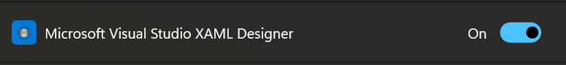
It is recommended to pin the designer icon for easy viewing. To do this, go to Taskbar Settings → Other system tray icons and enable this icon:
👁 image
At the moment, three modes are implemented, each with its own pros and cons.
Availability of various options(depends on the version of WindowsAppSDK you are using):
| Option | Packaged App | Unpackaged App |
|---|---|---|
| Transparency | 🟢 from 1.1.0-preview | 🟢 from 1.1.0-preview |
| Borderless | 🔷 | 🟢 from 1.1.0-preview |
| Animations | 🟢, but with borders | 🟢 from 1.1.0-preview |
| Submenus | 🔷 | 🔷 |
Priority place for bugs: https://github.com/HavenDV/H.NotifyIcon/issues\
Priority place for ideas and general questions: https://github.com/HavenDV/H.NotifyIcon/discussions\
I also have a Discord support channel:
https://discord.gg/g8u2t9dKgE
| Product | Versions Compatible and additional computed target framework versions. |
|---|---|
| .NET | net10.0 net10.0 is compatible. net10.0-android net10.0-android was computed. net10.0-android36.0 net10.0-android36.0 is compatible. net10.0-browser net10.0-browser was computed. net10.0-ios net10.0-ios was computed. net10.0-ios26.0 net10.0-ios26.0 is compatible. net10.0-maccatalyst net10.0-maccatalyst was computed. net10.0-maccatalyst26.0 net10.0-maccatalyst26.0 is compatible. net10.0-macos net10.0-macos was computed. net10.0-tvos net10.0-tvos was computed. net10.0-windows net10.0-windows was computed. |
This package is not used by any NuGet packages.
This package is not used by any popular GitHub repositories.
| Version | Downloads | Last Updated |
|---|---|---|
| 2.4.2-dev.22 | 45 | 6/15/2026 |
| 2.4.2-dev.17 | 55 | 5/15/2026 |
| 2.4.2-dev.16 | 48 | 5/15/2026 |
| 2.4.2-dev.15 | 51 | 5/15/2026 |
| 2.4.2-dev.14 | 52 | 5/15/2026 |
| 2.4.2-dev.13 | 63 | 5/12/2026 |
| 2.4.2-dev.11 | 69 | 4/12/2026 |
| 2.4.2-dev.10 | 60 | 4/11/2026 |
| 2.4.2-dev.9 | 70 | 4/10/2026 |
| 2.4.2-dev.8 | 73 | 3/14/2026 |
| 2.4.2-dev.7 | 64 | 3/14/2026 |
| 2.4.2-dev.6 | 75 | 3/14/2026 |
| 2.4.1 | 677 | 12/1/2025 |
| 2.3.2 | 261 | 10/23/2025 |
| 2.3.1 | 267 | 10/6/2025 |
| 2.3.0 | 323 | 3/1/2025 |
| 2.2.0 | 290 | 12/6/2024 |
| 2.1.4 | 264 | 10/22/2024 |
| 2.1.3 | 355 | 8/18/2024 |
| 2.1.2 | 299 | 8/15/2024 |