 |
VOOZH | about |
|
VOOZH | about |
dotnet add package Material.Icons.WPF --version 3.0.2
NuGet\Install-Package Material.Icons.WPF -Version 3.0.2
<PackageReference Include="Material.Icons.WPF" Version="3.0.2" />
<PackageVersion Include="Material.Icons.WPF" Version="3.0.2" />Directory.Packages.props
<PackageReference Include="Material.Icons.WPF" />Project file
paket add Material.Icons.WPF --version 3.0.2
#r "nuget: Material.Icons.WPF, 3.0.2"
#:package Material.Icons.WPF@3.0.2
#addin nuget:?package=Material.Icons.WPF&version=3.0.2Install as a Cake Addin
#tool nuget:?package=Material.Icons.WPF&version=3.0.2Install as a Cake Tool
Parsed icons set from materialdesignicons.com and display control implementations for different GUI frameworks.
This project consists of 3 parts:
👁 alternate text is missing from this package README image
contains info about the icons
👁 alternate text is missing from this package README image
contains controls for AvaloniaUI
👁 alternate text is missing from this package README image
contains controls for WPF
👁 alternate text is missing from this package README image
contains controls for WinUI3
FAQ - frequently asked questions
dotnet add package Material.Icons.Avalonia
App.xaml (for 2.0.0 version and higher):
<Application xmlns:materialIcons="clr-namespace:Material.Icons.Avalonia;assembly=Material.Icons.Avalonia"
 ...>
 <Application.Styles>
 ...
 <materialIcons:MaterialIconStyles />
 </Application.Styles>
</Application>
Add Material.Icons.Avalonia namespace to the root element of your file (your IDE can suggest it or do it automatically):
xmlns:materialIcons="clr-namespace:Material.Icons.Avalonia;assembly=Material.Icons.Avalonia"
Use MaterialIcon control:
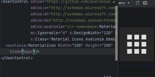
<materialIcons:MaterialIcon Kind="Abacus" />
The Foreground property controls the color of the icon.
Also, there is MaterialIconExt which allows you to use is as the markup extension:
<Button Content="{materialIcons:MaterialIconExt Kind=Abacus}" />
Or with a text via MaterialIconTextExt:
<Button Content="{materialIcons:MaterialIconTextExt Kind=Play, Text=Play}" />
The MaterialIcon implements IImage interface, to allow to use as an Image source:
<Image>
 <materialIcons:MaterialIcon Foreground="DeepPink" Kind="Abacus" />
</Image>


<Image Source="{materialIcons:MaterialIconExt Kind=Abacus, IconForeground=DeepPink}" />
Note that when using MaterialIcon as an Image source, the Width and Height properties must be defined under <Image>,
any size definition on MaterialIcon have no impact. Also, animation are not supported in this use case.
{x:Null}(Default) icons will not reserve space for it in layout.dotnet add package Material.Icons.Avalonia
type App() =
 inherit Application()

 override this.Initialize() =
 ..
 this.Styles.Add(MaterialIconStyles(null))
 ..
MaterialIcon
namespace Avalonia.FuncUI.DSL

[<AutoOpen>]
module MaterialIcon =
 open Material.Icons
 open Material.Icons.Avalonia
 open Avalonia.FuncUI.Types
 open Avalonia.FuncUI.Builder

 let create (attrs: IAttr<MaterialIcon> list): IView<MaterialIcon> =
 ViewBuilder.Create<MaterialIcon>(attrs)

 type MaterialIcon with

 static member kind<'t when 't :> MaterialIcon>(value: MaterialIconKind) : IAttr<'t> =
 AttrBuilder<'t>.CreateProperty<MaterialIconKind>(MaterialIcon.KindProperty, value, ValueNone)
Button.create [
 Button.content (
 MaterialIcon.create [
 MaterialIcon.kind MaterialIconKind.Export
 ]
 )
]
Install Material.Icons.WPF nuget package:
dotnet add package Material.Icons.WPF
Add Material.Icons.WPF namespace to the root element of your file (your IDE can suggest it or do it automatically):
xmlns:materialIcons="clr-namespace:Material.Icons.WPF;assembly=Material.Icons.WPF"
Use MaterialIcon control:
<materialIcons:MaterialIcon Kind="Abacus" />
The Foreground property controls the color of the icon.
Also, there is MaterialIconExt which allows you to use is as the markup extension:
<Button Content="{materialIcons:MaterialIconExt Kind=Abacus}" />
Install Material.Icons.WinUI3 nuget package:
dotnet add package Material.Icons.WinUI3
Add Material.Icons.WinUI3 namespace to the root element of your file (your IDE can suggest it or do it automatically):
xmlns:materialIcons="using:Material.Icons.WinUI3"
Use MaterialIcon control:
<materialIcons:MaterialIcon Kind="Abacus" />
The Foreground property controls the color of the icon.
Also, there is MaterialIconExt which allows you to use is as the markup extension:
<Button Content="{materialIcons:MaterialIconExt Kind=Abacus}" />
Install Material.Icons nuget package:
dotnet add package Material.Icons
Icon types stored in Material.Icons.MaterialIconKind enum.
We can resolve an icon path by using Material.Icons.MaterialIconDataProvider.GetData().
Currently, there is no way to add your own icons, as icons are enum and cannot be modified.
But you can override some existing icons to use your own data:
public class CustomIconProvider : MaterialIconDataProvider
{
 public override string ProvideData(MaterialIconKind kind)
 {
 return kind switch
 {
 MaterialIconKind.TrophyVariant => "some SVG code",
 _ => base.ProvideData(kind)
 };
 }
}

// When your application starts (e.g. in the Main method) replace MaterialIconDataProvider with your own
public static int Main(string[] args)
{
 MaterialIconDataProvider.Instance = new CustomIconProvider(); // Settings custom provider

 // Application startup code
 // return BuildAvaloniaApp().StartWithClassicDesktopLifetime(args);
}
MaterialIcon and it extensions supports pre-defined animations:
<MaterialIcons:MaterialIcon Kind="Refresh" Animation="Spin" />
<MaterialIcons:MaterialIcon Kind="Heart" Foreground="DeepPink" Animation="FadeInOut" />
Foreground property.MaterialIcon control - use Width or/and Height properties.MaterialIconExt - use Size property.Material.Icons package version in your project file.1.0.0 and 1.0.1 are compatible, but 1.0.0 and 1.1.0 might not be.| Product | Versions Compatible and additional computed target framework versions. |
|---|---|
| .NET | net5.0 net5.0 was computed. net5.0-windows net5.0-windows was computed. net6.0 net6.0 was computed. net6.0-android net6.0-android was computed. net6.0-ios net6.0-ios was computed. net6.0-maccatalyst net6.0-maccatalyst was computed. net6.0-macos net6.0-macos was computed. net6.0-tvos net6.0-tvos was computed. net6.0-windows net6.0-windows was computed. net6.0-windows7.0 net6.0-windows7.0 is compatible. net7.0 net7.0 was computed. net7.0-android net7.0-android was computed. net7.0-ios net7.0-ios was computed. net7.0-maccatalyst net7.0-maccatalyst was computed. net7.0-macos net7.0-macos was computed. net7.0-tvos net7.0-tvos was computed. net7.0-windows net7.0-windows was computed. net7.0-windows7.0 net7.0-windows7.0 is compatible. net8.0 net8.0 was computed. net8.0-android net8.0-android was computed. net8.0-browser net8.0-browser was computed. net8.0-ios net8.0-ios was computed. net8.0-maccatalyst net8.0-maccatalyst was computed. net8.0-macos net8.0-macos was computed. net8.0-tvos net8.0-tvos was computed. net8.0-windows net8.0-windows was computed. net8.0-windows7.0 net8.0-windows7.0 is compatible. net9.0 net9.0 was computed. net9.0-android net9.0-android was computed. net9.0-browser net9.0-browser was computed. net9.0-ios net9.0-ios was computed. net9.0-maccatalyst net9.0-maccatalyst was computed. net9.0-macos net9.0-macos was computed. net9.0-tvos net9.0-tvos was computed. net9.0-windows net9.0-windows was computed. net9.0-windows7.0 net9.0-windows7.0 is compatible. net10.0 net10.0 was computed. net10.0-android net10.0-android was computed. net10.0-browser net10.0-browser was computed. net10.0-ios net10.0-ios was computed. net10.0-maccatalyst net10.0-maccatalyst was computed. net10.0-macos net10.0-macos was computed. net10.0-tvos net10.0-tvos was computed. net10.0-windows net10.0-windows was computed. |
| .NET Core | netcoreapp3.1 netcoreapp3.1 is compatible. |
| .NET Framework | net461 net461 is compatible. net462 net462 was computed. net463 net463 was computed. net47 net47 was computed. net471 net471 was computed. net472 net472 was computed. net48 net48 was computed. net481 net481 was computed. |
Showing the top 3 NuGet packages that depend on Material.Icons.WPF:
| Package | Downloads |
|---|---|
|
MattEqualsCoder.MSURandomizer.UI
UI library with windows and controls for randomizing MSUs. |
|
|
Frank.Libraries.Wpf
A library of WPF controls and utilities for .NET 8.0 and later. Fundamentally, this library is a collection of controls and utilities that I have found useful in my own projects. I hope you find them useful as well. |
|
|
Material.Icons.WPF.Demo
Package Description |
Showing the top 3 popular GitHub repositories that depend on Material.Icons.WPF:
| Repository | Stars |
|---|---|
|
grzybeek/grzyClothTool
grzyClothTool is a free tool to create and manage GTA5 addon clothing packs
|
|
|
tylercamp/palcalc
Comprehensive breeding solver for Palworld
|
|
|
project-sbc/Handheld-Hardware-Tools
Software that compliments Windows laptops/tablets/gaming handhelds to allow easy control of TDP, brightness, cpu clock, etc.
|
| Version | Downloads | Last Updated |
|---|---|---|
| 3.0.3-nightly.0.2 | 91 | 4/13/2026 |
| 3.0.3-nightly.0.1 | 66 | 4/13/2026 |
| 3.0.2 | 2,186 | 4/13/2026 |
| 3.0.1 | 248 | 4/7/2026 |
| 3.0.0 | 1,464 | 2/19/2026 |
| 3.0.0-preview7.5 | 74 | 2/19/2026 |
| 3.0.0-preview7.4 | 72 | 2/19/2026 |
| 3.0.0-preview7 | 172 | 2/7/2026 |
| 3.0.0-preview6 | 138 | 1/17/2026 |
| 3.0.0-preview5 | 207 | 12/25/2025 |
| 3.0.0-avalonia12 | 115 | 2/19/2026 |
| 2.4.3 | 190 | 4/13/2026 |
## What's Changed
* Fix icons being bigger in 3.0.0 by @SKProCH in https://github.com/SKProCH/Material.Icons/pull/73
**Full Changelog**: https://github.com/SKProCH/Material.Icons/compare/v2.4.2...v3.0.2