
There are plenty of things to nitpick about Windows 11, but the Start Menu is in a league of its own. It’s the single most used element of the interface, yet it feels like it was designed by people who don’t actually use their computers for work.
Good design is usually invisible; it gets out of your way so you can get things done. Unfortunately, the Windows 11 Start Menu does the exact opposite – it demands your attention while offering less value than ever before.
7 design flaws in Windows 11 Microsoft still hasn't fixed
What are we waiting for?
Lacks customization options
Takes up the entire screen
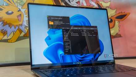
The irony of Windows 11’s Start menu is that it feels claustrophobic on the very devices it’s supposed to be optimized for: laptops. On my 13-inch HP Spectre x360, the Start menu doesn’t feel like a tool; it feels like an event. When I hit the Windows key, it hijacks my entire workspace.
I’m not looking for a cinematic experience every time I want to open Excel. I just want a compact, surgical launcher that gets in, lets me find what I need, and gets out of my way.
But in Windows 11, I’m forced into this massive, fixed-size box that wastes 40% of real estate. It’s 2026, I can’t just grab the corner of the menu and shrink it down to a size that makes sense for my screen.
Recently, Microsoft even went ahead and started placing ads right on the Start menu. It’s no longer a Start menu; it’s a billboard that I paid for, sitting right in the middle of my workflow.
Performance nightmare
Good luck finding that specific file
The most frustrating part of this entire experience isn’t just how the Start menu looks – it’s how it actually performs. Every time I hit that Windows key to find an app or a file, there is a split-second hiccup. It’s a micro-shutter that tells me the OS is struggling to decide what to show me first.
Instead of a lightning-fast index of my files, I’m forced to wait while the menu decides whether it wants to show me the Photoshop icon I have clicked a thousand times or a Bing search result for Photoshop tutorials that I never asked for.
Half the time, the performance is so inconsistent that by the time the menu actually populates, I have already hit the Enter key – only to realize the search result shifted at the last millisecond, and now I am accidentally launching a web search for a typo instead of opening my file.
It’s a performance nightmare because it’s no longer just a launcher; it’s a web-integrated monster. I can’t even switch from Bing to the Google search engine.
The search is still broken
Local vs. web
What really makes the Windows 11 Start menu feel like a half-baked experiment is the absolute disaster that is Windows Search. It is broken. I will start typing the name of a local app I use every single day – something like Notepad or Steam – and instead of an instant launch, I get a spinning wheel while Windows tries to fetch a Bing search result.
Then there is the Recommended section, which is supposed to be a smart hub for my preferred files, apps, and images, but in reality, it’s a chaotic mess of things I opened once three weeks ago and never want to see again. My most important project files are often buried. The worst part is, there is no way to hide the entire section either.
There is zero meaningful integration with the third-party services I actually rely on. For example, I can’t directly jump to a relevant WhatsApp chat, Slack channel, or find a specific 1Password entry right from the Start menu.
The alternatives are getting better
There is one from even Microsoft itself
There is no shortage of Start menu alternatives on Windows. You can either go with third-party apps or opt for a solution from Microsoft itself. Yes, I’m talking about PowerToys Run.
It is the best thing Microsoft has ever unofficially released. Instead of a giant, screen-filling box, I get a sleek, minimalist search bar that stays out of my way until I hit Alt + Space.
There are no Recommended junk, OneDrive ads, or Bing-powered searches. It just works. It does calculations, converts units, and finds my files in no time. It’s an irony that I have to install an extra utility from Microsoft just to fix the mess that Microsoft built into the OS.
Form over function
The Start Menu has been the heartbeat of the Windows experience for ages, but with the latest iteration, the Windows maker has messed up the execution. It’s slow, less customizable, and nowhere near the Spotlight Search on Mac.
If Microsoft wants the Windows 11 Start Menu to be more than a wasted rectangle of pixels, it needs to stop treating user workflows as an afterthought. Give us the ability to resize it, let us turn off the ‘Recommended’ clutter entirely, and bring back the efficiency of a true command center.
If you are tired of the Windows 11 Start menu, check out these robust alternatives to fly through your workflow.