
Almost five years with Windows 11, and Microsoft has made several changes to the Start menu. But the core usability problems never got fixed. The oversized layout, the Recommended section taking up valuable space, and the lack of meaningful customization made it feel oddly limited on a desktop PC. In the past, I tried living with it; I even tried several native tweaks like registry edits and Group Policy workarounds, but those still felt like a patchwork, not an actual solution.
I have always been the kind of person who avoids replacing a core Windows component because it feels unnecessary. But when the workarounds didn’t work for me, I realized I was doing more to fix the stock Start menu than simply replacing it with a better alternative. That’s what pushed me toward Start11. I originally installed it to replace the Start menu, and it did more than that. The Start menu was just the beginning.
8 Windows 11 features that should never have been added
Windows 11 is great, but there are features that never should have been added - here are workarounds for some of them
Start11 immediately felt more complete than Windows 11's own menu
This is what I wanted from Microsoft
I had been thinking about replacing the Start menu for a long time, but avoided it because it felt excessive. I wanted stability while working, and a Start menu replacement sounded like something enthusiasts did in the Windows 8 era. I expected compromises, instability, and visual weirdness once I replaced the Start menu with a custom one. I have already been following a number of tools, such as Start11, StartAllBack, and Open-Shell, that are actively developed and maintained. Finally, I decided to give one of them a try and started with Start11. Installing Start11 took only a minute or two.
Why Start11? It was developed by Stardock, a company that has been developing similar software for more than three decades, and it has a long history of Windows customization tools. I went with Start11 because I wanted something polished and actively maintained, not just free. But fortunately, it offers a 30-day free trial without any commitment or feature gating, and a single license runs $7 annually after that, so it worked in my favor.
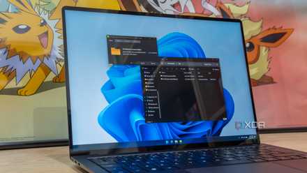
The onboarding was rather simpler than I had expected. I had occasionally used open-source tweak tools like ExplorerPatcher and Windhawk, but their first-launch experience always assumed you already knew what you were doing. As soon as I installed Start11, it applied the default Windows 7 Start menu and opened the Start11 app. The layout picker was simple, with a preview of what to expect. There were seven layouts to choose from. I immediately picked the “Windows App Style,” and, surprisingly, I am still using it. The difference was obvious almost immediately.
As a web developer, I always thought, "How hard can a Start menu design be?" All quick settings in one corner, profile on another, with pinned apps and all the apps listed below that. Start11 made that possible with no app crowding and pinned apps no longer floating in empty space. Within 10 minutes, I had already fixed three things Microsoft still doesn’t properly let you do — removing Recommended entirely, resizing the Start menu, and changing search behavior.
The biggest difference was not nostalgia; it was the efficiency that Start11 delivered from the first launch. The design felt built around desktop workflows again, and Windows 11’s stock menu suddenly felt oversized and restrictive.
The taskbar fixes I didn't expect to get with it
Two problems, one tool
I originally installed Start11 to replace the stock Windows 11 Start menu and never intended to touch anything else. But once I started exploring the taskbar settings inside Start11, I couldn’t stop myself from trying them out. I don’t know about you, but I was a big fan of Windows 10's taskbar flexibility, being able to position it to any edge of the screen I wanted. Seeing those options in Start11 made me realize Microsoft had removed more functionality than I remembered.
I had previously used a bunch of apps to force-position the taskbar, but it never felt native. By "native," I mean that the notification center and the control area were still at the default (bottom-right) position when active, and the taskbar was on the left. While it felt weird using those tweak tools, everything felt native with Start11. My taskbar was on the left edge, and so were the context menu, control center, and notification area.
Finally, my taskbar was clean and organized. No Windows bloatware, and aligned to the left. Beyond the alignment, I also tweaked taskbar icon size, labeling, right-click behavior, and a few appearance settings. Since I work with multiple monitors, Start11 lets me configure each one separately. On my primary monitor, I aligned the taskbar to the left and kept the icons unlabeled, but on my secondary and tertiary monitors, the taskbar remained at the bottom with ungrouped icons and labels.
Note: If you want similar taskbar tweaks for free, you can get much of the same functionality through ExplorerPatcher, but I preferred having most of it integrated into one polished app.
Windows 11 removed basic desktop workflow features without asking, and Start11 quietly gave them back — identifying windows faster with labels, fewer accidental app switches, less hovering over grouped icons, and muscle memory returning.
Now Windows 11's default Start menu feels unfinished to me
I can't unsee the compromises anymore
Due to the nature of my work, I regularly jump between different Windows PCs and VMs, and testing something on a fresh install is practically a daily thing for me. After a few days with Start11, coming back to the default Windows 11 Start menu made the differences impossible to ignore.
Save on Windows customization software and subscription deals
The issue with the Windows 11 default Start menu shifted from “I dislike this design” to "This workflow feels inefficient now.” Coming back to the Windows 11 default Start menu after being used to Start11 felt slower while navigating, the information density felt poor, and most importantly, it lacked customization options.
Microsoft clearly prioritizes visual consistency, but desktop flexibility feels increasingly secondary. Over time, Microsoft has evolved, and Windows has historically succeeded because it adapted to a new workflow, but often at the cost of features that made users adopt it in the first place. But third-party tools revived those customization options that Microsoft had quietly stripped away.
I was not trying to relive the Windows 7 era; I genuinely like where Windows 11 has landed overall. Start11 simply makes the shell feel more mature and efficient. I no longer rely on registry hacks and Group Policy workarounds, hoping Microsoft improves things someday. With Start11, I stopped waiting for future Windows updates to fix the Start menu.
7 ways to customize the Windows taskbar for maximum productivity
The Windows 11 taskbar may seem basic, but there's a lot you can change about it. Here are a few ways you can boost your productivity.
I should have stopped waiting much sooner
Replacing a core Windows component felt unnecessary and the kind of thing I would install for a week and eventually uninstall. But Start11 earned a permanent place in my setup because it quietly fixed several frustrating issues I had come to accept in Windows 11. What surprised me the most was that after a while, I stopped thinking about the Start menu entirely. Faster navigation, fewer clicks, and a taskbar that finally behaved the way I expected. I kept waiting for Microsoft to fix the Start menu, but at this point, I’ve stopped waiting.
Stardock Start11 v2
- OS
- Windows 11/10
Stardock Start11 v2 is a great application to personalize your Windows 11 or Windows 10 experience. You can add a floating taskbar, three styles of Start Menu, and even pin folders to your taskbar, and so much more.