 |
VOOZH | about |
|
VOOZH | about |
React Storybook is a user interface development environment and playground for UI components. It allows developers to develop their components and showcase them interactively in an isolated environment.
👁 ImageStorybook also allows the developer to provide code examples of component usage which may, in turn, serve as documentation for the component. Storybook is widely used by engineers around the world to speed up UI development and provide documentation for their components.
Storybook also has amazing documentation and this walkthrough will get one set up from scratch. They also provided this live demo of how storybook works. You may also want to take a look at this article on how Storybook can simplify component testing.
Pretty useful right? It gets better as there are many other ways to achieve results similar to those provided by Storybook. In this article, we’ll be looking at other alternatives to Storybook for React applications. These alternatives include:
The Replay is a weekly newsletter for dev and engineering leaders.
Delivered once a week, it's your curated guide to the most important conversations around frontend dev, emerging AI tools, and the state of modern software.
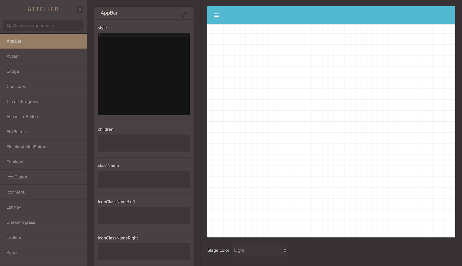
Atellier is probably one of our more versatile options in our list. Developed by Scup, Atellier allows you to preview and share components while providing features such as the ability to edit props, state and functions attached to a component as well as manipulate styling. You can see just how detailed this is using this live demo with material UI which showcases a variety of components.
Atellier is also fairly easy to set up. To do so, install the react-attelier package like this:
npm install react-atellier
Next, let’s import it and set it up in our project:
import ReactAtellier from 'react-atellier';
import myComponent from 'myComponent';
//import other components here

const componentList = [{
 componentName : myComponent.displayName,
 component : myComponent
 },
 //...map other components
];

//pass the list of components to atellier via props
var AtellierWrapper = React.createClass({
 render: function() {
 return (
 <ReactAtellier components={componentList} />
 );
 }
});

//render atellier somewhere in your app
render((
 <Router history={browserHistory}>
 <Route path="/" component={App}>
 <Route path="atellier" component={AtellierWrapper}/>
 </Route>
 </Router>
), document.body)
And that’s it, on the atellier route of your app you will find the components rendered in a demo with all of Atellier’s features available.
Atellier is open source and they are open to contributions to developers with a CLI currently being worked on to improve the development experience.
It’s important to note that this package hasn’t been updated since 2016.
React Cosmos is another great option. Cosmos scans your project and enables you to do the following:
Cosmos is a dev tool first, made to improve all components, big and small, not just the stateless UI bits. The fixture and proxy architecture doubles as an automated testing utility, providing a complete solution for developing robust and reusable components. Cosmos also makes it easy to create a living style guide, but it’s a secondary goal and you might get more value from alternatives if this is your chief concern.
A live demo of Cosmos at work can be found here.
Docz is a fantastic tool for documenting your components with zero configuration and live preview. Docz is powered by Gatsby making it blazing fast. It is built on five main principles:
Docz also offers plugin and themes support therefore improving customization and usability.
Carte Blanche is an isolated development space with integrated fuzz testing for your components. See them individually, explore them in different states and quickly and confidently develop them.
Setting up Carte Blanche is an easy two-step process:
npm install --save-dev carte-blanchevar CarteBlanche = require('carte-blanche');
/* … */
plugins: [
new CarteBlanche({
componentRoot: './src/components'
})
],
That’s it, now start your development environment and go to /carte-blanche to see your Carte Blanche. The team was kind enough to provide this short video illustrating the available features.
Like Atellier, it’s important to note that this package hasn’t been updated since 2016.
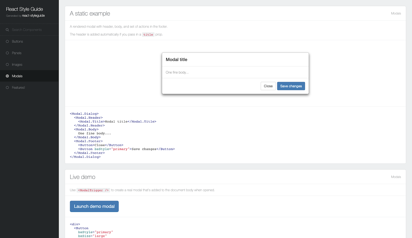
React Styleguide Generator is used to easily generate a good-looking style guide by adding some documentation to your React project.
You can find a demo here created with React-Bootstrap showcasing documentation for a number of components.
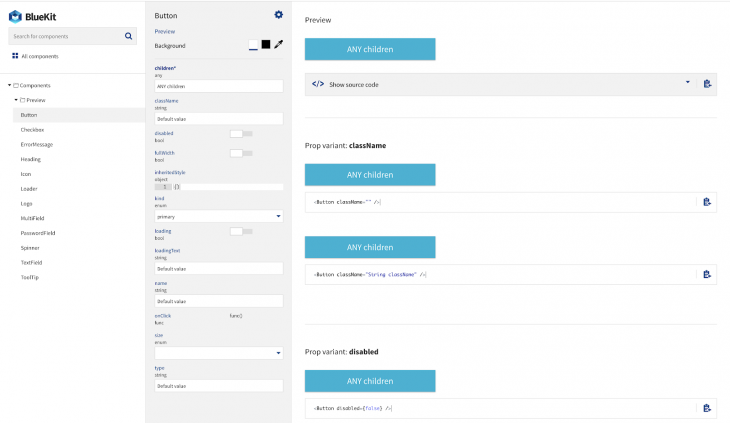
Created by Blueberry, Bluekit is a fantastic looking component documentation tool that seamlessly integrates with gulp.
To install it run npm install react-bluekit --save.
Add the following lines to your gulp file:
import createBlueKit from 'react-bluekit/lib/createBlueKit';

createBlueKit({
 // your directory where components are located
 baseDir: `${__dirname}/src/browser`,
 // relative paths from base dir where to look for components
 paths: ['./components', './auth']
});
Then run gulp build-bluekit to generate information about your components.
import Bluekit from 'react-bluekit';
import componentsIndex from './componentsIndex';

<BlueKit
 componentsIndex={componentsIndex}
 inline // display inline (not full page)
/>
You can also setup BlueKit to be built on application start and then to watch for component changes using the gulp watch-bluekit task:
gulp.task('default', ['build-bluekit', 'server', 'watch-bluekit']);
Documentation is important even for UI components as it helps create an environment where developers can collaborate easily and build applications faster. The tools above can help achieve this. If you have an open-source UI component library, this can also help your users get familiar with your tools faster.
Install LogRocket via npm or script tag. LogRocket.init() must be called client-side, not
server-side
$ npm i --save logrocket

// Code:

import LogRocket from 'logrocket';
LogRocket.init('app/id');
// Add to your HTML:

<script src="https://cdn.lr-ingest.com/LogRocket.min.js"></script>
<script>window.LogRocket && window.LogRocket.init('app/id');</script>
Learn how next-browser gives AI agents runtime context for debugging Next.js apps, including React props, hydration, PPR, forms, and performance.
Build dynamic LLM routing in Next.js with OpenRouter, TanStack AI, task classification, model fallbacks, and cost-aware routing.
TSRX adds first-class control flow, conditional hooks, and scoped styles to React via a TypeScript compiler extension — no new framework required.
Learn how to build a full React Native auth system using Better Auth and Expo — with email/password login, Google OAuth, session persistence, and protected routes.
Would you be interested in joining LogRocket's developer community?
Join LogRocket’s Content Advisory Board. You’ll help inform the type of content we create and get access to exclusive meetups, social accreditation, and swag.
Sign up now