 |
VOOZH | about |
|
VOOZH | about |
Providing alternate themes for your website has significant appeal. It not only allows you to alter the entire look of your website with a click of a button, but it’s also become an important accessibility feature.
👁 custom themes in tailwindCSSThere are multiple ways to create custom themes using Tailwind CSS, a utility-first CSS framework. In this article, we’ll cover the various ways you can implement alternate themes and the pros and cons of each method.
The Replay is a weekly newsletter for dev and engineering leaders.
Delivered once a week, it's your curated guide to the most important conversations around frontend dev, emerging AI tools, and the state of modern software.
The easiest way to theme your Tailwind CSS website is to use your colors in one mode (theme) and enable a plugin such as Nightwind to invert it. Nightwind maps your color palette so that a color of the scale 500 in light mode becomes 400 in dark mode, or bg-red-900 in one mode becomes bg-red-50 in the other, for example.
To prevent this coloring inverse in Nightwind, you can use the utility class nightwind-prevent, which disables Nightwind’s effects for the element without affecting its descendant nodes. Using nightwind-prevent-block, on the other hand, covers the descendants as well.
You can check out a live example here:
Tailwind Play
An advanced online playground for Tailwind CSS that lets you use all of Tailwind’s build-time features directly in the browser.
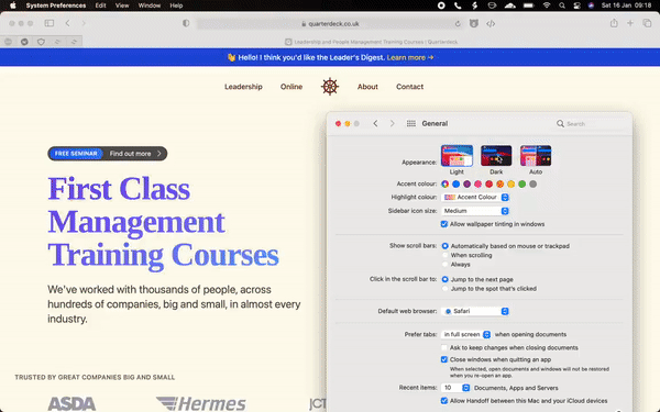
bg-white for the website background, the dark mode variant of that is an unpleasant pitch blackIn the form of a variant, Tailwind provides a theming API that provides the most control out of all the methods we’ll discuss in this article. By default, the dark variant is enabled only for color-related classes such as text, background, and border colors.
<p class="text-black dark:text-white">The quick brown fox jumps over the lazy dog</p>
Using this markup, the dark:text-white class will turn the paragraph white when dark mode is enabled. This is a far more explicit and powerful approach to theming than using a plugin.
Using this API, you can create a site that looks completely different between its dark and light modes. Here, we are displaying a different image based on the theme:
<div>
 <img class="dark:hidden" src="./sun.png" alt="the sun">
 <img src="./moon.png" alt="the moon">
</div>
Here’s a prime example of the many possibilities behind the dark mode API in Tailwind, where the entire look and feel of the website changes when in dark mode, as opposed to only reversing colors:
Tailwind supports two strategies for its dark mode variants: media and class.
// tailwind.config.js
module.exports = {
 darkMode: 'media', // or 'class'
}
The media strategy selects the current theme from the user’s own operating system settings for dark mode by querying the prefer-color-scheme media query, generating CSS that looks like this:
@media (prefers-color-scheme: dark) {
 .dark\:bg-white {
 background-color: white;
 }
}
Using this strategy, the user can only switch themes by switching the dark mode preference on the operating system level.
This is where the class strategy comes in. It provides you with more control over the current theme of your app by enabling dark mode using CSS scoping through the class name, dark. This means that dark mode will be enabled for the descendants of any element with the class dark:
.dark .dark\:bg-white {
 background-color: white;
}
<div>
 <!-- the text will be black -->
 <p class="text-black dark:text-white"></p>
</div>

<div class="dark">
 <!-- the text will be white -->
 <p class="text-black dark:text-white"></p>
</div>
Usually, the dark class goes into the root html tag to enable or disable dark mode for the entire app. However, by using the class variant, the convenience of defaulting to the user’s operating system preference is no longer automatic.
We can choose one default theme for all users by hard-coding (or excluding) the dark class on the html tag, but a more dynamic approach would be to store the current theme in localStorage and use the operating system preference as a fallback.
To achieve this, we can use the following JavaScript code:
const isDarkSet = localStorage.theme === 'dark';
const isThemeStored = 'theme' in localStorage;
const isDarkPrefered = window.matchMedia('(prefers-color-scheme: dark)').matches;

if (isDarkThemeSet || (!isThemeStored && isDarkPrefered)) {
 document.documentElement.classList.add('dark')
} else {
 document.documentElement.classList.remove('dark')
}
This needs to be placed as early in the document as possible to avoid Flash of Unstyled Content (FOUC), where the site changes its CSS after the page becomes visible.
To do that, we can add this code in a script tag right under the html tag in our index.html file. Some web frameworks like Next.js, for instance, do not expose the index.html file directly. In Next, the code must go inside pages/_document.js.
After that, to enable or disable dark mode, we can toggle the dark class and update localStorage:
const themeSwitch = document.querySelector('.switch')

themeSwitch.addEventListener('click', () => {
 document.documentElement.classList.toggle('dark')
 localStorage.theme = localStorage.theme === 'dark' ? 'light' : 'dark'
})
Tailwind Play
An advanced online playground for Tailwind CSS that lets you use all of Tailwind’s build-time features directly in the browser.
One of the primary usages of CSS custom properties is creating themes. In Tailwind, using custom properties is not as straightforward as using vanilla CSS due to its composition under the hood.
For example, supporting border-color utilities is effortless because there exists a longhand border-color property beside the border shorthand. But, supporting text opacity is not as simple because CSS does not offer a text opacity property.
Tailwind CSS uses CSS custom properties to get around these limitations. To make text opacity utility classes possible, text color classes are written as such:
.text-black {
 --text-opacity: 1;
 color: rgba(0, 0, 0, var(--text-opacity));
}
Using this, one can change the text opacity of an element by changing the --text-opacity custom property:
.text-opacity-50 {
 --text-opacity: 0.5;
}
Combining these two classes in one element — text-black text-opacity-50 — would result in having a semi-transparent text as intended.
Unlike using real colors to extend Tailwind’s default color palette, Tailwind cannot access the value behind the custom property to properly add intermediate custom properties:
module.exports = {
 theme: {
 extend: {
 colors: {
 white: '#ffffff',
 variable: 'var(--white-color)',
 },
 },
 },
}
Tailwind can take the white hex color #ffffff and convert it into an RGBA color. The same cannot be said for the variable color.
Luckily for us, Tailwind supports adding intermediate custom properties by making the colors functions instead of strings:
module.exports = {
 theme: {
 extend: {
 colors: {
 variable: ({ opacityValue }) =>
 opacityValue
 ? `rgba(var(--white-color), ${opacityValue})`
 : `rgb(var(--white-color))`,
 },
 },
 },
}
The function receives opacityValue as an argument that we can use to create color utility classes. This means that we must define our custom properties using RGB values.
To create a theme using custom properties, we can extend the base styles with our palette:
@tailwind base;
@tailwind components;
@tailwind utilities;

@layer base {
 :root {
 --bg-primary: 255, 255, 255;
 --bg-secondary: 245, 246, 247;
 --bg-tertiary: 238, 238, 238;

 --text-primary: 0, 0, 0;
 --text-secondary: 56, 63, 74;
 --text-tertiary: 255, 255, 255;
 }
}
In our tailwind.config.js file, we can register these as new colors using a generateColorClass function:
const generateColorClass = (variable) => {
 return ({ opacityValue }) =>
 opacityValue
 ? `rgba(var(--${variable}), ${opacityValue})`
 : `rgb(var(--${variable}))`
}

const textColor = {
 primary: generateColorClass('text-primary'),
 secondary: generateColorClass('text-secondary'),
 tertiary: generateColorClass('text-tertiary'),
}

const backgroundColor = {
 primary: generateColorClass('bg-primary'),
 secondary: generateColorClass('bg-secondary'),
 tertiary: generateColorClass('bg-tertiary'),
}

module.exports = {
 theme: {
 extend: {
 textColor,
 backgroundColor,
 },
 },
}
This would create primary, secondary, and tertiary utility classes for both the text and background color properties.
To provide multiple themes that go along these utility classes, we can update our base styles:
@layer base {
 :root {
 --bg-primary: 255, 255, 255;
 --bg-secondary: 245, 246, 247;
 --bg-tertiary: 238, 238, 238;

 --text-primary: 0, 0, 0;
 --text-secondary: 56, 63, 74;
 --text-tertiary: 255, 255, 255;
 }

 .dark {
 /*
 * update all colors:
 * --bg-primary: ...
 */
 }

 .coffee {
 /*
 * update all colors:
 * --bg-primary: ...
 */
 }
}
And, much like the previous approach, we can enable any of these themes by having a dark or coffee class on the root html element.
Tailwind Play
An advanced online playground for Tailwind CSS that lets you use all of Tailwind’s build-time features directly in the browser.
In this article, we covered how to theme your app using Tailwind CSS using plugins, the built-in dark mode variant, and CSS custom properties. Each approach has its pros and cons to take into consideration before use, where one approach might maximize control while another prioritizes ease of use. Thanks for reading.
As web frontends get increasingly complex, resource-greedy features demand more and more from the browser. If you’re interested in monitoring and tracking client-side CPU usage, memory usage, and more for all of your users in production, try LogRocket.
👁 LogRocket Dashboard Free Trial BannerLogRocket lets you replay user sessions, eliminating guesswork around why bugs happen by showing exactly what users experienced. It captures console logs, errors, network requests, and pixel-perfect DOM recordings — compatible with all frameworks.
LogRocket's Galileo AI watches sessions for you, instantly identifying and explaining user struggles with automated monitoring of your entire product experience.
Modernize how you debug web and mobile apps — start monitoring for free.
Learn how next-browser gives AI agents runtime context for debugging Next.js apps, including React props, hydration, PPR, forms, and performance.
Build dynamic LLM routing in Next.js with OpenRouter, TanStack AI, task classification, model fallbacks, and cost-aware routing.
TSRX adds first-class control flow, conditional hooks, and scoped styles to React via a TypeScript compiler extension — no new framework required.
Learn how to build a full React Native auth system using Better Auth and Expo — with email/password login, Google OAuth, session persistence, and protected routes.
Would you be interested in joining LogRocket's developer community?
Join LogRocket’s Content Advisory Board. You’ll help inform the type of content we create and get access to exclusive meetups, social accreditation, and swag.
Sign up now