 |
VOOZH | about |
|
VOOZH | about |
The newly announced moveBefore() API helps developers easily reposition DOM elements while preserving their state. This new API is particularly valuable for web applications with complex animations and more nuanced state management.
Chrome recently announced the moveBefore() API. If this is your first time coming across this API, it just might be a game-changer.
When it comes to moving elements around your webpage, the DOM has traditionally been limited to removing and inserting primitives. For the past twenty years, whenever we as developers “move” elements within a webpage, what really happens behind the scenes is that we remove and then insert that element elsewhere.
The element also tends to lose its initial state. There is a workaround for this, but it’s a bit complicated for such a menial task. This is exactly why we have the moveBefore() API.
In this article, we’ll discuss how DOM elements were moved previously, and what difference the moveBefore() API brings. We will also look at the benefits of using moveBefore() over more traditional methods, such as appendChild()or insertBefore(). Feel free to clone this demo project to see moveBefore() in action.
The Replay is a weekly newsletter for dev and engineering leaders.
Delivered once a week, it's your curated guide to the most important conversations around frontend dev, emerging AI tools, and the state of modern software.
MoveBefore()The moveBefore() API is available on any DOM node, and its syntax looks like this:
parentNode.moveBefore(nodeToMove, referenceNode);
Let’s break down the syntax above:
parentNodeThis is the destination where you want your element to end up. It must be a node capable of having children.
Example: If you have <div id="container2"></div>, document.getElementById('container2') could be your parentNode.
This is the element you’re relocating. It can already be in the DOM (attached to another parent) or detached (not currently in the DOM). Unlike older methods, moving it with moveBefore() preserves its state.
Example: An <iframe id="myIframe"> you want to shift from one container to another.
This specifies where nodeToMove lands among parentNode's children. It must be a direct child of parentNode or null.
If it’s a child (e.g, <h3> inside <div>), nodeToMove is inserted right before it. If it’s null, nodeToMove goes to the end of parentNode's child list (like appendChild).
Example: If parentNode has <h3> and <p>, passing the <p> as referenceNode places nodeToMove between <h3> and <p>.
moveBefore()appendChild or insertBefore, which remove and re-insert the node, moveBefore() performs an “atomic” move. This means the node’s internal state stays intactinsertBefore() – The syntax mirrors insertBefore (node, referenceNode) for familiarity, but the behavior is differentparentNode (and isn’t null), or if nodeToMove can’t be moved (e.g, it’s an ancestor of parentNode), it throws a DOMExceptionmoveBefore() API?To understand the why behind moveBefore(), we need to understand how DOM manipulation actually works.
At its very core, DOM manipulation involves methods like appendChild(), insertBefore(), and removeChild(). When you want to move an element – let’s say, shifting a <div> from one parent to another – you typically remove it from its current location and reattach it elsewhere.
For example:
 const element = document.querySelector("#myElement");
 const newParent = document.querySelector("#newParent");
 newParent.appendChild(element);
The code above will detach myElement from its original parent and append it to newParent. Simple, right? But while this approach works for basic repositioning, it fails to maintain its ease for complex applications.
I can point out three major problems you may face with the previous pattern of moving, i.e, detaching and attaching in the real sense.
Let’s consider an example of an element being detached and reattached. In this case, a CSS animation or iframe content’s internal state will reset. For instance, a running CSS animation might restart from its initial keyframe, disrupting the user experience.
Moving elements by detaching and reattaching them will trigger reflows and repaints in the browser’s rendering engine. In a small DOM tree, this might be negligible. But in a large application, this operation can lead to jank, slowing down the interface.
In order to preserve state or performance, we must write workarounds, storing input values in variables, pausing animations, or debouncing reflows. What should have been straightforward becomes bloated.
moveBefore()APILet’s imagine you are designing a webpage for a course where users watch a video lecture while taking notes or viewing supplementary content. The video will be embedded in an <iframe>, either from YouTube or Vimeo.
The interface has two major layouts:
You want to make users toggle between these layouts, and you want the video to keep playing without interruption as it moves between positions.
It would be unfair if the video restarts every time the user switches layouts. Just imagine losing your spot in a 20-minute lecture just because you opened the notes – that would be so annoying!
Using the old traditional appendChild() DOM method, we’d implement it like so:
<!DOCTYPE html>
<html lang="en">
<head>
<meta charset="UTF-8">
<title>Beautiful Video Layout Toggle</title>
<style>
* {
box-sizing: border-box;
margin: 0;
padding: 0;
}
body {
font-family: 'Segoe UI', Tahoma, Geneva, Verdana, sans-serif;
background: #f7f9fc;
color: #333;
line-height: 1.6;
padding: 20px;
min-height: 100vh;
}
.container {
max-width: 1200px;
margin: 0 auto;
padding: 20px;
}
.header {
text-align: center;
padding: 20px 0 30px;
}
.header h1 {
font-size: 2.5rem;
color: #2c3e50;
margin-bottom: 10px;
font-weight: 600;
}
.header p {
color: #7f8c8d;
font-size: 1.1rem;
}
#full-screen-container {
background: white;
border-radius: 12px;
box-shadow: 0 10px 30px rgba(0, 0, 0, 0.05);
padding: 30px;
margin-bottom: 30px;
transition: all 0.3s ease;
}
#split-screen-container {
display: none;
width: calc(65% - 15px);
float: left;
background: white;
border-radius: 12px;
box-shadow: 0 10px 30px rgba(0, 0, 0, 0.05);
padding: 30px;
margin-right: 15px;
transition: all 0.3s ease;
}
#notes-container {
display: none;
width: calc(35% - 15px);
float: right;
background: white;
border-radius: 12px;
box-shadow: 0 10px 30px rgba(0, 0, 0, 0.05);
padding: 30px;
margin-left: 15px;
transition: all 0.3s ease;
}
h3 {
color: #2c3e50;
margin-bottom: 20px;
font-weight: 500;
font-size: 1.5rem;
}
.video-wrapper {
position: relative;
padding-bottom: 10px;
text-align: center;
}
iframe {
border: none;
border-radius: 8px;
box-shadow: 0 5px 15px rgba(0, 0, 0, 0.08);
max-width: 100%;
transition: all 0.3s ease;
}
textarea {
width: 100%;
min-height: 300px;
padding: 15px;
border: 1px solid #e0e0e0;
border-radius: 8px;
font-family: inherit;
font-size: 1rem;
resize: vertical;
transition: all 0.3s ease;
}
textarea:focus {
outline: none;
border-color: #3498db;
box-shadow: 0 0 0 2px rgba(52, 152, 219, 0.2);
}
.toggle-button {
background: #3498db;
color: white;
border: none;
padding: 12px 24px;
font-size: 1rem;
font-weight: 500;
border-radius: 6px;
cursor: pointer;
margin: 20px auto;
display: block;
transition: all 0.2s ease;
box-shadow: 0 4px 6px rgba(52, 152, 219, 0.2);
}
.toggle-button:hover {
background: #2980b9;
transform: translateY(-2px);
box-shadow: 0 6px 8px rgba(52, 152, 219, 0.25);
}
.toggle-button:active {
transform: translateY(0);
}
.clearfix::after {
content: "";
display: table;
clear: both;
}
.footer {
text-align: center;
margin-top: 40px;
color: #7f8c8d;
font-size: 0.9rem;
}
@media (max-width: 768px) {
#split-screen-container, #notes-container {
width: 100%;
float: none;
margin: 0 0 20px 0;
}
}
</style>
</head>
<body>
<div class="container">
<div class="header">
<h1>Interactive Video Experience</h1>
<p>Toggle between full screen and note-taking modes</p>
</div>
<div id="full-screen-container">
<h3>Video Presentation</h3>
<div class="video-wrapper">
<iframe id="video" src="https://www.youtube.com/embed/Ki_0iES2cGI?autoplay=1" width="800" height="450" allowfullscreen></iframe>
</div>
</div>
<div id="split-screen-container" class="clearfix">
<h3>Video Presentation</h3>
<div class="video-wrapper">
<!-- Video will be moved here -->
</div>
</div>
<div id="notes-container" class="clearfix">
<h3>Your Notes</h3>
<textarea placeholder="Take notes as you watch the video..."></textarea>
</div>
<button class="toggle-button" onclick="toggleLayout()">Toggle Layout</button>
<div class="footer">
<p>(c) 2025 Interactive Learning Platform</p>
</div>
</div>
<script>
const videoIframe = document.getElementById('video');
const fullScreenContainer = document.getElementById('full-screen-container');
const splitScreenContainer = document.getElementById('split-screen-container');
const notesContainer = document.getElementById('notes-container');
const splitVideoWrapper = splitScreenContainer.querySelector('.video-wrapper');
let isFullScreen = true;
function toggleLayout() {
if (isFullScreen) {
// Switch to split-screen
fullScreenContainer.style.display = 'none';
splitScreenContainer.style.display = 'block';
notesContainer.style.display = 'block';
videoIframe.width = '400';
videoIframe.height = '225';
// Use appendChild: adds iframe to split-screen-container
splitVideoWrapper.appendChild(videoIframe);
} else {
// Switch to full-screen
fullScreenContainer.style.display = 'block';
splitScreenContainer.style.display = 'none';
notesContainer.style.display = 'none';
videoIframe.width = '800';
videoIframe.height = '450';
// Use insertBefore: places iframe into the video-wrapper in full-screen-container
const fullVideoWrapper = fullScreenContainer.querySelector('.video-wrapper');
fullVideoWrapper.appendChild(videoIframe);
}
isFullScreen = !isFullScreen;
}
</script>
</body>
</html>
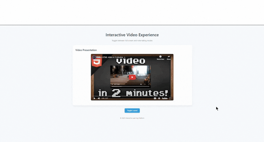
👁 video player with traditional append child method
We can see above that the iframe in question moves, but it loses its state. In this case, you will need an extra code workaround to enable this work.
But with the introduction of moveBefore(), we no longer need workarounds for something so basic:
<!DOCTYPE html>
<html lang="en">
<head>
 <meta charset="UTF-8">
 <title>Beautiful Video Experience</title>
 <style>
 * {
 box-sizing: border-box;
 margin: 0;
 padding: 0;
 }

 body {
 font-family: 'Inter', -apple-system, BlinkMacSystemFont, 'Segoe UI', Roboto, Oxygen, Ubuntu, Cantarell, sans-serif;
 background: linear-gradient(135deg, #f5f7fa 0%, #ebf0f6 100%);
 color: #333;
 line-height: 1.6;
 min-height: 100vh;
 padding: 30px;
 }

 .container {
 max-width: 1200px;
 margin: 0 auto;
 }

 .header {
 text-align: center;
 margin-bottom: 40px;
 }

 .header h1 {
 font-size: 2.4rem;
 font-weight: 700;
 color: #1a365d;
 margin-bottom: 10px;
 letter-spacing: -0.5px;
 }

 .header p {
 color: #4a5568;
 font-size: 1.1rem;
 }

 #full-screen-container {
 background: white;
 border-radius: 16px;
 box-shadow: 0 10px 25px rgba(0, 0, 0, 0.05);
 padding: 30px;
 margin-bottom: 30px;
 text-align: center;
 overflow: hidden;
 transition: all 0.3s ease;
 }

 #split-screen-container {
 display: none;
 width: calc(60% - 15px);
 float: left;
 background: white;
 border-radius: 16px;
 box-shadow: 0 10px 25px rgba(0, 0, 0, 0.05);
 padding: 30px;
 margin-right: 15px;
 transition: all 0.3s ease;
 }

 #notes-container {
 display: none;
 width: calc(40% - 15px);
 float: right;
 background: white;
 border-radius: 16px;
 box-shadow: 0 10px 25px rgba(0, 0, 0, 0.05);
 padding: 30px;
 margin-left: 15px;
 transition: all 0.3s ease;
 }

 h2 {
 color: #2d3748;
 margin-bottom: 20px;
 font-weight: 600;
 font-size: 1.5rem;
 }

 iframe {
 border: none;
 border-radius: 12px;
 box-shadow: 0 6px 16px rgba(0, 0, 0, 0.1);
 max-width: 100%;
 transition: all 0.4s ease;
 }

 textarea {
 width: 100%;
 min-height: 330px;
 padding: 16px;
 border: 1px solid #e2e8f0;
 border-radius: 8px;
 background-color: #f8fafc;
 font-family: inherit;
 font-size: 1rem;
 line-height: 1.6;
 resize: vertical;
 transition: all 0.3s ease;
 color: #2d3748;
 }

 textarea:focus {
 outline: none;
 border-color: #4299e1;
 box-shadow: 0 0 0 3px rgba(66, 153, 225, 0.15);
 background-color: #fff;
 }

 textarea::placeholder {
 color: #a0aec0;
 }

 .button-container {
 text-align: center;
 margin: 30px 0;
 clear: both;
 }

 .toggle-button {
 background: #4299e1;
 color: white;
 border: none;
 padding: 14px 28px;
 font-size: 1rem;
 font-weight: 500;
 border-radius: 8px;
 cursor: pointer;
 transition: all 0.2s ease;
 box-shadow: 0 4px 6px rgba(66, 153, 225, 0.2);
 display: inline-flex;
 align-items: center;
 justify-content: center;
 }

 .toggle-button:hover {
 background: #3182ce;
 transform: translateY(-2px);
 box-shadow: 0 7px 10px rgba(66, 153, 225, 0.25);
 }

 .toggle-button:active {
 transform: translateY(0);
 box-shadow: 0 4px 6px rgba(66, 153, 225, 0.2);
 }

 .toggle-button svg {
 margin-right: 10px;
 }

 .status-badge {
 display: inline-block;
 margin-left: 15px;
 font-size: 0.85rem;
 padding: 5px 10px;
 border-radius: 20px;
 background-color: #edf2f7;
 color: #4a5568;
 }

 .video-container {
 position: relative;
 text-align: center;
 margin: 0 auto;
 }

 .clearfix::after {
 content: "";
 display: table;
 clear: both;
 }

 .footer {
 text-align: center;
 margin-top: 50px;
 color: #718096;
 font-size: 0.9rem;
 padding: 20px 0;
 }

 @media (max-width: 900px) {
 body {
 padding: 15px;
 }

 .header h1 {
 font-size: 2rem;
 }

 #split-screen-container, #notes-container {
 width: 100%;
 float: none;
 margin: 0 0 20px 0;
 }

 iframe {
 width: 100% !important;
 height: auto !important;
 aspect-ratio: 16/9;
 }
 }
 </style>
</head>
<body>
 <div class="container">
 <div class="header">
 <h1>Seamless Video Experience</h1>
 <p>Toggle between cinematic view and note-taking mode</p>
 </div>

 <div id="full-screen-container">
 <div class="video-container">
 <iframe id="video" src="https://www.youtube.com/embed/Ki_0iES2cGI?autoplay=1" width="800" height="450" allowfullscreen></iframe>
 </div>
 </div>

 <div id="split-screen-container" class="clearfix"></div>

 <div id="notes-container" class="clearfix">
 <h2>Notes</h2>
 <textarea placeholder="Take notes as you watch the video...

• Write down key points
• Questions to research later
• Your thoughts and observations
• Important timestamps to revisit"></textarea>
 </div>

 <div class="button-container">
 <button class="toggle-button" onclick="toggleLayout()">
 <svg xmlns="http://www.w3.org/2000/svg" width="16" height="16" viewBox="0 0 24 24" fill="none" stroke="currentColor" stroke-width="2" stroke-linecap="round" stroke-linejoin="round">
 <rect x="2" y="3" width="20" height="14" rx="2" ry="2"></rect>
 <line x1="8" y1="21" x2="16" y2="21"></line>
 <line x1="12" y1="17" x2="12" y2="21"></line>
 </svg>
 Toggle Layout
 </button>
 <span class="status-badge" id="tech-badge">
 Using <span id="tech-type">standard DOM</span>
 </span>
 </div>

 <div class="footer">
 <p>(c) 2025 Interactive Learning Platform • Powered by moveBefore API</p>
 </div>
 </div>

 <script>
 const videoIframe = document.getElementById('video');
 const fullScreenContainer = document.getElementById('full-screen-container');
 const splitScreenContainer = document.getElementById('split-screen-container');
 const notesContainer = document.getElementById('notes-container');
 const techBadge = document.getElementById('tech-badge');
 const techType = document.getElementById('tech-type');
 let isFullScreen = true;

 // Check if moveBefore is supported
 if ('moveBefore' in Element.prototype) {
 techType.textContent = 'moveBefore API';
 techBadge.style.backgroundColor = '#c6f6d5';
 techBadge.style.color = '#276749';
 }

 function toggleLayout() {
 if (isFullScreen) {
 // Switch to split-screen
 fullScreenContainer.style.display = 'none';
 splitScreenContainer.style.display = 'block';
 notesContainer.style.display = 'block';
 videoIframe.width = '400';
 videoIframe.height = '225';

 if ('moveBefore' in Element.prototype) {
 splitScreenContainer.moveBefore(videoIframe, null);
 } else {
 splitScreenContainer.appendChild(videoIframe);
 }
 } else {
 // Switch to full-screen
 fullScreenContainer.style.display = 'block';
 splitScreenContainer.style.display = 'none';
 notesContainer.style.display = 'none';
 videoIframe.width = '800';
 videoIframe.height = '450';

 if ('moveBefore' in Element.prototype) {
 fullScreenContainer.moveBefore(videoIframe, null);
 } else {
 fullScreenContainer.appendChild(videoIframe);
 }
 }
 isFullScreen = !isFullScreen;
 }
 </script>
</body>
</html>
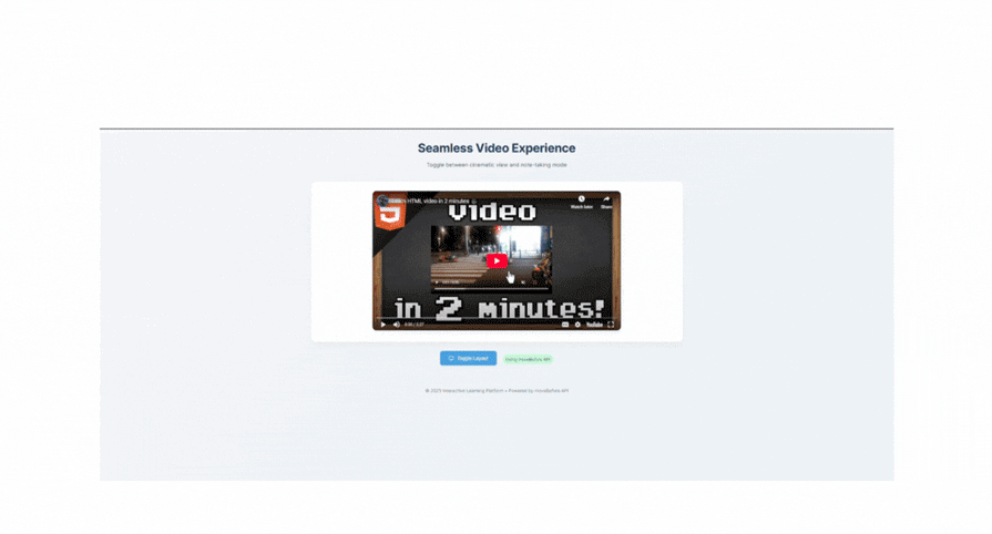
👁 video player with move before api
In the GIF above, we can see how seamless it is.
As of April 2025, moveBefore() is supported in Chrome 133+. Safari and Firefox have expressed interest, but we are still unable to use the moveBefore() API in those browsers.
This is a drawback for the API, so I advise employing a fallback:
if ("moveBefore" in Element.prototype) {
 // Supported
 } else {
 // Fallback to appendChild or insertBefore
 }
In this article, we examined in detail how to use the moveBefore() API. We’ve seen its beauty and the positive effects it brings to a unique aspect of software development.
Though it is yet to be introduced to other browsers, I’d predict we’ll be using this in Safari a few months from now.
Thank you for hanging by; feel free to talk about other ways we could utilize this new API in the comments. Keep coding, my friends!
Learn how to use Gemini CLI subagents to delegate frontend, backend, testing, and docs tasks to specialized agents with guardrails and clear ownership.
Learn how next-browser gives AI agents runtime context for debugging Next.js apps, including React props, hydration, PPR, forms, and performance.
Build dynamic LLM routing in Next.js with OpenRouter, TanStack AI, task classification, model fallbacks, and cost-aware routing.
TSRX adds first-class control flow, conditional hooks, and scoped styles to React via a TypeScript compiler extension — no new framework required.
Hey there, want to help make our blog better?
Join LogRocket’s Content Advisory Board. You’ll help inform the type of content we create and get access to exclusive meetups, social accreditation, and swag.
Sign up now