 |
VOOZH | about |
|
VOOZH | about |
Matplotlib is the most popular open-source Python library applied for creating, interactive as well as animated and static visualizations. Matplotlib is one of the oldest and very versatile libraries for data visualization in Python. A wide variety of plot tools are provided by Matplotlib for users to create graphs, charts, and plots with a high degree of customization.
In this article we will discuss the use of matplotlib snippets in Python;
Table of Content
Matplotlib is a comprehensive and powerful Python library used to generate visualizations that can range from very simple to very highly customized plots. It allows generating a wide range of different charts from simple line plots toscatter plots, bar charts, histograms, pie charts and many more. Therefore, it is necessary for data analysis and presentation.
Matplotlib lets every user style all dimensions of a plot: colors and labels, style and axes. It works well with libraries such as NumPy and Pandas, easy to view structures as plots. Also, Matplotlib supports export in formats like PNG, PDF and SVG that allow plots to be used both for interactive applications and publication.
Here are some of the most commonly used Matplotlib snippets for creating various types of plots and visualizations:
To install Matplotlib, you will use Python's package manager pip or if you are working in an environment that uses Anaconda, you might have conda.
First make sure Python is installed. Open your terminal or command prompt and run the following:
If Python is not installed, download it from the [official Python website] (https://www.python.org/downloads/)
Now that you've confirmed Python is installed, you can install Matplotlib with pip. Here's what you need to do:
You can run a simple script to verify whether Matplotlib is installed correctly. Open a new Python file and paste the following code in it:
Alternatively, if you have Anaconda or Miniconda installed, you can install Matplotlib using conda
Good practice is to create a new environment for your projects
Use the command below to install
Like pip, you can install by running
Matplotlib has a number of plots for effectively visualizing data. Below are some of the most common ones along with examples:
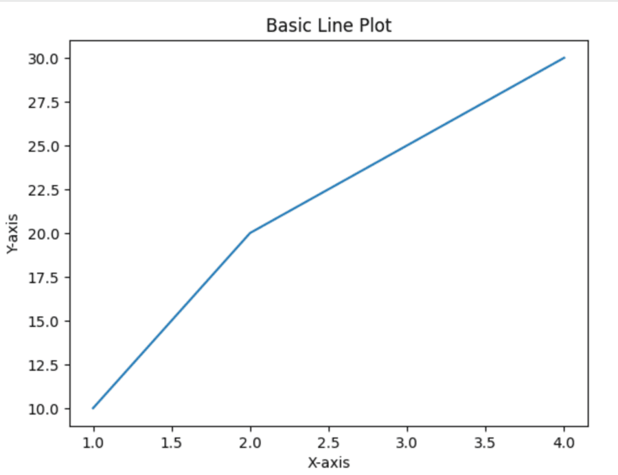
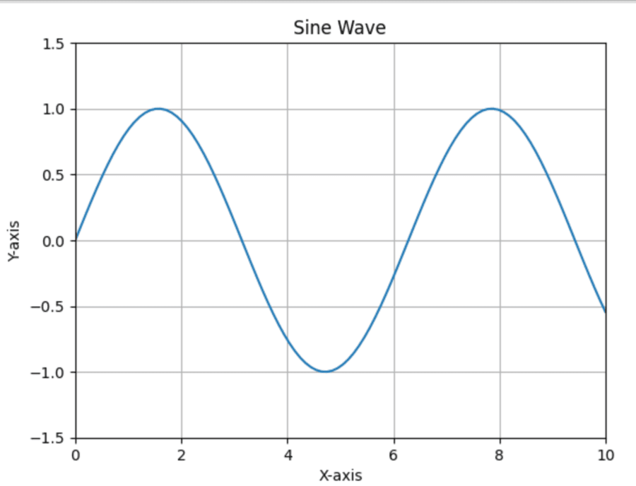
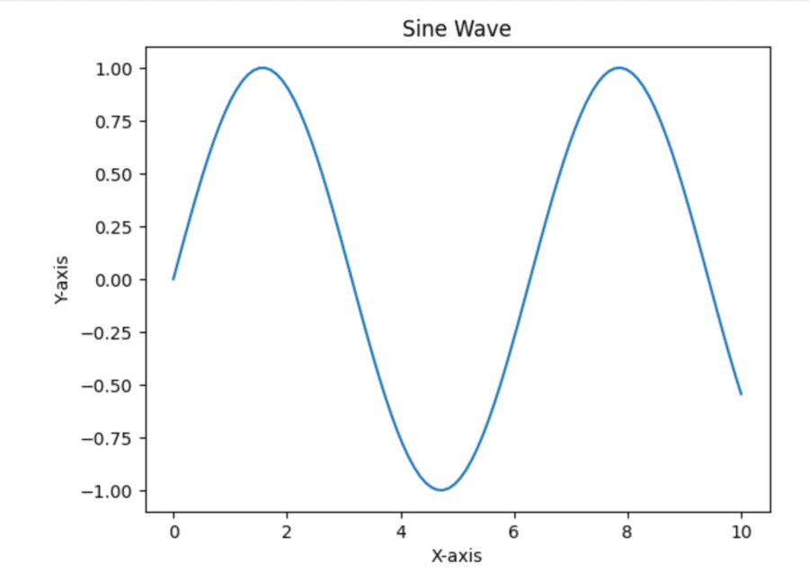
A line plot is one of the most common data visualization types that basically depicts how two variables are correlated by drawing a line connecting data points. In Python, one of the most common libraries for creating a line plot would be Matplotlib because of its utility and versatility.
Output
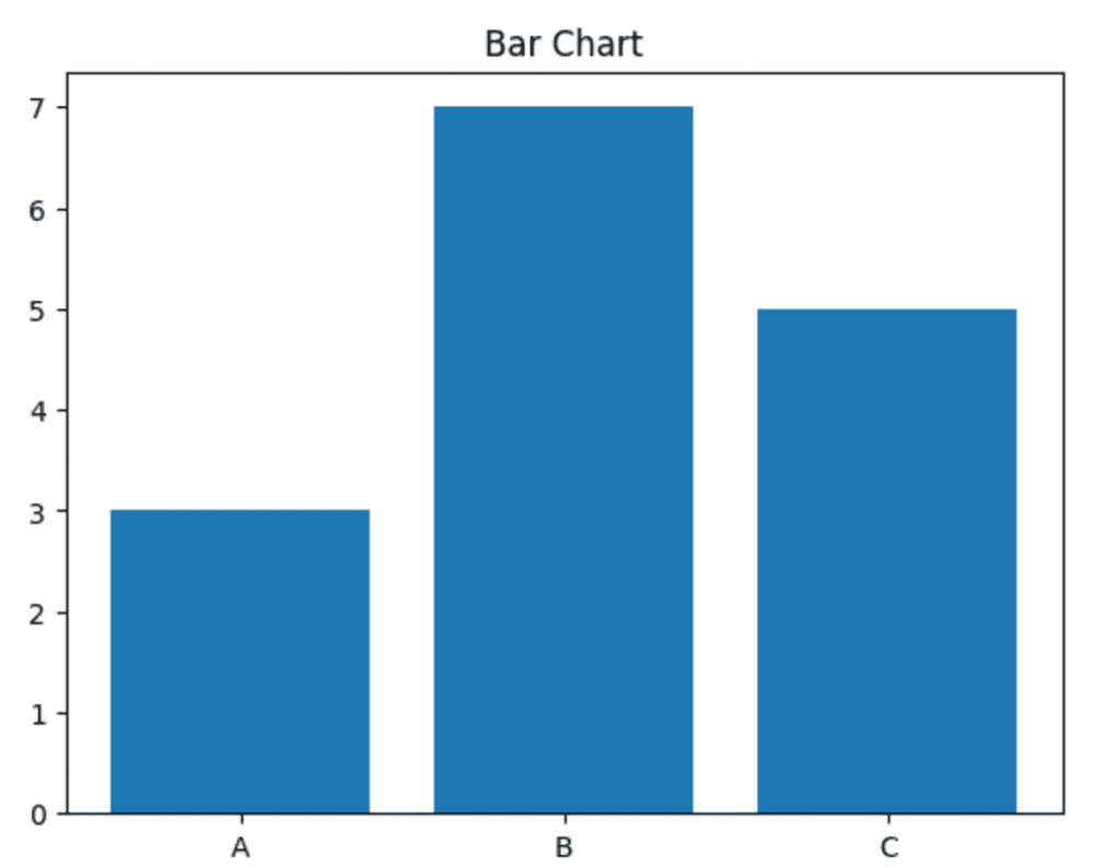
A bar plot is a very basic form of data visualization that represents categorical data for comparison. Python's Matplotlib library offers a convenient method of drawing a bar chart by utilizing the bar() function of the pyplot module.
Output
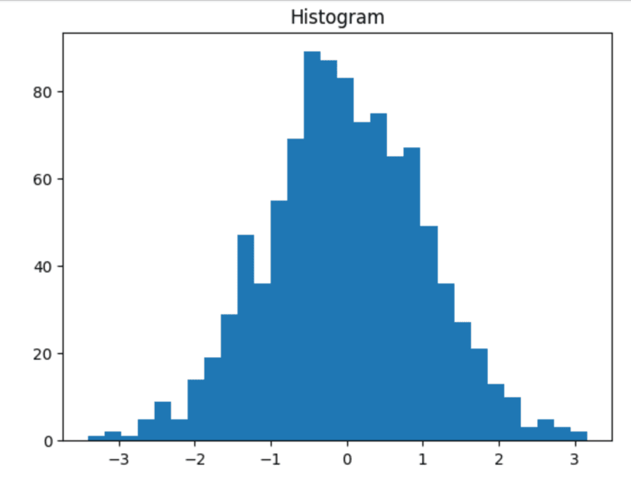
Histograms are essential for visualization of data where numerical data is represented by forming groups or bins of values and then by illustrating the count of data points falling under each bin. Python offers this at its fingertips via Matplotlib's pyplot by providing a simple way to create histograms with the function pyplot.hist().
Output
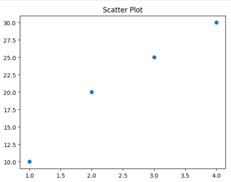
Scatter plots are a type of graph used to visualize how one numerical variable could impact another. It can be seen that how one variable changes impacts another. Python's Matplotlib library has a simple means of drawing scatter plots using the command pyplot.scatter().
Output
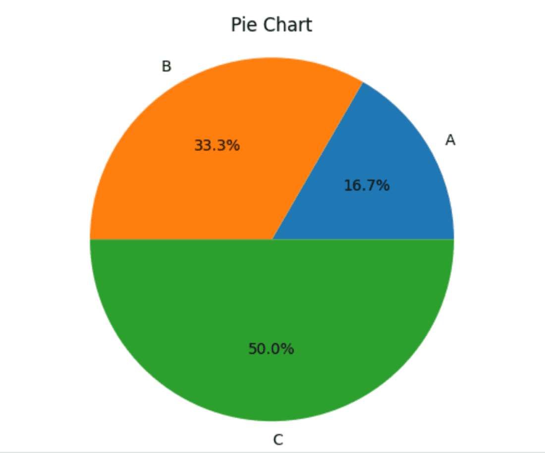
Pie charts are one of the most common methods to represent the proportion of various categories in a dataset. Data is represented as slices of a circle where the size of each slice is proportional to its value. Python's Matplotlib library has an easy-to-use function plt.pie() for creating pie charts.
Output
Customizing plots in Matplotlib is crucial for creating visually effective informative visualizations. Matplotlib provides a lot of options to adjust various aspects of your plot such as color, line style, axes properties, annotations, etc. and aesthetics in general. Here's a detailed overview on how to customize your plots properly.
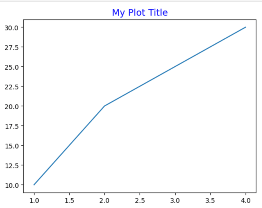
Titles and labels in plots can be added to draw out the clarity and interpretability of your visualizations using Matplotlib.
Output
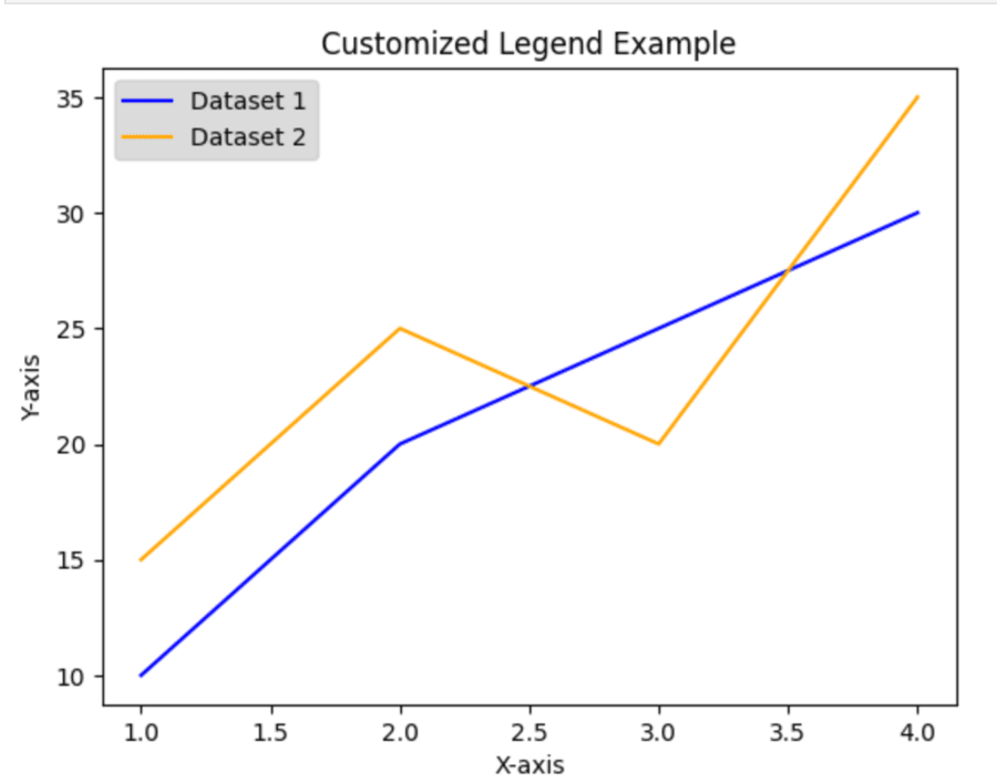
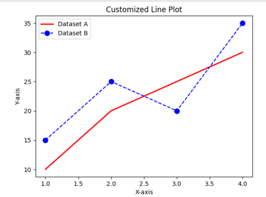
Legends in Matplotlib are important for identifying which data series are shown in a plot. In this regard, legends help viewers to understand what each line, bar or point represents. Adding a legend to your visualizations is possible with the function legend().
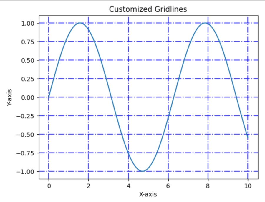
Gridlines in Matplotlib are always necessary to enhance a plot's legibility by furnishing a base framework of referencing data points. The grid() function is then used to prepare and style those gridlines present in your graphics.
Matplotlib is highly customizable to the colors and styles of the plots, thereby enabling users to create visually informative plots. This section gives a general overview on how to use color and style for effective plots with Matplotlib.
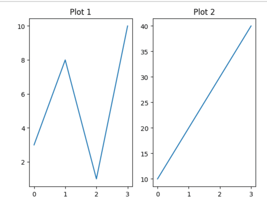
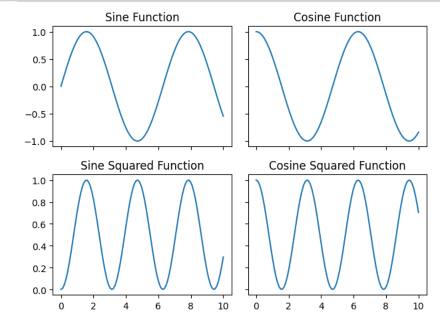
Subplots and axes are the really powerful features in Matplotlib: they allow to place multiple plots inside a single figure. Those are especially good for comparing data or showing lots of different visualizations in a concise format.
In a subplot in Matplotlib, one can add as many plots within a figure by making use of subplots so that easy comparisons may be done of multiple datasets or a visual relationship among different complex data may be viewed.
This will help to focus on regions of your data. Adjusting axes limits with Matplotlib allows you to be very specific and to highlight different parts of your data. With it, you can set both x-axis limits and y-axis limits in numerous ways.
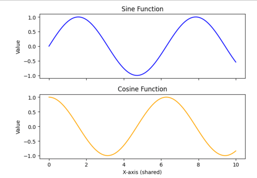
Sharing axes in Matplotlib is especially useful for subplots that have the same range in their datasets so that by visual comparison, the two datasets appear similar. The share x and share y parameters can be used to make this happen.
a. Basic Sharing
With the sharex or sharey argument set to True, you may share the x or y axis with subplots, respectively. One can also allow sharing by column or row via 'col' or 'row'.
b. Sharing by Row or Column
c. Sharing Axes after Creation
When you need to share axes, which is discouraged, but allowed after creating the subplots you could use Axes. Share x() and Axes.share y().
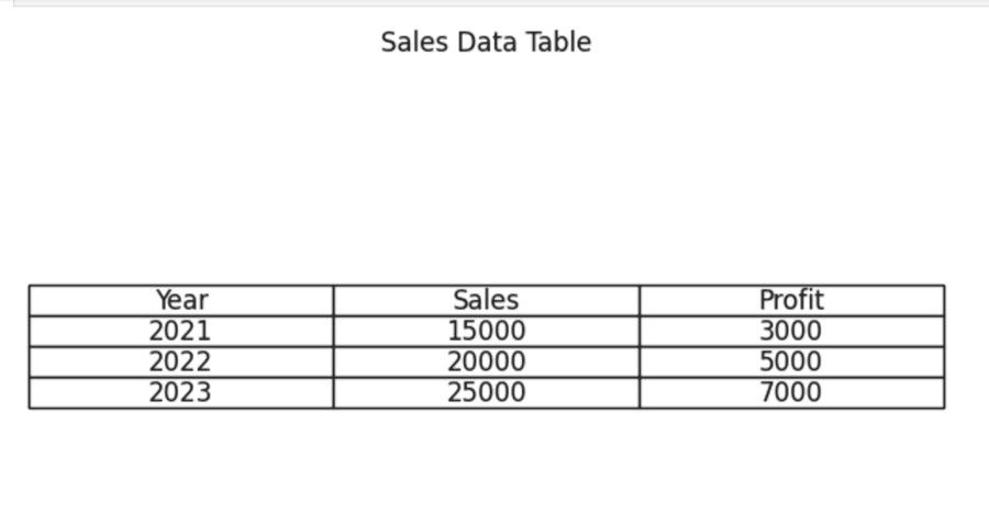
Matplotlib also allows one to create tables inside their plot so that he or she is able to visualize better data and graphics. Working with tables in Matplotlib-Includes creating a table, table manipulation, and how to draw them.
You can directly add a table in your plot using the table() function. You can set the cell contents, colors, and many other properties.
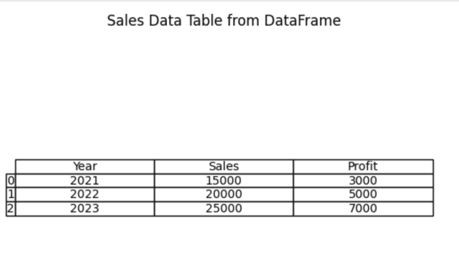
If you work with data within a Pandas DataFrame then it is relatively simple to convert the same into a Matplotlib table by using pandas.plotting.table() method. The method helps you to display DataFrame contents as visualizations.
NOTE: At the time of compiling this code you should have to install the pandas notebook i.e. "pip install pandas notebook" using command prompt.
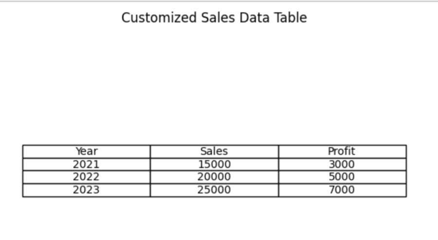
Customizing tables in Matplotlib enhances data presentation by providing for increased readability and more attractive visual appearances. Here's an all-inclusive guide on creating and customizing tables using Matplotlib, which includes styling options for colors, fonts, and layouts.
Primarily, saving and exporting figures in Matplotlib utilizes the savefig() function. This function allows you to save your plots in a variety of formats, including PNG, PDF, SVG, and JPG, among others.
You mainly use the savefig() function in Matplotlib for saving figures in different formats. It is possible to export any visualization into various file types including PNG, PDF, SVG, and JPEG.
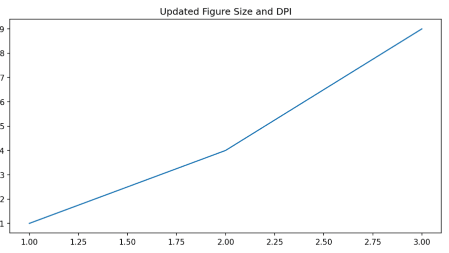
One should alter the DPI or figure size for controlling the resolution and size of the plots with Matplotlib. Here is the detailed guide for effective management.
a. Creating figure with specified size and DPI
b. Changing figure size after creation
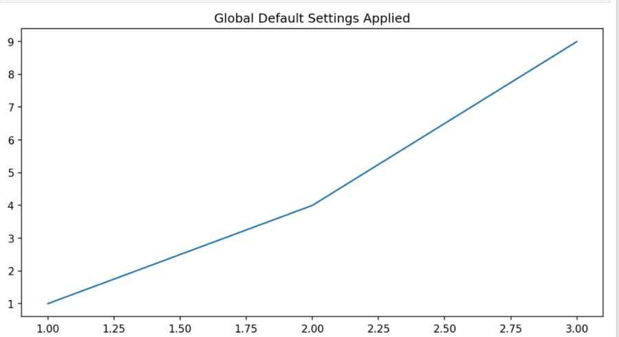
c. Using 'rcParams' for Global Settings
With the following advanced features in Matplotlib, you can get into annotations and texts in plots, customizing of ticks and tick labels, as well as using stylesheets for consistent formatting including details on all these.
Annotations are informative text that you add to specific points in your plots. They add clarity and help you understand the trend or behavior of what is happening. Annotate() uses the arrow function to mark points in your data.
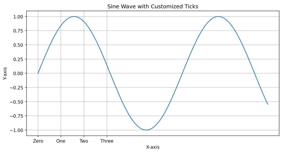
Customize your ticks and labels to make your plots more readable. You can change the location, appearance and format of your ticks through several methods.
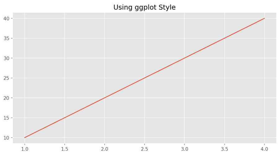
Matplotlib offers you the capability to define a stylesheet that will be applied for consistent formatting throughout multiple visualizations. You may use the available styles or design your own.
To sum it up, 25+ Most Used snippets of Matplotlib encourages efficiency and reuse which results in the development of common tasks without rewriting a lot of code. Snippets encourage modularity in code which makes it cleaner as well as more maintainable. Moreover, they allow for personalization using features such as annotations, customized ticks and stylesheets which makes plots more informative and aesthetically pleasing. Snippets can be used with other libraries like Pandas to make the transition from data processing to visualization easier.