 |
VOOZH | about |
|
VOOZH | about |
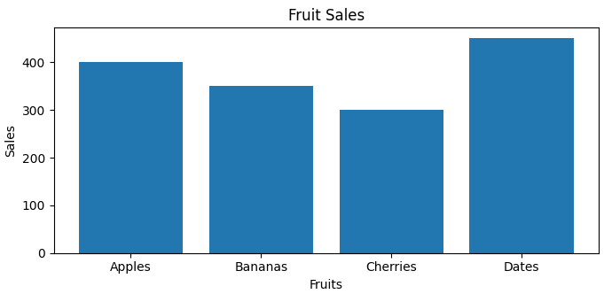
A bar plot uses rectangular bars to represent data categories, with bar length or height proportional to their values. It compares discrete categories, with one axis for categories and the other for values.
Consider a simple example where we visualize the sales of different fruits:
Output:
A bar plot(or bar chart) is a graphical representation that uses rectangular bars to compare different categories. The height or length of each bar corresponds to the value it represents. The x-axis typically shows the categories being compared, while the y-axis shows the values associated with those categories. This visual format makes it easy to compare quantities across different groups.
This function takes several parameters:
Bar plots are significant because they provide a clear and intuitive way to visualize categorical data. They allow viewers to quickly grasp differences in size or quantity among categories, making them ideal for presenting survey results, sales data, or any discrete variable comparisons.
Syntax: plt.bar(x, height, width, bottom, align)
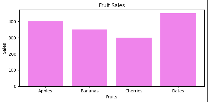
You can customize the color of the bars by using the color parameter in the bar() function:
Output:
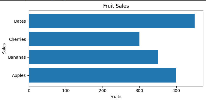
For horizontal bar plots, you can use the barh() function. This function works similarly to bar(), but it displays bars horizontally:
Output:
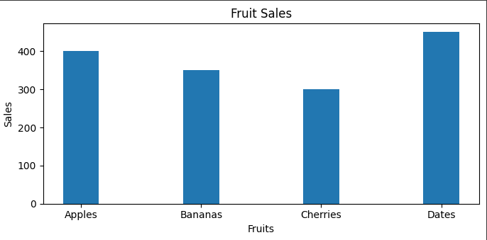
You can control the width of the bars using the width parameter:
Output:
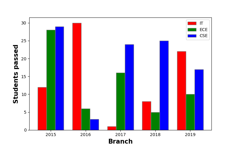
Multiple bar plots are used when comparison among the data set is to be done when one variable is changing. We can easily convert it as a stacked area bar chart, where each subgroup is displayed by one on top of the others. It can be plotted by varying the thickness and position of the bars. Following bar plot shows the number of students passed in the engineering branch:
Output:
👁 ImageStacked bar plots represent different groups on top of one another. The height of the bar depends on the resulting height of the combination of the results of the groups. It goes from the bottom to the value instead of going from zero to value. The following bar plot represents the contribution of boys and girls in the team.
Output:
👁 Image