 |
VOOZH | about |
|
VOOZH | about |
Matplotlib is a Python library for creating static, interactive and animated visualizations from data. It provides flexible and customizable plotting functions that help in understanding data patterns, trends and relationships effectively.
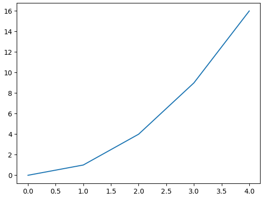
Example: Let's create a simple line plot using Matplotlib, showcasing the ease with which you can visualize data.
Output
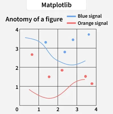
Anatomy of a Matplotlib Plot: This section dives into the key components of a Matplotlib plot, including figures, axes, titles and legends, essential for effective data visualization.
The parts of a Matplotlib figure include (as shown in the figure above):
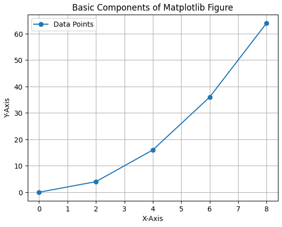
Pyplot is a module within Matplotlib that provides a MATLAB-like interface for making plots. It simplifies the process of adding plot elements such as lines, images and text to the axes of the current figure.
Let's visualize a basic plot and understand basic components of matplotlib figure:
Output
Matplotlib offers a wide range of plot types to suit various data visualization needs. Here are some of the most commonly used types of plots in Matplotlib:
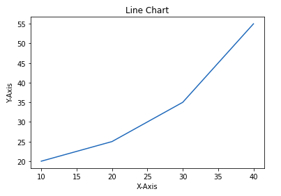
Line chart is one of the basic plots and can be created using plot() function. It is used to represent a relationship between two data X and Y on a different axis.
Example: This code plots a simple line chart with labeled axes and a title using Matplotlib.
Output
👁 line chart matplotlibSyntax:
matplotlib.pyplot.plot(x, y)
Parameter: x, y Coordinates for data points.
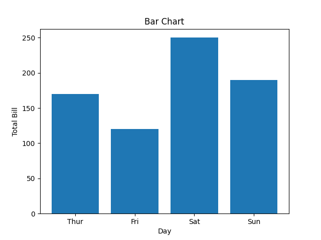
Bar chart displays categorical data using rectangular bars whose lengths are proportional to the values they represent. It can be plotted vertically or horizontally to compare different categories.
Example: This code creates a simple bar chart to show total bills for different days. X-axis represents the days and Y-axis shows total bill amount.
Output
👁 barchartmatplotlibSyntax:
matplotlib.pyplot.bar(x, height)
Parameter:
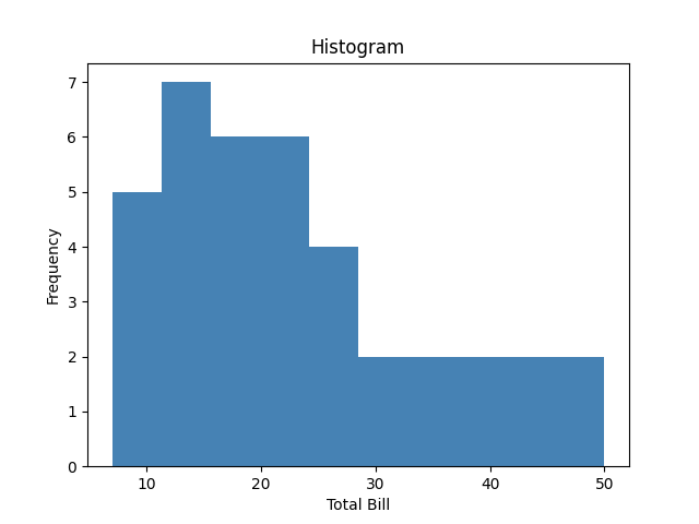
Histogram shows the distribution of data by grouping values into bins. The hist() function is used to create it, with X-axis showing bins and Y-axis showing frequencies.
Example: This code plots a histogram to show frequency distribution of total bill values from the list x. It uses 10 bins and adds axis labels and a title for clarity.
Output
👁 histogrammatplotlibSyntax:
matplotlib.pyplot.hist(x, bins=None)
Parameter:
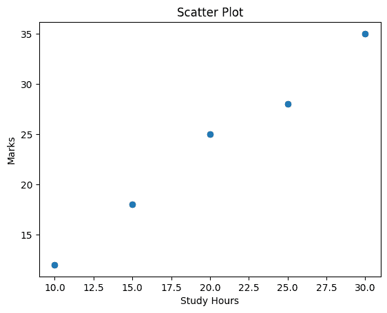
Scatter plots are used to observe relationships between variables. The scatter() method in the matplotlib library is used to draw a scatter plot.
Example: This code creates a scatter plot to visualize the relationship between days and total bill amounts using scatter().
Output
Syntax:
matplotlib.pyplot.scatter(x, y)
Parameter: x, y Coordinates of the points.
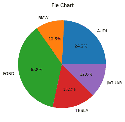
Pie chart is a circular chart used to show data as proportions or percentages. It is created using the pie(), where each slice (wedge) represents a part of the whole.
Example: This code creates a simple pie chart to visualize distribution of different car brands. Each slice of pie represents the proportion of cars for each brand in the dataset.
Output
Syntax:
matplotlib.pyplot.pie(x, labels=None, autopct=None)
Parameter:
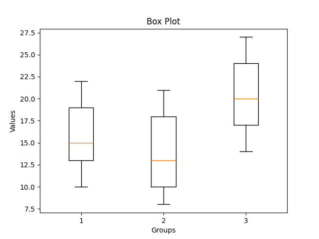
Box plot is a simple graph that shows how data is spread out. It displays the minimum, maximum, median and quartiles and also helps to spot outliers easily.
Example: This code creates a box plot to show the data distribution and compare three groups using matplotlib
Output
👁 boxplotmatplotlibSyntax:
matplotlib.pyplot.boxplot(x, notch=False, vert=True)
Parameter:
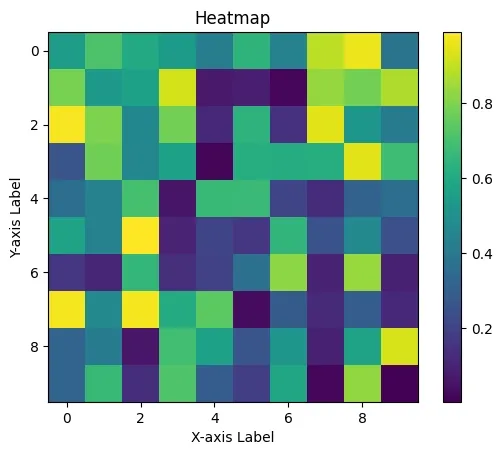
Heatmap is a graphical representation of data where values are shown as colors. It helps visualize patterns, correlations or intensity in a matrix-like format. It is created using imshow() method in Matplotlib.
Example: This code creates a heatmap of random 10×10 data using imshow(). It uses 'viridis' color map and colorbar() adds a color scale.
Output
👁 heatmapMatplotlibExplanation:
Syntax:
matplotlib.pyplot.imshow(X, cmap='viridis')
Parameter: