 |
VOOZH | about |
|
VOOZH | about |
A Pie Chart is a circular statistical plot that can display only one series of data. The area of the chart is the total percentage of the given data. Pie charts in Python are widely used in business presentations, reports, and dashboards due to their simplicity and effectiveness in displaying data distributions. In this article, we will explore how to create a pie chart in Python using the Matplotlib library, one of the most widely used libraries for data visualization in Python.
Table of Content
Pie charts provide a visual representation of data that makes it easy to compare parts of a whole. They are particularly useful when:
However, while pie charts are useful, they also have limitations. They can become cluttered with too many categories or lead to misinterpretation if not designed thoughtfully. Despite this, a well-crafted pie chart using Matplotlib can significantly enhance the presentation of your data.
A pie chart consists of slices that represent different categories. The size of each slice is proportional to the quantity it represents. The following components are essential when creating a pie chart in Matplotlib:
Matplotlib API has pie() function in its pyplot module which create a pie chart representing the data in an array. let's create pie chart in python.
Syntax: matplotlib.pyplot.pie(data, explode=None, labels=None, colors=None, autopct=None, shadow=False)
Parameters:
- data represents the array of data values to be plotted, the fractional area of each slice is represented by data/sum(data)
- labels is a list of sequence of strings which sets the label of each wedge.
- color attribute is used to provide color to the wedges.
- autopct is a string used to label the wedge with their numerical value.
- shadow is used to create shadow of wedge.
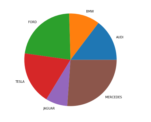
Let's create a simple pie chart using the pie() function in Matplotlib. This function is a powerful and easy way to visualize the distribution of categorical data.
Output:
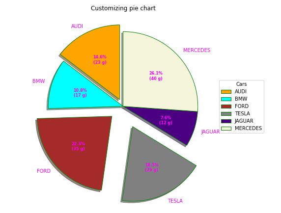
👁 pie-chart-pythonOnce you are familiar with the basics of pie charts in Matplotlib, you can start customizing them to fit your needs. A pie chart can be customized on the basis several aspects:
linewidth, edgecolor, and facecolor. This level of customization allows you to enhance the visual distinction between wedges, making your matplotlib pie chart more informative.The explode parameter separates a portion of the chart, and colors define each wedge's color. The autopct function customizes text display, and legend and title functions enhance chart readability and aesthetics.
Output:
By leveraging the capabilities of the plt.pie() function in Matplotlib, we can create informative and visually appealing pie charts that help to communicate with data effectively. Whether you are presenting data to stakeholders or creating visual aids for your reports, mastering the art of plotting pie charts in Python is a valuable skill.
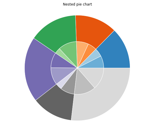
A nested pie chart is an effective way to represent hierarchical data, allowing you to visualize multiple categories and subcategories in a single view. In Matplotlib, you can create a nested pie chart by overlaying multiple pie charts with different radii. Below, we’ll explore how to create this type of chart in Python.
Here’s a simple example of how to create a nested pie chart using Matplotlib:
Output:
As with a regular pie chart in Python, you can customize various attributes, such as startangle, shadow, autopct, and wedgeprops, to enhance the overall aesthetics of your nested pie chart.
To create a proper 3D pie chart in Matplotlib, you can use the following code snippet. Note that Matplotlib does not have a direct function for 3D pie charts, but we can simulate it with a 3D surface plot or use a workaround with 2D pie charts:
In this article, we explored the fundamentals of creating and customizing pie charts in Python using the Matplotlib library. From constructing a simple pie chart in Matplotlib to visualizing more complex datasets with 2D and 3D pie charts in Python, we have covered various aspects that can enhance the effectiveness of our visualizations.
By utilizing plt.pie in Python, we learned how to present categorical data clearly, making it easier to convey insights to stakeholders.