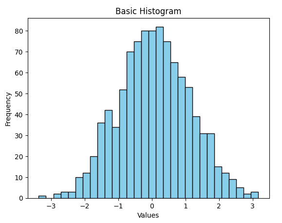
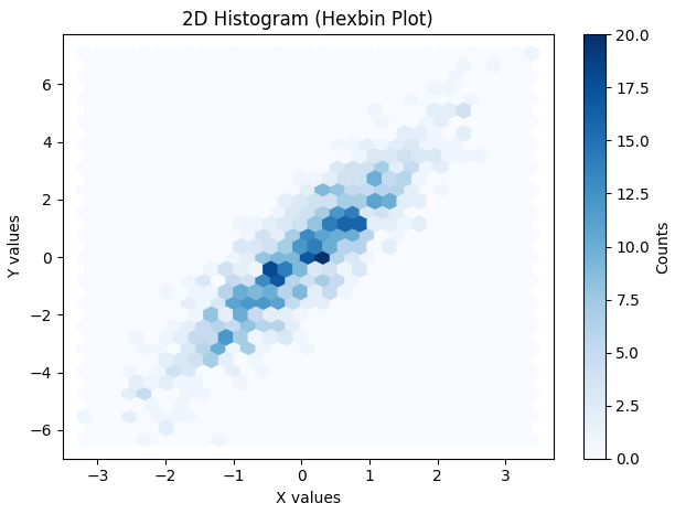
Histograms are one of the most fundamental tools in data visualization. They provide a graphical representation of data distribution, showing how frequently each value or range of values occurs. Histograms are especially useful for analyzing continuous numerical data, such as measurements, sensor readings or experimental results.
A histogram is a type of bar plot where:
The X-axis represents intervals (called bins) of the data.
The Y-axis represents the frequency of values within each bin.
Unlike regular bar plots, histograms group data into bins to summarize data distribution effectively.
Creating a Matplotlib Histogram
Divide the data range into consecutive, non-overlapping intervals called bins.
Count how many values fall into each bin.
Use the matplotlib.pyplot.hist() function to plot the histogram.
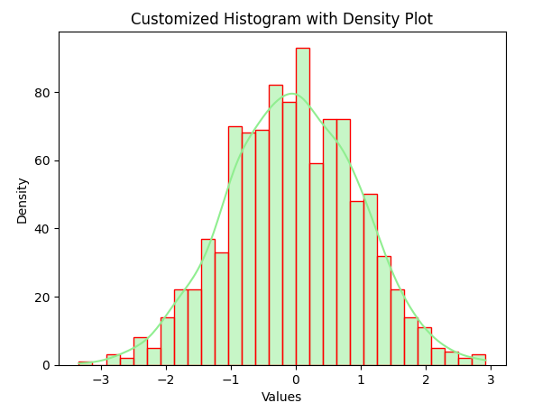
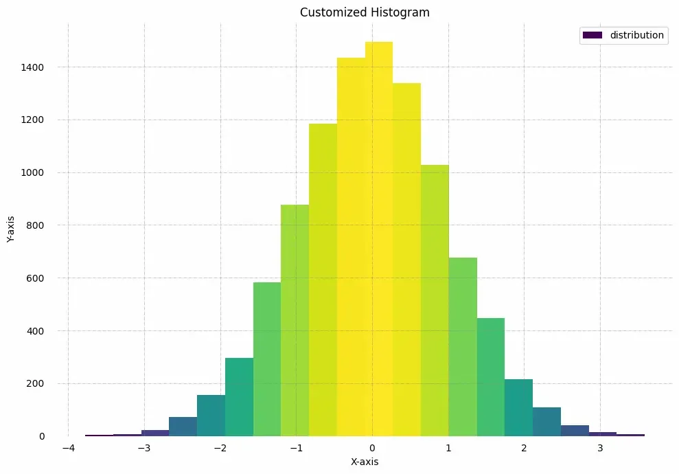
The following table shows the parameters accepted by matplotlib.pyplot.hist() function :
Attribute
Parameter
x
An array or sequence of numerical data.
bins
Number of bins (int) or specific intervals (array).
density
If True, normalises the histogram to show probability instead of frequency.
range
A tuple specifying lower and upper limits of bins.
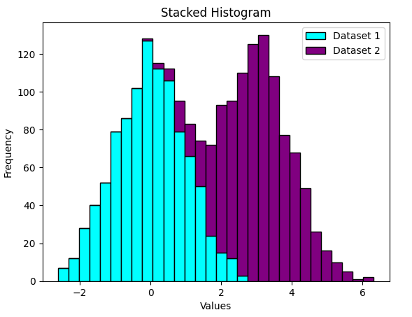
histtype
Type of histogram: bar, barstacked, step, stepfilled. Default: bar.
align
Bin alignment: left, right, mid.
weights
An array of weights for each data point.
bottom
Baseline for bins.
rwidth
Relative width of bars (0–1).
color
Color of bars. Can be a single color or sequence.
label
Label for legend.
log
If True, uses logarithmic scale on Y-axis.
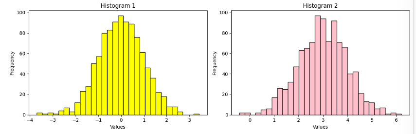
Plotting Histogram in Python using Matplotlib
Here we will see different methods of Plotting Histogram in Matplotlib in Python:
