 |
VOOZH | about |
|
VOOZH | about |
Pygal is an open-source Python library designed for creating interactive SVG (Scalar Vector Graphics) charts. It is known for its simplicity and ability to produce high-quality visualizations with minimal code. Pygal is particularly useful for web applications, as it integrates well with frameworks like Flask and Django, and its SVG output ensures scalability without loss of quality.
To get started, you need to install Pygal. You can do this using pip:
pip install pygalPygal supports a variety of chart types. Here’s an overview of some popular ones: Let's explore how to create some basic charts using Pygal. Pygal primarily generates charts in SVG (Scalable Vector Graphics) format, which is a vector image format.
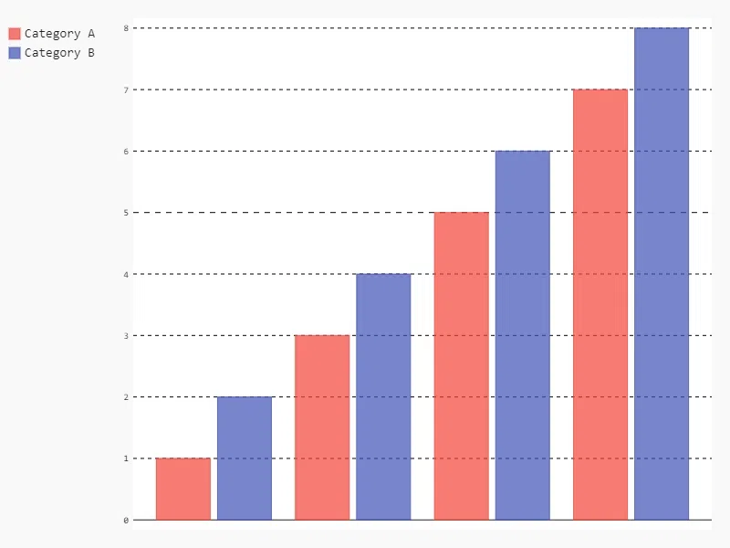
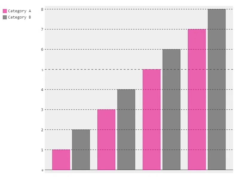
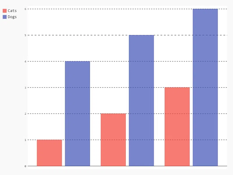
Bar charts are used to compare quantities across different categories. It is one of the most common chart types and is helpful in visualizing the differences between discrete categories. Pygal's Bar chart allows you to plot data for different categories and add multiple series.
Syntax:
pygal.Bar(title=None, x_labels=None, style=None, width=None, height=None, legend_at_bottom=None)
- title: (str) The title of the chart.
- x_labels: (list) Labels for the x-axis, usually categories.
- style: (object) Optional styling for the chart (e.g., color themes).
- width: (int) Width of the chart in pixels.
- height: (int) Height of the chart in pixels.
- legend_at_bottom: (bool) Whether to place the legend at the bottom.
Output:
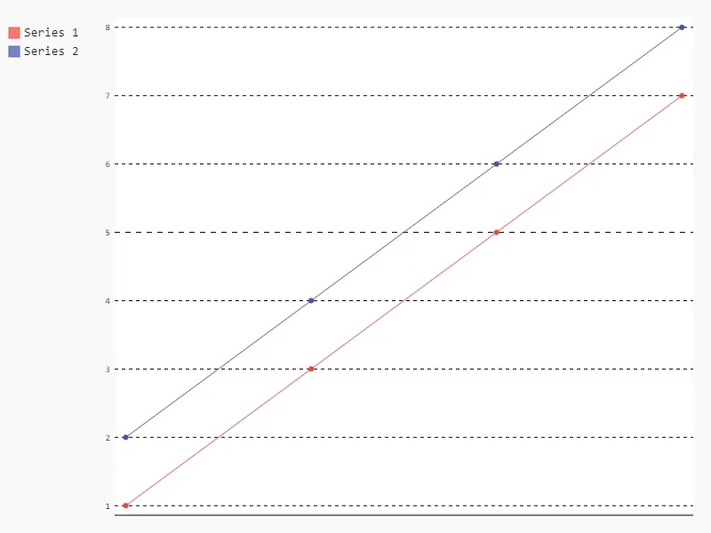
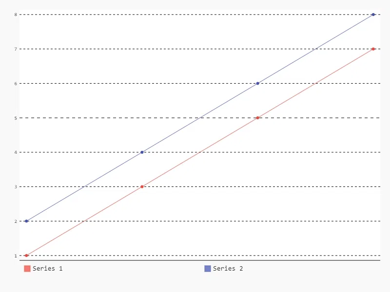
Line charts are used to display information as a series of data points connected by straight lines. They are particularly useful for showing trends over time.
Syntax:
pygal.Line(title=None, x_labels=None, style=None, width=None, height=None, legend_at_bottom=None)
- title: (str) The title of the chart.
- x_labels: (list) Labels for the x-axis, often representing time intervals.
- style: (object) Optional chart styling.
- width: (int) Width of the chart.
- height: (int) Height of the chart.
- legend_at_bottom: (bool) Whether to display the legend at the bottom.
Output:
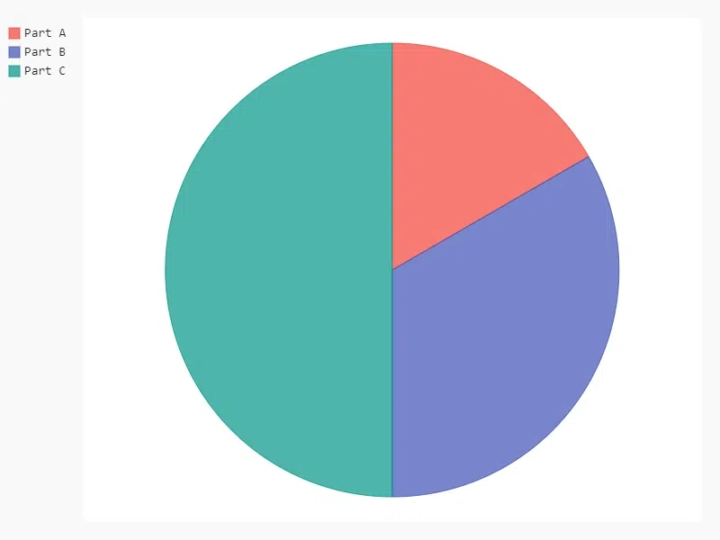
Pie charts show data in a circle, with each slice representing a part of the whole. The size of each slice shows how much each category contributes. They're useful for displaying how different parts make up a total.
Syntax:
pygal.Pie(title=None, inner_radius=None, style=None, width=None, height=None)
- title: (str) The title of the chart.
- inner_radius: (float) Radius for the inner part of the pie (used in donut charts).
- style: (object) Optional styling.
- width: (int) Chart width.
- height: (int) Chart height.
Output:
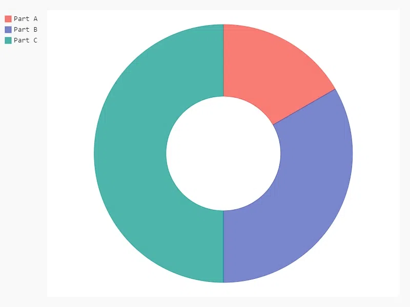
A donut chart is a variation of the pie chart with a hole in the center. It’s useful when comparing proportions with some central data or reference point.
Syntax:
pygal.Pie(title=None, inner_radius=0.4, style=None, width=None, height=None)
- title: (str) The title of the chart.
- inner_radius: (float) Radius of the center hole (0.4 for a typical donut chart).
- style: (object) Optional style.
- width: (int) Chart width.
- height: (int) Chart height.
Output:
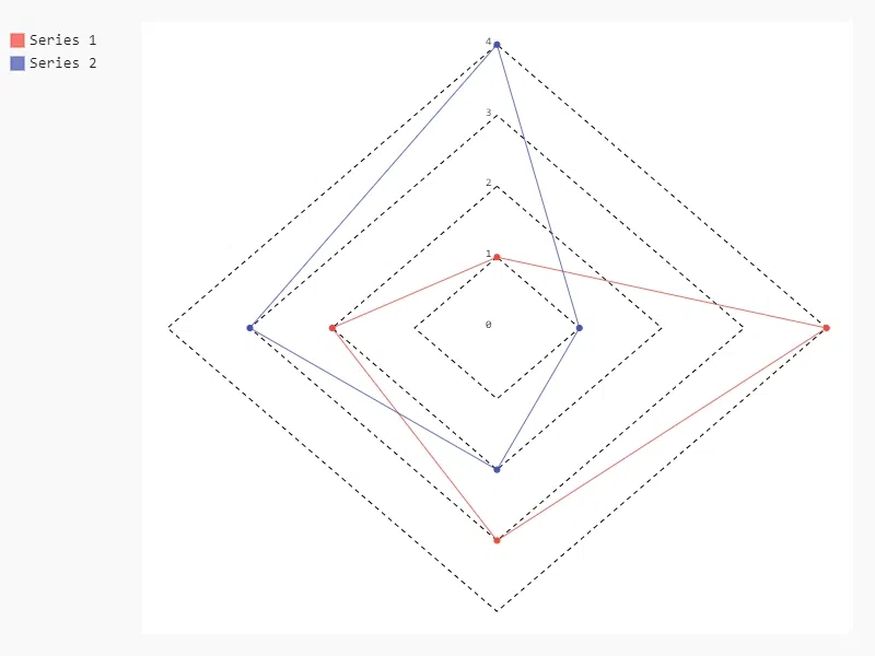
Radar charts display multivariate data on axes starting from the same point. They are good for comparing multiple variables.
Syntax:
pygal.Radar(title=None, x_labels=None, style=None, width=None, height=None)
- title: (str) The title of the chart.
- x_labels: (list) Labels for the radar axes, representing different variables.
- style: (object) Chart styling.
- width: (int) Chart width.
- height: (int) Chart height.
Output:
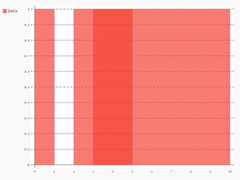
Histograms show the distribution of numerical data by grouping data into bins and showing the frequency of data points within each bin.
Syntax:
pygal.Histogram(title=None, bins=None, style=None, width=None, height=None)
- title: (str) The title of the chart.
- bins: (list of tuples) Each tuple represents a bin with the format
(frequency, lower_bound, upper_bound).- style: (object) Chart style.
- width: (int) Chart width.
- height: (int) Chart height.
Output:
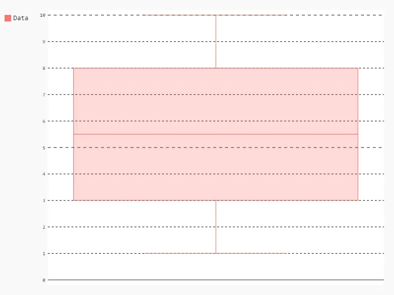
Box plots are used to display the distribution of data based on five summary statistics: minimum, first quartile, median, third quartile, and maximum.
Syntax:
pygal.Box(title=None, x_labels=None, style=None, width=None, height=None)
- title: (str) The title of the chart.
- x_labels: (list) Labels for the data categories.
- style: (object) Chart style.
- width: (int) Chart width.
- height: (int) Chart height.
Output:
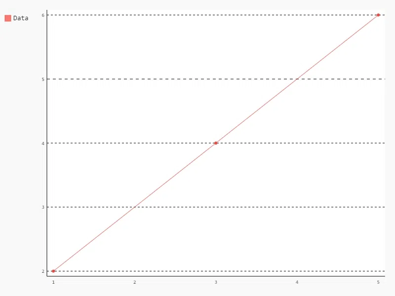
XY plots (scatter plots) are used to plot two-dimensional data, showing the relationship between two variables. They help visualize patterns, trends, and correlations in the data, making it easier to understand how the variables interact.
Syntax:
pygal.XY(title=None, x_title=None, y_title=None, dots_size=None, style=None, width=None, height=None)
- title: (str) The title of the chart.
- x_title: (str) The label for the x-axis.
- y_title: (str) The label for the y-axis.
- dots_size: (int) Size of the dots representing data points.
- style: (object) Chart style.
- width: (int) Chart width.
- height: (int) Chart height.
Output:
Pygal offers extensive customization options for charts. Customization is one of Pygal's standout features, allowing you to create personalized and visually appealing charts with minimal effort. From adjusting titles and labels to modifying colors, legends, and tooltips, Pygal provides extensive options to enhance your data visualizations. Here’s an in-depth look at the most important customization aspects:
You can easily set titles and axis labels to make your chart more informative. Titles help provide context for the data being visualized, while labels guide the viewer in interpreting the data points.
Output:
Pygal allows you to customize the color palette and overall style of your charts, ensuring they align with your branding or aesthetic preferences.
LightStyle and DarkStyle are available, offering quick theming options, while you can also create custom styles by defining attributes such as background color, font size, and stroke width.Output:
Legends and labels provide additional information about the chart, such as explaining different series and categorizing data.
Output:
Tooltips enhance interactivity by showing detailed information when the user hovers over a specific data point in the chart. This is especially useful for web-based visualizations where you want to provide more insight without cluttering the chart.
Output:
For more customizations, refer to:
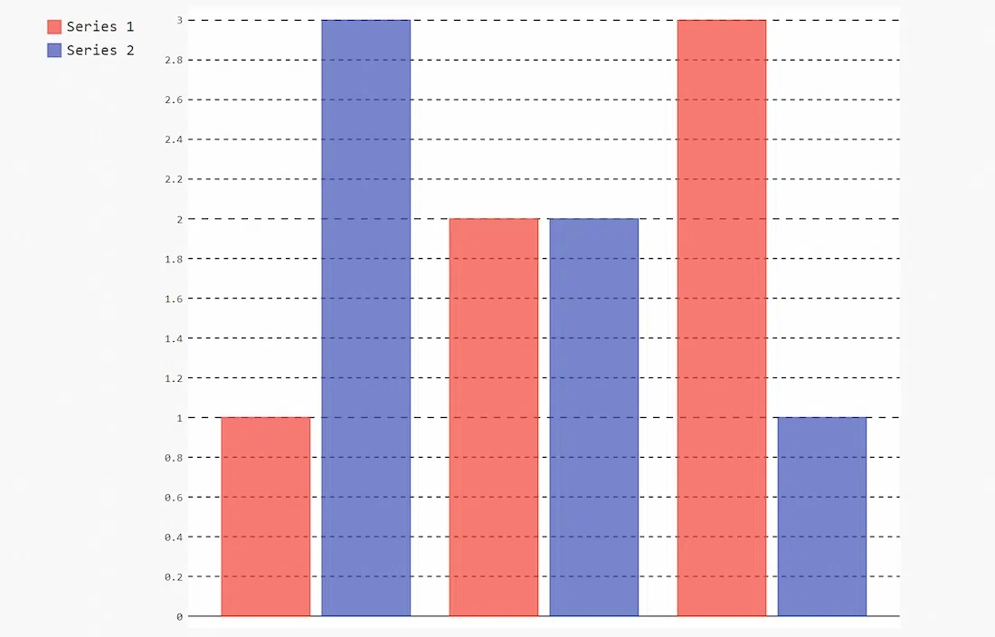
Adding multiple series to a chart in Pygal allows you to compare different datasets within the same visualization. This is particularly useful for spotting trends, patterns, and relationships between groups of data. Whether you’re comparing sales over different years, tracking multiple product categories, or analyzing performance metrics across departments, multiple series enhance the depth of your data representation.
Output:
One of Pygal’s most powerful features is its ability to generate dynamic charts by integrating it with Python’s data structures. This means you can create charts that update automatically based on real-time or changing datasets, making Pygal an excellent choice for dashboards, reports, and web applications where data is continuously updated.
How Dynamic Charts Work:
Example:
For instance, if you're tracking live sales data:
[500, 600, 700]).Output:
Use Case:
In a real-time dashboard, you might use a list of temperatures updated every minute. As the list is updated, Pygal dynamically reflects these changes in the Line chart, allowing for continuous monitoring of temperature trends.
One of Pygal’s strengths is that it can export charts as SVG files, which stay clear and sharp at any size. Pygal charts can be easily added to websites, making it simple to share interactive data online.
File Export Options:
Embedding Charts in Web Pages:
<img> tag.To use Pygal charts in HTML, we use the render method to get the SVG data:
In Conclusion Pygal is a powerful tool for creating SVG charts in Python. With its variety of chart types, extensive customization options, and advanced features, it offers flexibility for visualizing data in various ways.