 |
VOOZH | about |
|
VOOZH | about |
A time series is a collection of data points indexed in time order, typically at equal time intervals. Examples include:
Analyzing and visualizing this data helps uncover trends, seasonality, and patterns that can inform future predictions. Let’s begin by creating a sample dataset and formatting it as time series data.
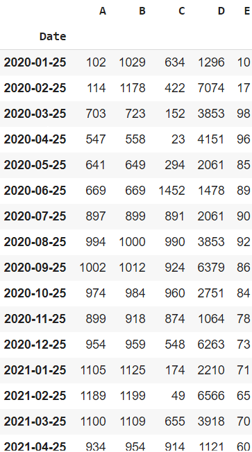
Output
Explanation: We’re creating a sample DataFrame with 5 variables (A to E) and a Date column. By converting the Date to datetime and setting it as the index, the DataFrame becomes time series-friendly for plotting.
Below are common and insightful methods to visualize and analyze time-series data using Python:
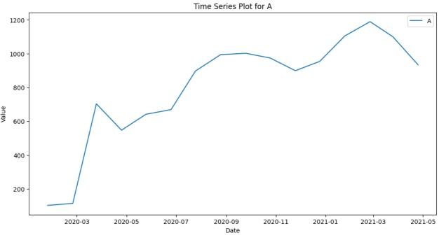
A line chart is the most basic yet effective way to visualize time series. It helps in understanding the overall trend, fluctuations and patterns in the data over time.
Output
Explanation: This code uses matplotlib to plot a line chart of column 'A' over time. It sets a custom style, draws the line, adds labels and a title and displays the plot.
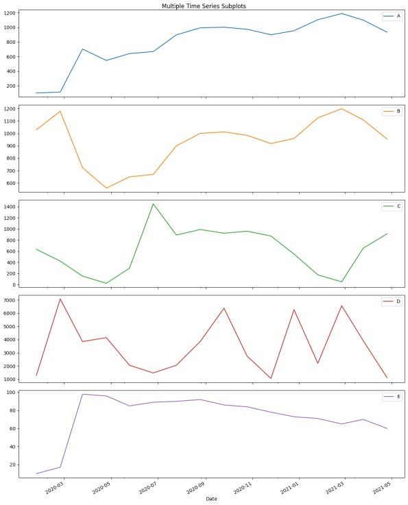
When dealing with multivariate time series, plotting all variables as subplots can provide a better understanding of each series independently.
Explanation: This uses pandas and plot() with subplots=True to generate separate line plots for each column in df. It adjusts the figure size and layout to neatly show multiple time series side by side.
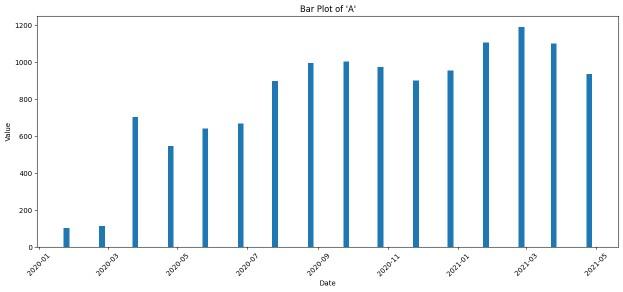
3. Bar Plot
A bar plot is useful when you want to emphasize individual time points, like monthly or yearly comparisons, rather than trends.
Output
Explanation: Creates a bar chart for column 'A' using plt.bar(), with time on the x-axis and values on the y-axis. Bar width and label rotation are set for readability.
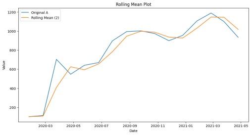
A rolling mean (moving average) smooths out short-term fluctuations and highlights long-term trends. It's essential for identifying the signal in noisy time series data.
Output
Explanation: This overlays the original data with a 2-period rolling average using .rolling().mean() to smooth short-term fluctuations.
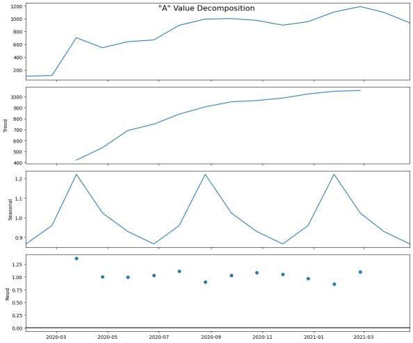
Time series can be decomposed into Trend, Seasonality, and Residual components. This decomposition provides a clear structure and is vital for modeling and forecasting.
Explanation: seasonal_decompose() breaks down the time series into trend, seasonal and residual parts, showing hidden structures.
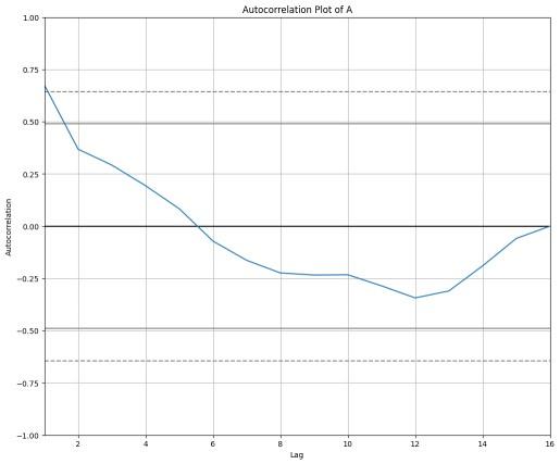
Autocorrelation measures how the values of a time series are correlated with previous values. This is important for understanding lag dependencies in time series data.
Output
Explanation: Displays how the time series 'A' correlates with its previous values (lags), indicating repeating patterns or dependencies.
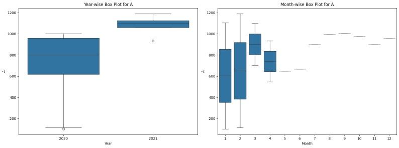
Box plots allow for statistical comparison across years and months, helping detect seasonal patterns, outliers, and variations over time.
Output
Explanation: Adds Year and Month columns and plots box plots to compare value distribution of 'A' across different years and months.
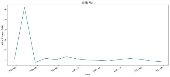
A shift operation is used to calculate relative changes over time. This is helpful to identify how much the value changes from one time point to another (e.g., daily or monthly growth ratio).
Output
Explanation: Calculates the relative change between current and previous values using .shift() and .div(), showing growth or volatility trends.
Related articles