 |
VOOZH | about |
|
VOOZH | about |
Seaborn is a statistical plotting library in python. It has beautiful default styles. This article deals with the ways of styling the different kinds of plots in seaborn.
This affects things like the color of the axes, whether a grid is enabled by default, and other aesthetic elements.
The ways of styling themes are as follows:
Set the background to be white:
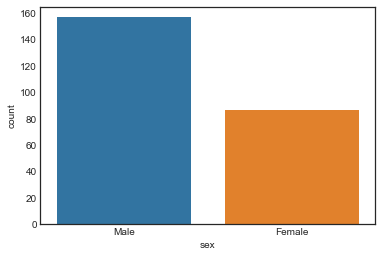
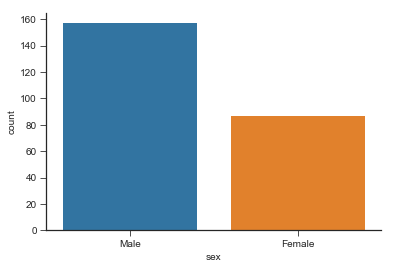
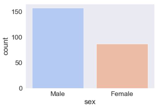
Given style with the help of countplot and the dataset is present in seaborn by default. load_dataset() function is used to load the dataset. set_style() function is used for plot styling.
Output:
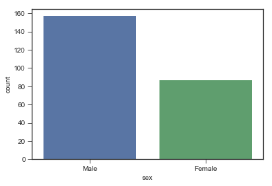
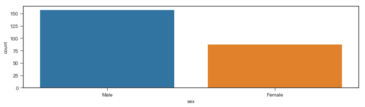
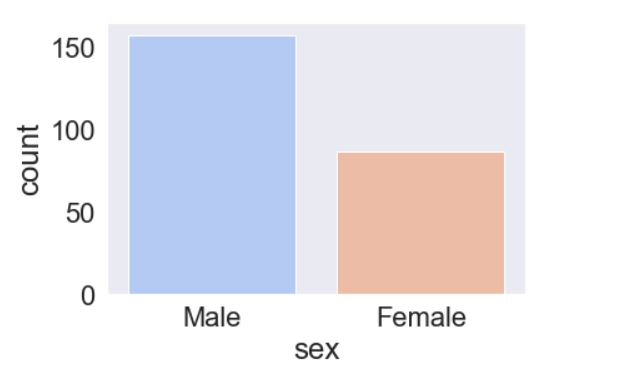
Set the background to ticks:
Ticks appear on the sides of the plot on setting it as set_style('ticks'). palette attribute is used to set the color of the bars. It helps to distinguish between chunks of data.
Output:
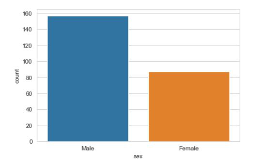
👁 ImageSet the background to be darkgrid:
Darkgrid appear on the sides of the plot on setting it as set_style('darkgrid'). palette attribute is used to set the color of the bars. It helps to distinguish between chunks of data.
Output:
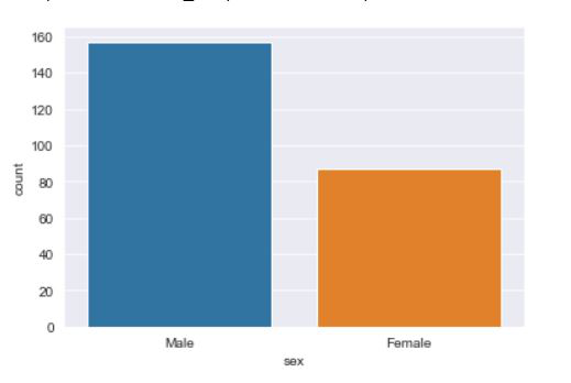
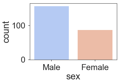
👁 ImageSet the background to be Whitegrid:
Whitegrid appears on the sides of the plot on setting it as set_style('whitegrid'). palette attribute is used to set the color of the bars. It helps to distinguish between chunks of data.
Output:
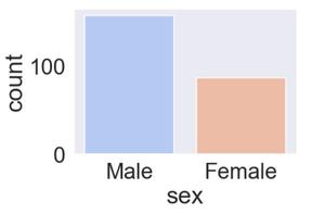
👁 ImageThe despine() is a function that removes the spines from the right and upper portion of the plot by default. sns.despine(left = True) helps remove the spine from the left.
Output
Non grid plot: The figure() is a matplotlib function used to plot the figures. The figsize is used to set the size of the figure.
Output:
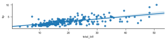
Grid type plot: This example shows a regression plot of tips vs the total_bill from the dataset. lmplot stands for linear model plot and is used to create a regression plot. x ='total_bill' sets the x axis to total_bill. y='tip' sets the y axis to tips. size=2 is used to the size(the height)of the plot. aspect is used to set the width keeping the width constant.
Output:
The set_context() allows us to override default parameters. This affects things like the size of the labels, lines, and other elements of the plot, but not the overall style.
The context are:
Example 1: using poster.
Output:
Example 2: Using paper.
Output:
👁 ImageExample 3: Using notebook.
Output:
👁 ImageExample 4: Using talk.
Output:
👁 Image