 |
VOOZH | about |
|
VOOZH | about |
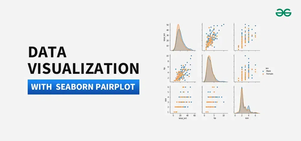
Data Visualization is the presentation of data in pictorial format. It is extremely important for Data Analysis, primarily because of the fantastic ecosystem of data-centric Python packages. Seaborn is one of those packages that can make analyzing data much easier.
In this article, we will use Pairplot Seaborn to analyze data and, using the sns.pairplot() function.
Pairplot in Seaborn is a data visualization tool that creates a matrix of scatterplots, showing pairwise relationships between variables in a dataset, aiding in visualizing correlations and distributions.
To plot multiple pairwise bivariate distributions in a dataset, you can use the pairplot() function. This shows the relationship for (n, 2) combination of variable in a DataFrame as a matrix of plots and the diagonal plots are the univariate plots.
Syntax:
seaborn.pairplot( data, \*\*kwargs )
Parameter:
First of all, We see Upload seaborn librarry 'tips' using pandas. Then, we will visualize data with seaborn.
Output:
 total_bill tip sex smoker day time size
0 16.99 1.01 Female No Sun Dinner 2
1 10.34 1.66 Male No Sun Dinner 3
2 21.01 3.50 Male No Sun Dinner 3
3 23.68 3.31 Male No Sun Dinner 2
4 24.59 3.61 Female No Sun Dinner 4
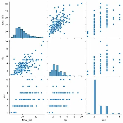
Let's plot pairplot using seaborn:
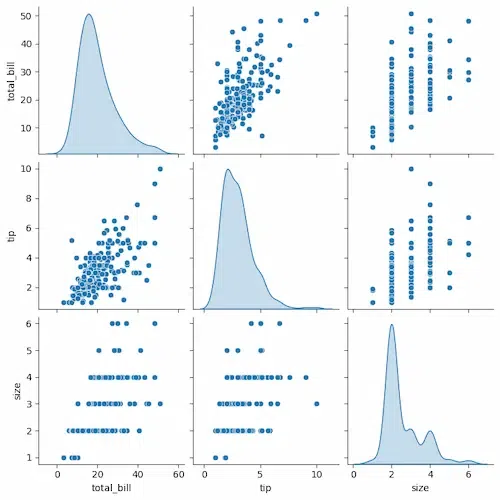
We will simply plot a pairplot with tips data frame.
Output:
Each combination of variables is represented by a scatter plot, and the diagonal plots show the distribution of each individual variable.
Output:
The plots on the diagonal show the distribution of each individual variable. For example, the top left plot shows the distribution of total bills, and the bottom right plot shows the distribution of tips.
The off-diagonal plots show the relationship between two variables. For example, the top right plot shows the relationship between total bill and tip. There is a positive correlation between these two variables, which means that larger bills tend to have larger tips.
Output:
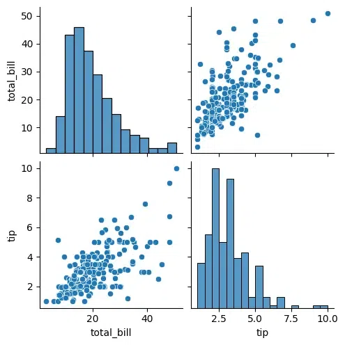
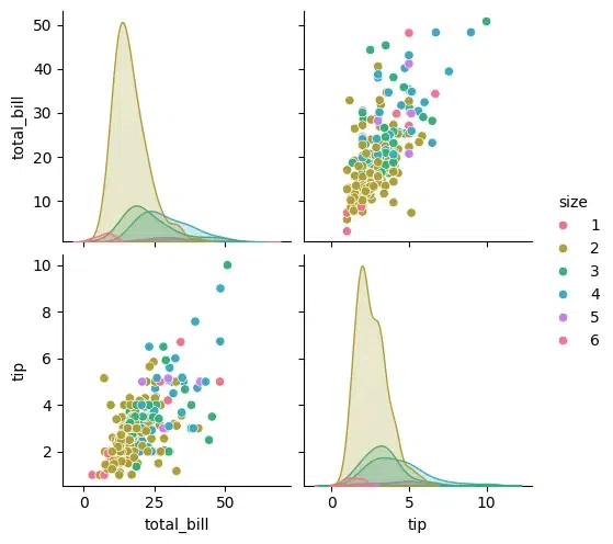
The points in this scatter plot are colored by the value of size, so you can see how the relationship between total_bill and tip varies depending on the size of the party.
Output:
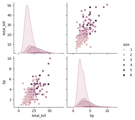
In Seaborn's Pairplot, the 'diag_kind' parameter specifies the type of plot to display along the diagonal axis, representing the univariate distribution of each variable. Options include 'hist' for histograms, 'kde' for kernel density estimates, and 'scatter' for scatterplots. Choose based on the nature of the data and analysis goals. Here, let's plot with kernel density estimates.
Output:
The kind parameter allows to change the type of plot used for the off-diagonal plots. You can choose any like scatter, kde, or reg (regression).
Output:
The markers parameter allows you to specify different markers for different categories.
Output:
If you are interested in only a subset of the variables, you can specify them using the vars parameter.
Output:
For advanced customization, you can access the underlying FacetGrid object and modify it further.
Output:
.webp)
.webp)
.webp)
.webp)