 |
VOOZH | about |
|
VOOZH | about |
Plotly is a data visualization library that enables users to create interactive, publication ready charts and dashboards in Python, R and JavaScript. It is widely used for exploratory data analysis, business reporting and web‑based visualisations.
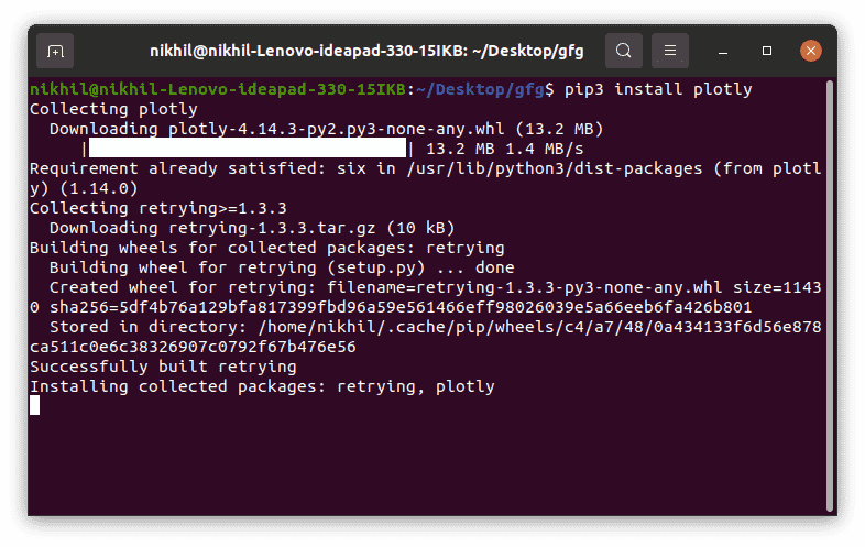
To get started with Plotly simply install it using the following command:
pip install plotly
This may take some time as it will install all the dependencies required for it.
Plotly consists of two key modules:
Example:
Output:
Here we will see how to generate basic charts using Plotly and apply various customizations to enhance their appearance and functionality. We will learn how to visualize different graph like line charts, scatter plots, bar charts, histograms and pie charts. We will cover the following customizations:
Plotly line chart is one of the simple plots where a line is drawn to show relation between the X-axis and Y-axis. It can be created using the px.line() method with each data position is represented as a vertex of a polyline mark in 2D space.
Syntax:
plotly.express.line(data_frame=None, x=None, y=None, color=None, title=None)
Parameters:
Return: A plotly.express.Figure object.
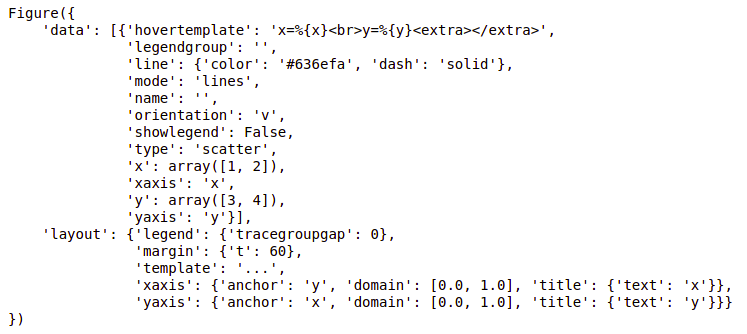
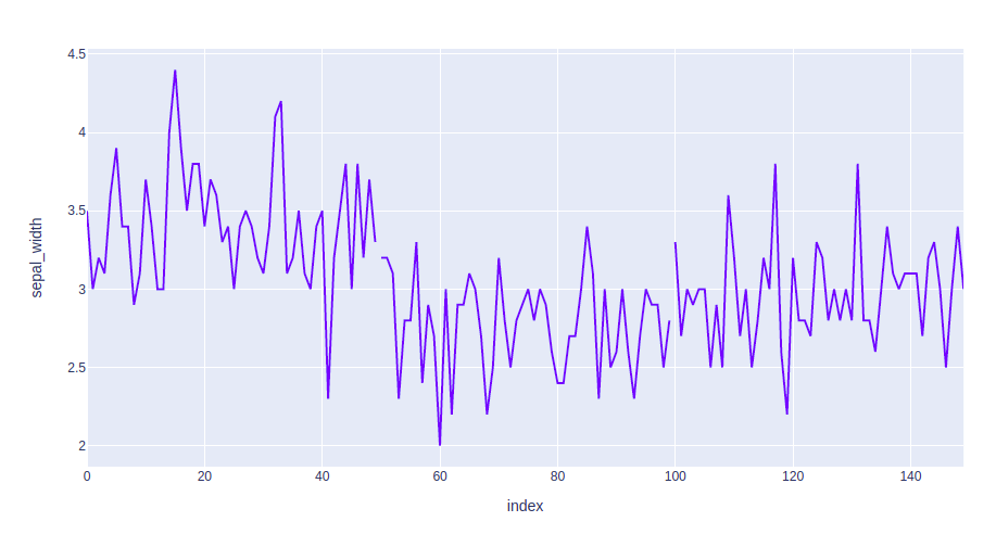
Example: We will be using Iris dataset and it is directly available as part of scikit-learn. df = px.data.iris() from the plotly.express library loads it into a Pandas DataFrame.
Output:
In the above example, we can see that:
Now let's try to customize our graph a little.
Example 1: In this example we will use the line dash parameter which is used to group the lines according to the dataframe column passed.
Output:
👁 line chart plotly with line group
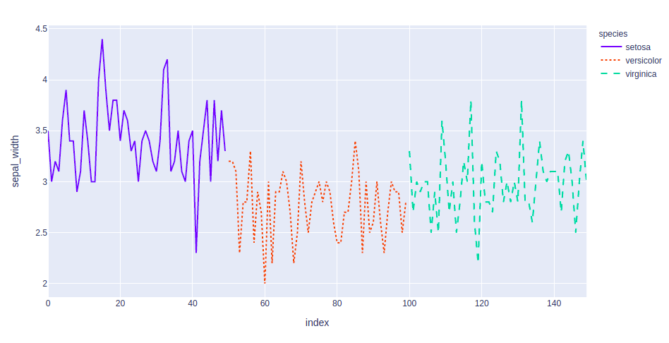
Example 2: In this example, we will group and color the data according to the species. We will also change the line format. For this we will use two attributes such line_dash and color.
Output:
👁 plotly line chart with color
A bar chart is a pictorial representation of data that presents categorical data with rectangular bars with heights or lengths proportional to the values that they represent. These data sets contain the numerical values of variables that represent the length or height. It can be created using the px.bar() method.
Syntax:
plotly.express.bar(data_frame=None, x=None, y=None, color=None, title=None)
Parameters:
Return: A plotly.express.Figure object.
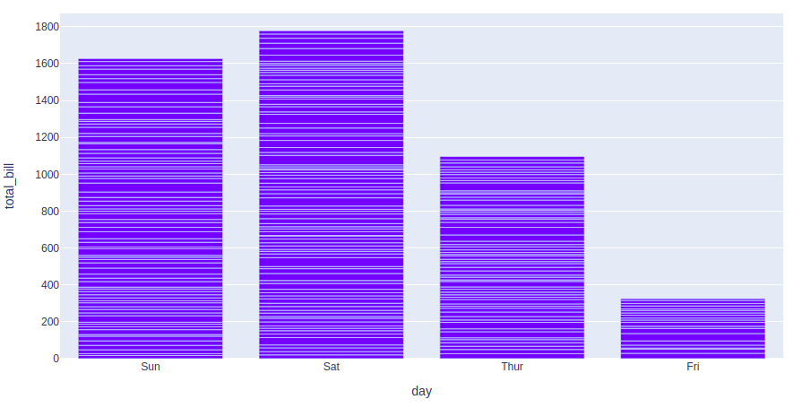
Example: We will be using tips dataset and this dataset contains 244 rows and 7 columns with each row representing a single restaurant bill and associated information.
Output:
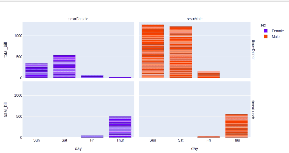
Let's try to customize this plot.
Output:
A scatter plot is a set of dotted points to represent individual pieces of data in the horizontal and vertical axis. A graph in which the values of two variables are plotted along X-axis and Y-axis, the pattern of the resulting points reveals a correlation between them and it can be created using the px.scatter() method.
Syntax:
plotly.express.scatter(data_frame=None, x=None, y=None, color=None, title=None)
Parameters:
Return: A plotly.express.Figure object.
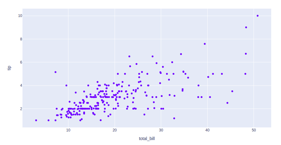
Example:
Output:
👁 scatter plot plotly
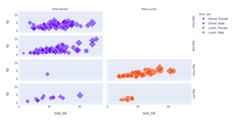
Let's see various customizations available for this chart:
Output:
👁 customized scatter plot plotly
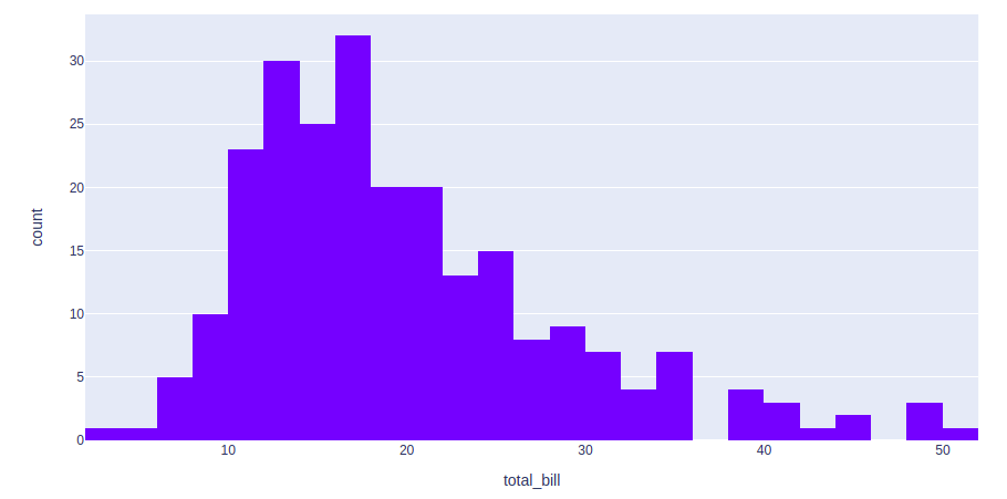
A histogram is used to represent data in the form of some groups. It is a type of bar plot where the X-axis represents the bin ranges while the Y-axis gives information about frequency. It can be created using the px.histogram() method.
Syntax:
plotly.express.histogram(data_frame=None, x=None, y=None, color=None, nbins=None, histnorm=None, title=None, width=None, height=None)
Parameters:
Return: A plotly.express.Figure object.
Example:
Output:
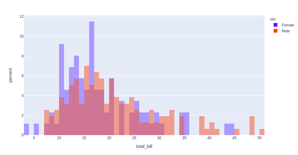
Let's customize the above graph.
Here barmode can be either 'group', 'overlay' or 'relative'.
Output:
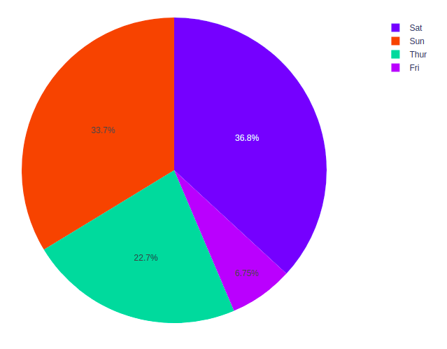
A pie chart is a circular statistical graphic which is divided into slices to show numerical proportions. It shows a special chart that uses “pie slices” where each sector shows the relative sizes of data. It can be created using the px.pie() method.
Syntax:
plotly.express.pie(data_frame=None, names=None, values=None, color=None, hole=None, title=None, width=None, height=None)
Parameters:
Return: A plotly.express.Figure object.
Example:
Output:
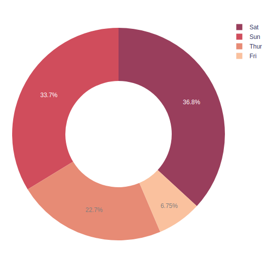
Let's customize the above graph.
Output:
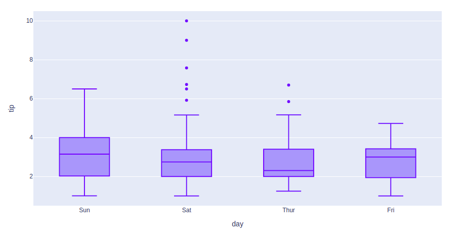
A Box Plot is also known as Whisker plot and in this a box is created from the first quartile to the third quartile, a vertical line is also there which goes through the box at the median. Here x-axis denotes the data to be plotted while the y-axis shows the frequency distribution. It can be created using the px.box() method
Syntax:
plotly.express.box(data_frame=None, x=None, y=None, color=None, facet_row=None, facet_col=None, title=None, width=None, height=None)
Parameters:
Return: A plotly.express.Figure object.
Example:
Output:
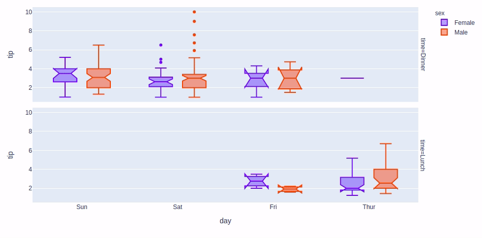
Let's customize the above graph.
Output:
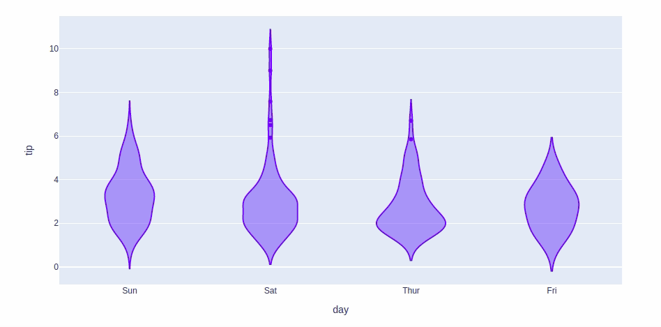
A Violin Plot shows the distribution of numerical data along with its density, combining features of a box plot and a density plot. It reveals patterns that box plots may miss, and in Plotly it can be created using px.violin().
Syntax:
plotly.express.violin(data_frame=None, x=None, y=None, color=None, facet_row=None, facet_col=None, title=None, width=None, height=None)
Parameters:
Return: A plotly.express.Figure object.
Example:
Output:
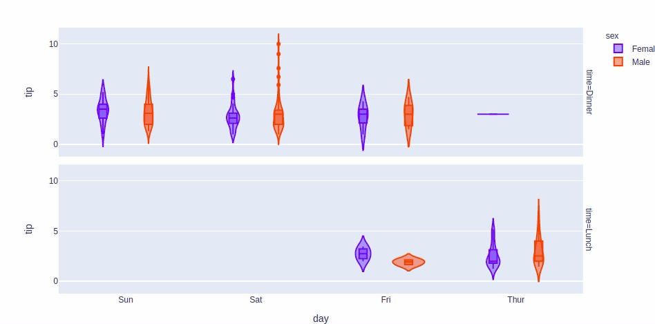
Let's customize the above graph.
Example: For customizing the violin plot we will use the same customizations available for the box plot except the boxmode and notched which are not available for the violin plot Setting this parameter to True will show a box plot inside the violin plot.
Output:
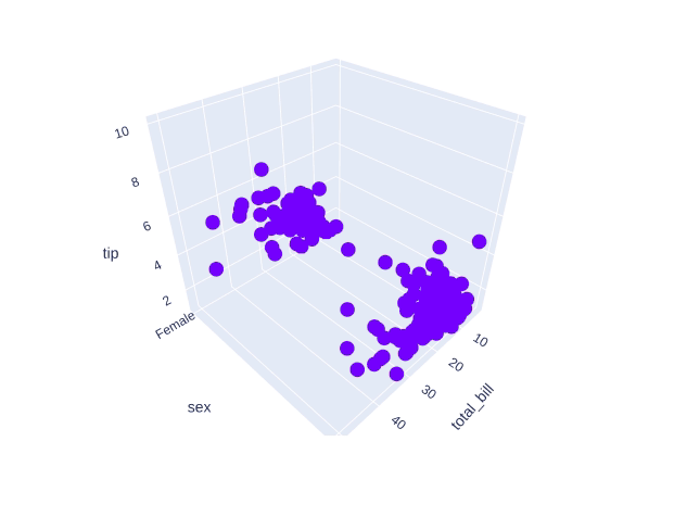
3D Scatter Plot shows data points in three dimensions, adding extra information by adjusting color, size and style of the points. These adjustments help make the plot clearer and easier to understand. You can create a 3D scatter plot using the scatter_3d function from the plotly.express class.
Syntax:
plotly.express.scatter_3d(data_frame=None, x=None, y=None, z=None, color=None, symbol=None, size=None, title=None, width=None, height=None)
Parameters:
Return: A plotly.express.Figure object.
Example:
Output:
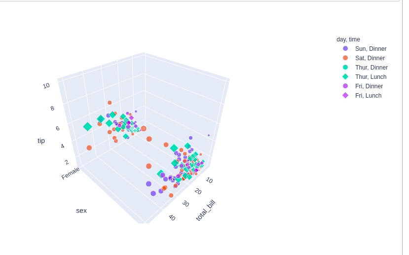
Customizing the 3D scatter plot.
Output:
👁 styled 3d scatter plot plotly
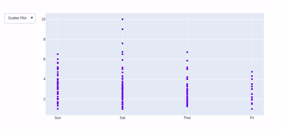
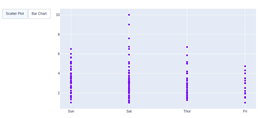
Plotly provides various interactive features which allows users to zoom, hover and click for deeper insights. Beyond these built-in interactions it allows customization with tools like dropdown menus, buttons and sliders. These can be added using the update menu attribute in the plot layout. Let’s explore these features:
A drop-down menu allows users to select different options to modify the chart. The update method is used to control the chart based on dropdown choices. In plotly there are 4 possible methods to modify the charts by using update menu method.
Example: Here we will be using Tips dataset which contains 244 rows and 7 columns and with each row representing a single restaurant bill and associated information.
Output:
In plotly, adding custom Buttons are used to quickly make actions directly from a record. Custom Buttons can be added to page layouts in CRM, Marketing and Custom Apps. There are also 4 possible methods that can be applied in custom buttons:
Example:
Output:
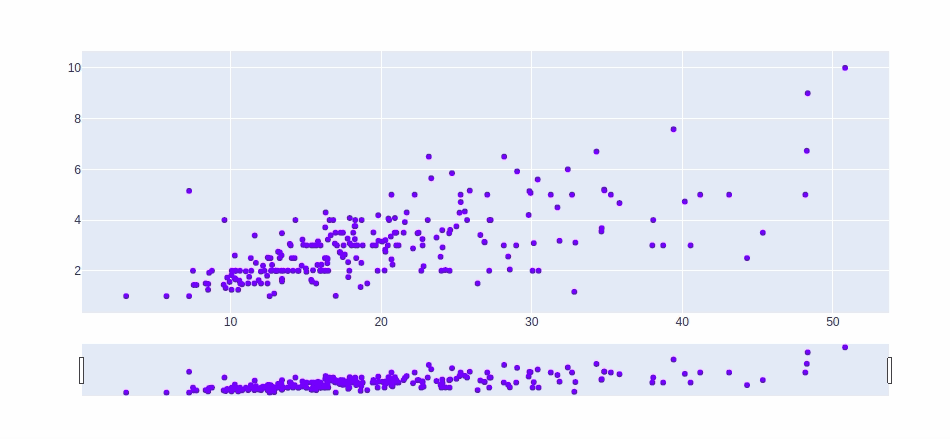
In Plotly, the range slider is an input control that allows users to select a value range between a specified minimum and maximum. It allows selecting pre-configured ranges and manually inputting minimum and maximum values or dates.
Example:
Output:
Plotly Dash is a framework for building interactive web applications with Python. It allows us to create dynamic and visually appealing dashboards that can handle complex interactions and data visualizations. In this section, we will see the importance of building interactive dashboards using Plotly Dash.
1. Install the necessary packages:
!pip install dash
!pip install --upgrade plotly
2. Create and run the Dash app:
Output:
With Plotly we can easily create interactive dashboards that make exploring and understanding data more engaging and insightful.
You can download source code from here.