 |
VOOZH | about |
|
VOOZH | about |
Plotly is a Python library which is used to design graphs, especially interactive graphs. It can plot various graphs and charts like histogram, barplot, boxplot, spreadplot and many more. It is mainly used in data analysis as well as financial analysis. plotly is an interactive visualization library.
Line plot in Plotly is much accessible and illustrious annexation to plotly which manage a variety of types of data and assemble easy-to-style statistic. With px.line each data position is represented as a vertex transformed(which location is given by the x and y columns) of a polyline mark in 2D space. Line chart Displays a series of numerical data as points which are connected by lines. It visualizes to show two data trends. The main productive feature is it can display thousands of data points without scrolling. It can be created using the line() method of plotly.express class.
Syntax: plotly.express.line(data_frame=None, x=None, y=None, line_group=None, color=None, line_dash=None, hover_name=None, hover_data=None, custom_data=None, text=None, facet_row=None, facet_col=None, facet_col_wrap=0, error_x=None, error_x_minus=None, error_y=None, error_y_minus=None, animation_frame=None, animation_group=None, category_orders={}, labels={}, orientation=None, color_discrete_sequence=None, color_discrete_map={}, line_dash_sequence=None, line_dash_map={}, log_x=False, log_y=False, range_x=None, range_y=None, line_shape=None, render_mode='auto', title=None, template=None, width=None, height=None)
Parameters:
| Name | Description |
|---|---|
| data_frame | Array-like and dict are transformed internally to a pandas DataFrame. Optional: if missing, a DataFrame gets constructed under the hood using the other arguments. |
| x | Either a name of a column in data_frame, or a pandas Series or array_like object. Values from this column or array_like are used to position marks along the x axis in cartesian coordinates. Either x or y can optionally be a list of column references or array_likes, in which case the data will be treated as if it were ‘wide’ rather than ‘long’. |
| y | Either a name of a column in data_frame, or a pandas Series or array_like object. Values from this column or array_like are used to position marks along the y axis in cartesian coordinates. Either x or y can optionally be a list of column references or array_likes, in which case the data will be treated as if it were ‘wide’ rather than ‘long’. |
| line_group | Either a name of a column in data_frame, or a pandas Series or array_like object. Values from this column or array_like are used to group rows of data_frame into lines. |
| line_dash | Either a name of a column in data_frame, or a pandas Series or array_like object. Values from this column or array_like are used to assign dash-patterns to lines. |
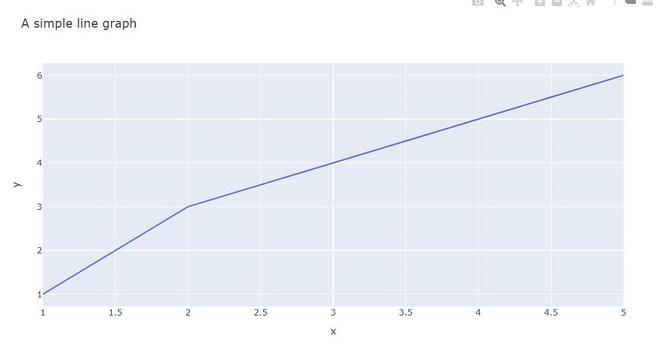
Example 1: In this example, we will see a simple line plot with two different datasets.
Output:
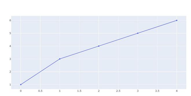
👁 ImageExample 2: In this example we will plot using go.Scatter. plotly.express has two functions scatter and line, go.Scatter can be used both for plotting points (makers) or lines, depending on the value of mode.
Output:
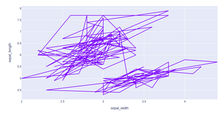
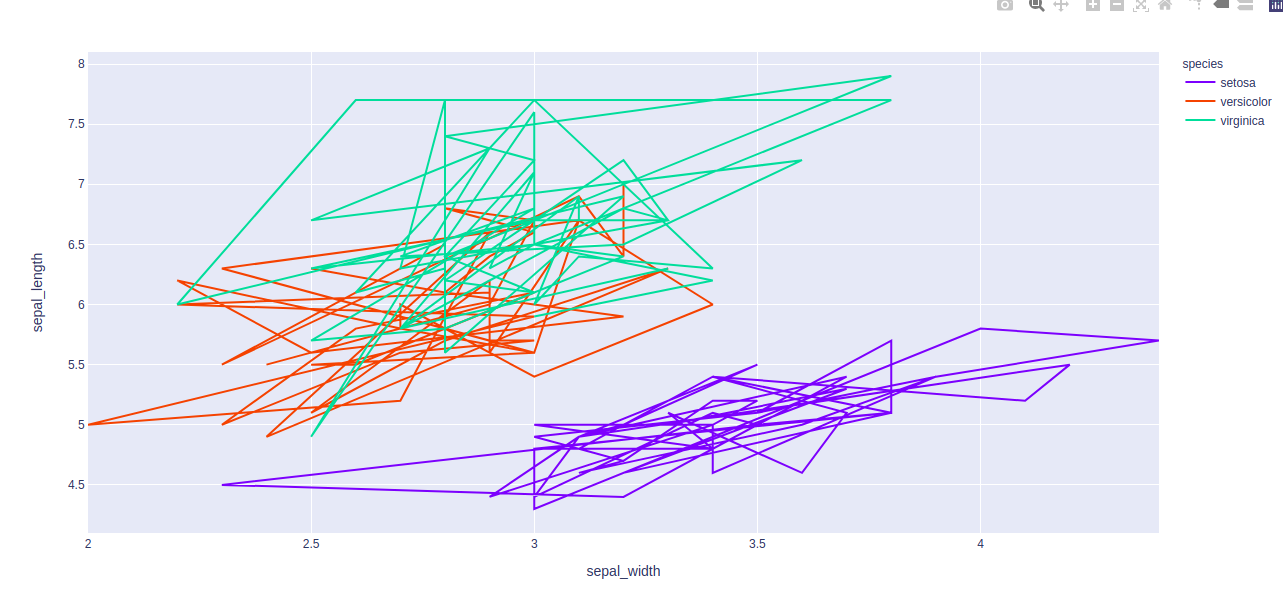
👁 ImageExample 3: Using the Iris dataset we will plot the line chart.
Output:
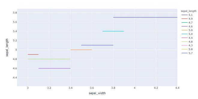
👁 ImageColumn encoding color is also known as, color mapping which is a type of method which represents text or numeric data in colors inline form.
Example 1: In This example, we will use color attributes to plot the line with a different color.
Output:
👁 Image
Example 2: In this example, we will use different color aspect.