VOOZH about

URL: https://www.geeksforgeeks.org/machine-learning/seaborn-distribution-plots/

⇱ Seaborn | Distribution Plots - GeeksforGeeks


  • Courses
  • Tutorials
  • Interview Prep

Seaborn | Distribution Plots

Last Updated : 15 Jun, 2026

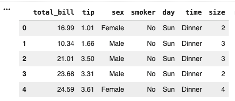
Distribution plots in Seaborn are used to visualize how data values are distributed and to understand patterns such as central tendency, spread, and skewness. They help analyze the frequency and probability distribution of numerical data, making it easier to identify trends and outliers.

Types of Distribution Plots

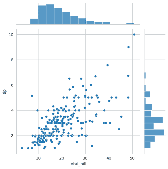
  • Joint Plot: Shows the relationship between two variables along with their individual distributions.
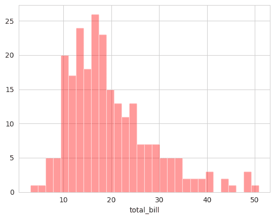
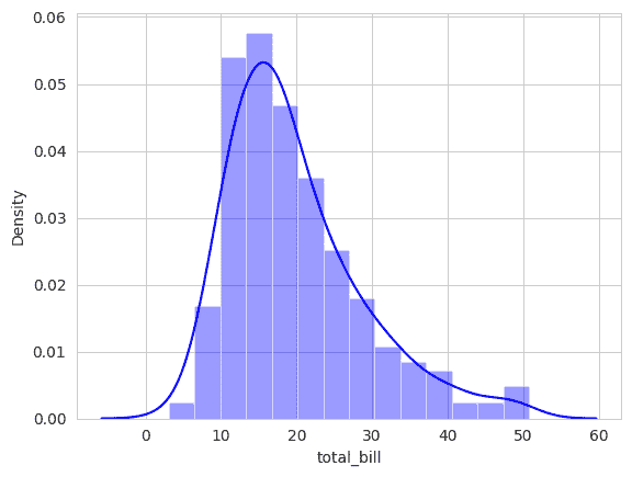
  • Dist Plot: Displays the distribution of a single variable.
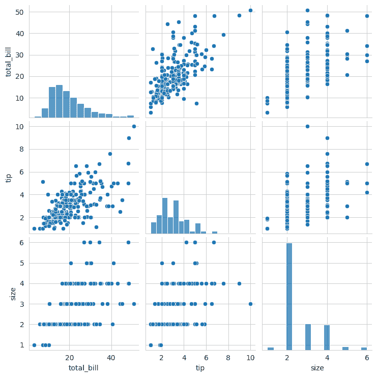
  • Pair Plot: Visualizes relationships between multiple variables in a dataset.
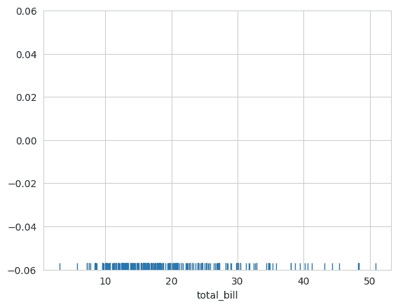
  • Rug Plot: Displays individual data points along an axis to show data distribution.

Implementation

1. Import Required Libraries

2. Load the Dataset

The built-in tips dataset is loaded.

Output:

👁 output
Dataset

3. Set Plot Style

This sets the background style of the plots to whitegrid, making them easier to read.

4. Create a Dist Plot

A Dist Plot displays the distribution of a single variable using a histogram.

  • Shows how values are distributed.
  • Helps identify common value ranges.
  • Useful for understanding data spread.

Output:

👁 displot
Dist Plot

5. Create a Dist Plot with KDE

  • Displays the probability density of the data.
  • Provides a smoother representation than a histogram.
  • Helps identify peaks and patterns in the distribution.

Output:

👁 withKDE
Dist Plot with KDE

6. Create a Joint Plot

  • Examines relationships between variables.
  • Displays both univariate and bivariate distributions.
  • Helps identify trends and correlations.

Output:

👁 joint-plot
Joint Plot

7. Create a Pair Plot

A Pair Plot creates scatter plots for every pair of numerical variables.

  • Shows relationships between multiple variables.
  • Displays distributions along the diagonal.
  • Useful for exploratory data analysis.

Output:

👁 pairplot
Pairplot

8. Create a Rug Plot

A Rug Plot displays each observation as a small mark on an axis.

  • Shows the exact location of data points.
  • Helps understand data density.
  • Often used together with KDE plots.

Output:

👁 rug-plot
Rug Plot

Download full code from here

Comment
Article Tags: