 |
VOOZH | about |
|
VOOZH | about |
Nowadays, Data is an important entity. It should be processed in such a way so that the companies can understand the psychology of the consumers. Data visualization is an important step in processing of data. Altair is a declarative statistical visualization library for Python, built on Vega and Vega-Lite. It offers a user-friendly and efficient way to create high-quality, interactive plots with minimal code. This tutorial will guide you through the core features of Altair and how to use it for data visualization.
Table of Content
Altair is designed with a declarative syntax, which allows you to define what you want to visualize without specifying the underlying computational details. It automatically handles data transformations, scale management, and encodings.
It is a technique used to visualize data in the form of graphs, charts etc. Data visualization is important because:
To start using Altair, you need to install it. You can do so using pip:
pip install altair vega_datasetsThe general syntax to create a chart in Altair is as follows
alt.Chart(data).mark_type().encode(x=val1, y=val2)
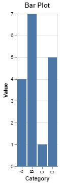
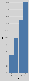
Bar chart is the most commonly used chart that is used to display relationships between two categorical data.
Syntax:
alt.Chart(data).mark_bar().encode(x=val1, y=val2)
Output:
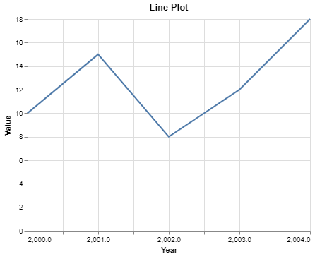
Line chart is the type of chart that is used to display relationship between dependent and independent variables.
Syntax
alt.Chart(data).mark_line().encode(x=val1, y=val2)
Output:
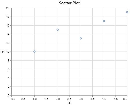
Scatter plot is used to display relationship between two quantitative variables in point format.
Syntax:
alt.Chart(data).mark_point().encode(x=val1, y=val2)
Output:
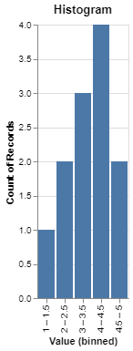
Histogram is used to show the trend of any continuous valued variable in bins.
Syntax:
alt.Chart(data).mark_bar().encode(alt.X('Value:O', bin=True), y=val2)
Output:
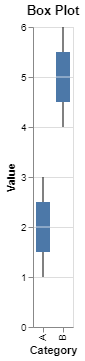
Boxplot is useful when we want to see the outliers and the trends in the data.
Syntax:
alt.Chart(data).mark_box().encode(alt.X('Value:O', bin=True), y=val2)
Output:
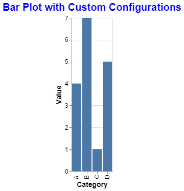
Customizing plots is an important step as we need to make our graphs more creative and interactive. Altair provides many features by which we can make our charts look better.
Title is an important part of graph as it provides the description of the chart in short. We can adjust font, color, style etc in Altair.
Output:
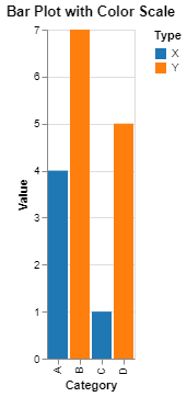
We can change the colors of the marks based on a particular column.
Output:
The latest version of Altair does not support themes. Instead we can use different background colors in our graphs.
Output:
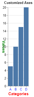
We can customize the axes that is the X and Y in the graphs. We can also add gridlines, modify labels, change the angle in which the labels are to be displayed etc.
Output:
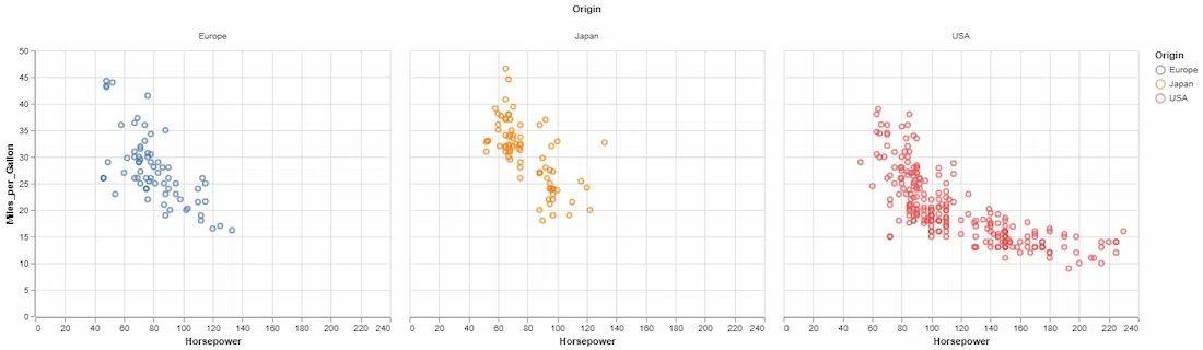
Here we have used Iris Dataset in which we will be creating charts using Altair. In Iris dataset there five columns: 'sepal length (cm)', 'sepal width (cm)', 'petal length (cm)', 'petal width (cm)', 'species'. So we will establish relationships between different features.
Output:
From the above code, we can see that we have created multiple plots such as bar plot, scatter plot, Histograms, Box plots etc. Lastly we have combined bar plot and scatter plot to see how the length of petal as well as length and width of sepal has influence on the category of flower.
You can create faceted or layered visualizations to compare multiple plots:
Output:
Explanation:
.mark_point() specifies the type of plot (scatter plot)..encode() maps data columns to visual encodings like x, y, and color..properties() sets the title and other properties of the chart.Output:
You can save Altair visualizations in various formats, including PNG, SVG, and HTML:
# Save as PNG
chart.save('scatter_plot.png')

# Save as HTML
chart.save('scatter_plot.html')
For more, refer to below articles:
Altair offers an intuitive, powerful way to create both simple and complex visualizations in Python. Its declarative syntax and built-in interactivity make it a go-to tool for data scientists and analysts. This tutorial covered the basics, but Altair’s potential goes far beyond what’s shown here. Explore the documentation for advanced topics like data transformations, more complex interactivity, and more chart types.