 |
VOOZH | about |
|
VOOZH | about |
Prerequisite: Introduction to Altair in Python
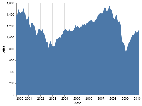
An Area Graph shows the change in a quantitative quantity with respect to some other variable. It is simply a line chart where the area under the curve is colored/shaded. It is best used to visualize trends over a period of time, where you want to see how the value of one variable changes over a period of time or with respect to another variable and do not care about the exact data values. Some modifications of the area chart are the stacked area chart and streamgraph.
Area Graph is readily available in Altair and can be applied using the mark_area() function.
To make an area chart, simply select suitable variables from the dataset and map them to the x and y encoding, where the quantitative variable should be mapped to the x encoding.
The dataset used in this article is from the Vega_datasets library.
Code:
Output:
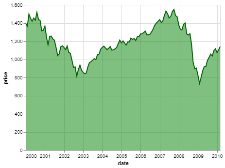
The following simple customizations can be done on an area chart:
Example: