 |
VOOZH | about |
|
VOOZH | about |
Matplotlib's pyplot module is a widely used interface that simplifies the process of creating visualizations in Python. It provides a MATLAB-like syntax, allowing users to generate line charts, bar graphs, scatter plots and other common visualizations with ease. With just a few lines of code analysts and developers can turn raw data into clear, informative charts for analysis and presentation.
This article will help you understand how to use Matplotlib’s Pyplot module to create simple charts.
Below are some of the most commonly used chart types in Pyplot, each demonstrated with a short example.
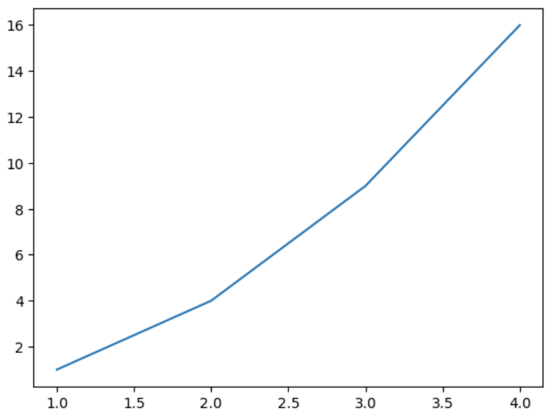
Line plots are simplest types of charts. The plot() function takes two lists: one for x-axis and one for y-axis and connects the points in a linear path.
Example:
Following code uses plt.plot() to draw a basic line graph for the given x and y values using Pyplot module.
Output
Explanation:
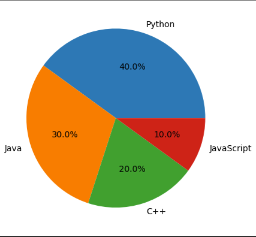
Pie charts show the share of each category in a whole. The pie() function takes a list of values and optional labels to represent each slice of the pie.
Example:
This code creates a pie chart using plt.pie() function to visualize the percentage share of different programming languages.
Output
Explanation: plt.pie(sizes, labels=labels, autopct='%1.1f%%') creates a pie chart with slice sizes from sizes, labels for each slice and autopct shows percentage values with one decimal place.
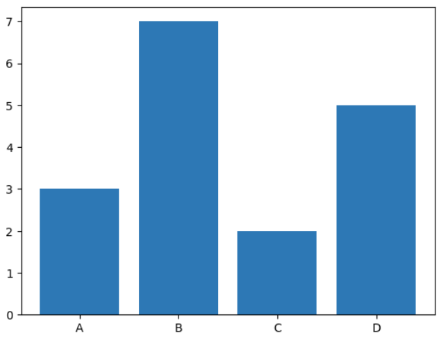
Bar charts are ideal for comparing quantities across categories. The bar() function takes two lists one for category labels (x-axis) and one for their corresponding values (y-axis).
Example:
This Example creates a bar chart using bar() function to display values for different categories.
Output
Explanation:plt.bar(categories, values) draws a vertical bar chart using given categories and values.
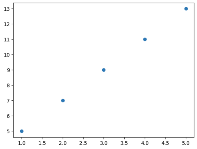
Scatter plots are used for displaying individual data points and showing relationship between two variables. The scatter() function takes two lists like plot(), but it only plots the individual points without connecting them.
Example:
Here, scatter plot is plotted using scatter() function to visualize individual data points.
Output
Explanation:plt.scatter(x, y) plots individual data points as dots at specified (x, y) coordinates.
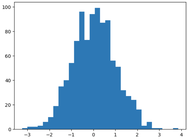
Histograms are used to visualize distribution of a dataset. The hist() function takes a list or array of numerical data and divides it into bins.
Example:
A histogram is plotted using hist() function to visualize the distribution of 1000 random data points.
Output
Explanation:
Related Articles: