 |
VOOZH | about |
|
VOOZH | about |
In this article, we are going to perform multiple linear regression analyses on the Boston Housing dataset using the R programming language.
Multiple Linear Regression is a supervised learning model, which is an extension of simple linear regression, where instead of just one independent variable, we have multiple independent variables that can potentially affect the value of the dependent variable. Similar to Linear regression, this model aims to find a linear equation (or simply, the line of best fit) that describes the relationship between multiple independent variables (also called features) and the dependent variable (also called target).
The equation is the same as that of Linear Regression but with the addition of multiple independent variables:
Y = b0 + b1X1 + b2X2 + b3X3 + ... biXi
Here,
Y: the predicted value
b0: the predicted value of Y when all independent variables are zero (or simply, intercept)
Xi: the value of the ith independent variable
bi: the slope coefficient for the ith independent variable
Dataset:Boston Housing Dataset (Kaggle)
It is the most common dataset that is used by ML learners to understand how Multiple Linear Regression works. This dataset contains information collected from the U.S. Census about housing in the suburbs of Boston. The dataset contains 14 columns (features) with labels like average number of rooms (RM), per capita crime rate (CRIM), etc.
All the features of the dataset are as follows:
Before starting to build the model, its always a good practice to first understand the format of dataset.
Output:
 CRIM ZN INDUS CHAS NOX RM AGE DIS RAD TAX PTRATIO B LSTAT MEDV
1 0.00632 18 2.31 0 0.538 6.575 65.2 4.0900 1 296 15.3 396.90 4.98 24.0
2 0.02731 0 7.07 0 0.469 6.421 78.9 4.9671 2 242 17.8 396.90 9.14 21.6
3 0.02729 0 7.07 0 0.469 7.185 61.1 4.9671 2 242 17.8 392.83 4.03 34.7
4 0.03237 0 2.18 0 0.458 6.998 45.8 6.0622 3 222 18.7 394.63 2.94 33.4
5 0.06905 0 2.18 0 0.458 7.147 54.2 6.0622 3 222 18.7 396.90 NA 36.2
6 0.02985 0 2.18 0 0.458 6.430 58.7 6.0622 3 222 18.7 394.12 5.21 28.7
Output:
 CRIM ZN INDUS CHAS NOX
 Min. : 0.00632 Min. : 0.00 Min. : 0.46 Min. :0.00000 Min. :0.3850
 1st Qu.: 0.08190 1st Qu.: 0.00 1st Qu.: 5.19 1st Qu.:0.00000 1st Qu.:0.4490
 Median : 0.25372 Median : 0.00 Median : 9.69 Median :0.00000 Median :0.5380
 Mean : 3.61187 Mean : 11.21 Mean :11.08 Mean :0.06996 Mean :0.5547
 3rd Qu.: 3.56026 3rd Qu.: 12.50 3rd Qu.:18.10 3rd Qu.:0.00000 3rd Qu.:0.6240
 Max. :88.97620 Max. :100.00 Max. :27.74 Max. :1.00000 Max. :0.8710
 NA's :20 NA's :20 NA's :20 NA's :20
 RM AGE DIS RAD TAX
 Min. :3.561 Min. : 2.90 Min. : 1.130 Min. : 1.000 Min. :187.0
 1st Qu.:5.886 1st Qu.: 45.17 1st Qu.: 2.100 1st Qu.: 4.000 1st Qu.:279.0
 Median :6.208 Median : 76.80 Median : 3.207 Median : 5.000 Median :330.0
 Mean :6.285 Mean : 68.52 Mean : 3.795 Mean : 9.549 Mean :408.2
 3rd Qu.:6.623 3rd Qu.: 93.97 3rd Qu.: 5.188 3rd Qu.:24.000 3rd Qu.:666.0
 Max. :8.780 Max. :100.00 Max. :12.127 Max. :24.000 Max. :711.0
 NA's :20
 PTRATIO B LSTAT MEDV
 Min. :12.60 Min. : 0.32 Min. : 1.730 Min. : 5.00
 1st Qu.:17.40 1st Qu.:375.38 1st Qu.: 7.125 1st Qu.:17.02
 Median :19.05 Median :391.44 Median :11.430 Median :21.20
 Mean :18.46 Mean :356.67 Mean :12.715 Mean :22.53
 3rd Qu.:20.20 3rd Qu.:396.23 3rd Qu.:16.955 3rd Qu.:25.00
 Max. :22.00 Max. :396.90 Max. :37.970 Max. :50.00
 NA's :20
As we can see some of the values in the dataset are missing (NA), so to work further on the dataset we first need to clean it
Let's first check number of missing values in the dataset.
Output:
Missing values: 120
 CRIM ZN INDUS CHAS NOX RM AGE DIS RAD TAX
 20 20 20 20 0 0 20 0 0 0
PTRATIO B LSTAT MEDV
 0 0 20 0
Here, totel number of missing values are 120.
Output:
Missing values after imputation: 0The missing values have been handled successfully, now we can proceed further with the model.
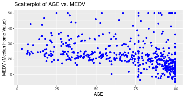
Scatterplot for AGE vs MEDV
Output:
Here, we have used AGE as x-axis and MEDV as y-axis for plotting points, respective labels as AGE, and MEDV (Median Home Value) with the color of points as blue, title of the plot as Scatterplot of AGE vs MEDV.
From the plot, it is evident that for majority of the houses as the age of the house increases the value of owner-occupied houses decreases for majority of houses, however for some houses the price increases as well (Small proportion).
To plot a correlation heatmap, first we need to understand what both these terms are:
Correlation is a Statistical method/technique to identify and analyse relationship between two variables. Basically, it means that if the change in value of one variable induces a change in value of other variable as well, then both the variables are in some sort of relation and analyses of this relationship is called as Correlation.
Broadly, this Correlation can be categorised in 3 subparts:
When a change in the first variable induces a change in another variable aligned in the same direction, it is said to have a positive correlation. For example, if increasing or decreasing the value in first variable leads to increment or decrement of value in second variable respectively, both of the variable are in positive correlation
As the name says, changing the value in former variable leads to no effect to latter, they are not in any Correlation.
When a change in the first variable brings about a change in another variable aligned in the opposite direction, it is said to have a negative correlation. For example, if increasing or decreasing the value in first variable leads to decrement or increment of value in second variable respectively, both of the variable are in positive correlation
Heatmap is a two-dimensional representation of data which contains different values in different shades of colours. Simply, heatmaps use colors to represent data values. Each cell's color intensity corresponds to the value it represents, making it easier to identify patterns and trends.
Now, a correlation heatmap, is a combination of both these concepts, so in simple words, it is a heatmap that represents different values of correlation in different shades of colour to signify the relationship between variables.
Output:
As it is evident from the plot, that red color shows negative correlation, white shows no correlation and green showing positive correlation. Different shades of colours are used to show varied values of correlation, with dark shade of green showing a strong positive correlation and that of red showing strong negative correlation. It can be concluded that the DIS variable and NOX variable has a strong negative correlation and TAX and RAD variable has a strong positive correlation.Multiple linear regression analysis of Boston Housing Dataset using R
First we need to install the libraries by executing following command in R terminal
We have installed desired packages to use them in our project
Here, we are importing two libraries, first one being ggplot2 for plotting the scatterplot and caret for splitting the dataset into training and test data
Now we need to split the dataset into training and test set.
Output:
 CRIM ZN INDUS CHAS NOX RM AGE DIS RAD TAX PTRATIO B LSTAT MEDV
1 0.00632 18.0 2.31 0 0.538 6.575 65.2 4.0900 1 296 15.3 396.90 4.98 24.0
2 0.02731 0.0 7.07 0 0.469 6.421 78.9 4.9671 2 242 17.8 396.90 9.14 21.6
4 0.03237 0.0 2.18 0 0.458 6.998 45.8 6.0622 3 222 18.7 394.63 2.94 33.4
5 0.06905 0.0 2.18 0 0.458 7.147 54.2 6.0622 3 222 18.7 396.90 11.43 36.2
7 0.08829 12.5 7.87 0 0.524 6.012 66.6 5.5605 5 311 15.2 395.60 12.43 22.9
8 0.14455 12.5 7.87 0 0.524 6.172 96.1 5.9505 5 311 15.2 396.90 19.15 27.1
[1] "Test data:\n"
 CRIM ZN INDUS CHAS NOX RM AGE DIS RAD TAX PTRATIO B LSTAT MEDV
3 0.02729 0.0 7.07 0 0.469 7.185 61.1 4.9671 2 242 17.8 392.83 4.03 34.7
6 0.02985 0.0 2.18 0 0.458 6.430 58.7 6.0622 3 222 18.7 394.12 5.21 28.7
9 0.21124 12.5 7.87 0 0.524 5.631 100.0 6.0821 5 311 15.2 386.63 29.93 16.5
11 0.22489 12.5 7.87 0 0.524 6.377 94.3 6.3467 5 311 15.2 392.52 20.45 15.0
14 0.62976 0.0 8.14 0 0.538 5.949 61.8 4.7075 4 307 21.0 396.90 8.26 20.4
15 0.63796 0.0 8.14 0 0.538 6.096 84.5 4.4619 4 307 21.0 380.02 10.26 18.2
Here, we set the seed to 123, which basically means it will give same training and test set even when ran multiple time (pseudo-random), so as to prevent the model to take test set, which will potentially hamper the accuracy.
Then we are setting the percentage of the data on which the model is to be trained in train_percentage variable, which is then parsed in createDataPartition which takes two arguments, the first one being the taget variable in whose respect the dataset is to be split so as to maintain equality of values between training and test set, and percentage of dataset to be partitioned as training set.
Now, dataset is splitted between training and test data with the index obtained from createDataPartition.
Now we will train our model on the test data.
Here, we parsed out target variable and dataset in the built-in function lm to train our model on the training set.
MEDV is the target variable and the . (dot) represents all the features in the dataset, i.e training our model for MEDV with respoect to multiple features, which makes it a Multiple Linear Regression Model.
Now let's test this model.
We will test the model using built-in predict function and also calculate errors to determine its accuracy.
Output:
Mean Absolute Error (MAE): 3.306711
Mean Squared Error (MSE): 20.32019
Root Mean Squared Error (RMSE): 4.507793
Here, we are first predicting MEDV by using test data and then finding errors based on it difference from the true value (actual values from the dataset)
We are evaluating 3 types of errors:
Now, we will be testing our model on data taken as input from the user.
Input:
Enter value for CRIM : 0.03
Enter value for ZN : 20
Enter value for INDUS : 5
Enter value for CHAS : 1
Enter value for NOX : 0.5
Enter value for RM : 6
Enter value for AGE : 60
Enter value for DIS : 4
Enter value for RAD : 3
Enter value for TAX : 300
Enter value for PTRATIO : 16
Enter value for B : 350
Enter value for LSTAT : 10
Output:
Predicted MEDV Value: 28.48026
.png)