 |
VOOZH | about |
|
VOOZH | about |
Scatter plots are a fundamental tool in data visualization, providing a visual representation of the relationship between two variables. In Python, scatter plots are commonly created using libraries such as Matplotlib and Seaborn. This article will delve into the concept of scatter plots, their applications, and how to implement them in Python using these powerful libraries.
Table of Content
A scatter plot is a type of data visualization that displays individual data points on a two-dimensional graph. It uses Cartesian coordinates to display values for typically two variables for a set of data. The data points are represented as dots, where the position of each dot on the horizontal and vertical axis indicates values for an individual data point.
Scatter plots are particularly useful for visualizing the relationship between two continuous variables and identifying patterns, trends, correlations, and outliers in the data.
Scatter plots have been a part of statistical graphics since the late 19th century and were used extensively by Francis Galton and Karl Pearson, who contributed significantly to the development of correlation and regression analysis.
Over time, scatter plots have become an integral tool in exploratory data analysis (EDA), providing a visual foundation for statistical methods.
Scatter plots are widely used in data analysis for several purposes:
A typical scatter plot consists of two axes:
Each point on the scatter plot represents an observation from the dataset, where the x-coordinate corresponds to the value of the independent variable, and the y-coordinate corresponds to the value of the dependent variable.
Gridlines improve readability, allowing viewers to estimate the values of points more accurately. Annotations can be added to highlight specific points or areas of interest in the scatter plot.
Scatter plots are instrumental in revealing relationships between two variables. A scatter plot can visually suggest various kinds of correlations between variables with different densities, shapes, and spreads. It allows for the identification of positive, negative, or no correlation:
Scatter plots can highlight trends and clusters within the data. For example, they can show if data points are grouped around a line or curve or if they are spread out. Scatter plots are also helpful in identifying patterns that suggest further statistical modeling.
Outliers can significantly affect the results of data analysis, skewing means and standard deviations and impacting model predictions. Scatter plots help in visually identifying these outliers, which can then be investigated or handled appropriately.
Several Python libraries provide tools for creating scatter plots, each offering unique features and customization options:
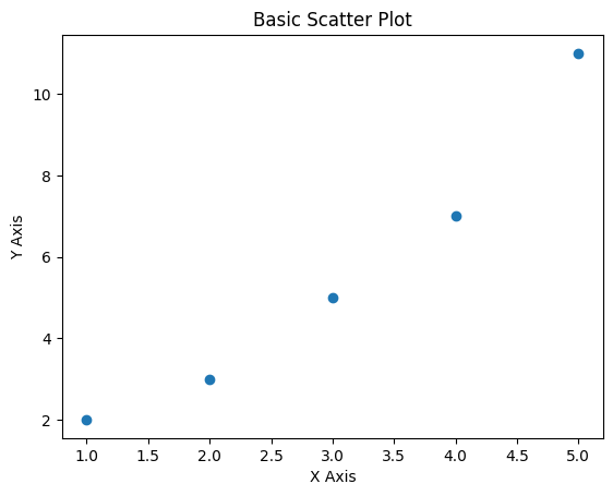
Here’s a basic example of how to create a scatter plot using Matplotlib:
Output:
Enhancing Scatter Plots with Seaborn Seaborn provides additional functionality for scatter plots, such as enhanced color palettes and regression lines:
Output:
The primary use of scatter plots is to identify correlations between variables:
Outliers appear as points that deviate significantly from the overall pattern. Identifying outliers is crucial as they can affect statistical analyses and modeling efforts.
Scatter plots can reveal clusters of points that may represent underlying groups or subpopulations within the data. Identifying clusters can provide insights into potential segmentation or categorization.
While scatter plots are powerful tools for visualizing relationships between variables, they have limitations:
Scatter plots are invaluable tools in data visualization, providing a straightforward way to understand the relationship between two variables. By using Python libraries like Matplotlib, Seaborn, Plotly, and Pandas, data analysts and scientists can create informative and visually appealing scatter plots that facilitate data exploration and communication. However, careful consideration of best practices, interpretation guidelines, and limitations is essential to fully leverage scatter plots' capabilities in data analysis.