 |
VOOZH | about |
|
VOOZH | about |
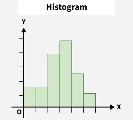
A histogram is a graphical representation of the frequency distribution of continuous series using rectangles. The x-axis of the graph represents the class interval and the y-axis shows the various frequencies corresponding to different class intervals.
Histograms of Frequency Distribution are of two types:
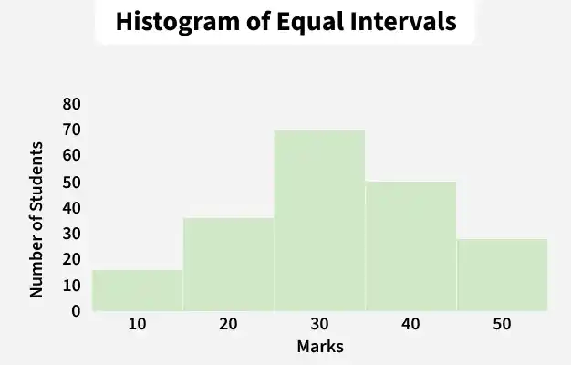
When histograms are drawn based on the data with equal class intervals, they are known as Histograms of equal class intervals. The histogram of equal class intervals includes rectangles with equal width; however, the length of the rectangles is proportional to the frequency distribution of the class intervals.
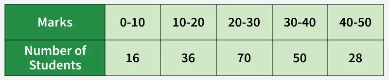
Example of Histogram of Equal Class Intervals:
Present the following information in the form of a Histogram:
When histograms are drawn based on the data with unequal class intervals, they are known as Histograms of unequal class intervals. Histogram of unequal class intervals includes rectangles of different width sizes. Therefore, before drawing a histogram in case of unequal class intervals, frequency distribution has to be adjusted.
Adjustment of frequencies of unequal class intervals:
1. Determine the class of the smallest interval ( lowest class interval ).
2. Then, calculate the adjustment factor using the formula:
3. Now, adjust the given frequencies using the adjustment factor:
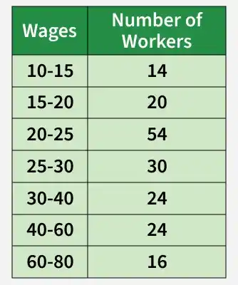
Example of Histogram of Unequal Class Intervals:
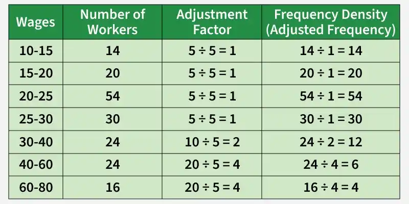
Present the following information in the form of a Histogram:
1. It can be seen clearly that the given class interval is unequal. So, before plotting the histogram, frequencies have to be adjusted.
2. Determine the class of the smallest interval, i.e., 10-15. Thus, the lowest class interval in the given frequency distribution is 5.
3. Formulate the Adjusted Table as shown below:
In the above table, the class interval is calculated as the difference between the upper-class limit and lower-class limit, i.e.,
15- 10 =5, 20- 15= 5, 20- 25 =5, 30- 25= 5, 40- 30= 10, 60- 40= 20 and 80- 60= 20.
4. Plotting Histogram: