 |
VOOZH | about |
|
VOOZH | about |
A frequency polygon is another way to show a frequency distribution on a graph. In addition to being an alternate for the histogram, the frequency polygon is also an outcome of the histogram. While comparing two or more frequency distributions, a frequency polygon is more suitable than using a histogram. Polygons can be constructed for both discrete and continuous series.
The steps required to construct a frequency polygon in the case of discrete series are:
The following data shows the number of shops on 70 streets in a city. Construct a frequency polygon for the same.
The discrete frequency distribution applies in this case. The number of rooms will be plotted on the X-axis, while the number of houses will be plotted on the Y-axis. A frequency polygon is created by joining the obtained points with a straight line.
There are two ways of creating a frequency polygon for a continuous frequency distribution:
(i) With the help of a Histogram
(ii) Without the help of a Histogram
The steps required to construct a frequency polygon in the case of continuous series with the help of a histogram are:
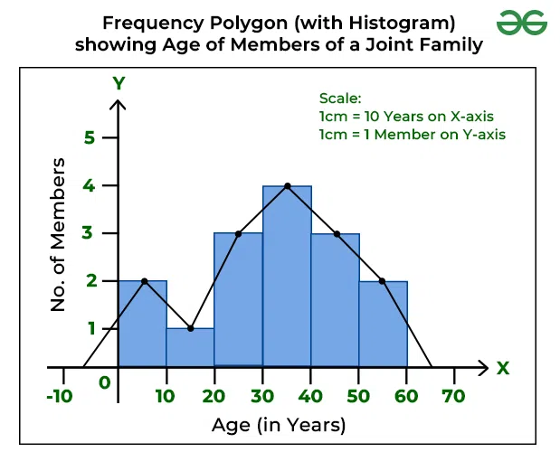
The following is the age distribution of members in a joint family. Create a histogram from this data and convert it to a frequency polygon.
The continuous frequency distribution applies in this case, as there is a frequency distribution with equal class intervals. Firstly, the histogram is prepared, and then the frequency polygon. The age of the members will be plotted on the X-axis, while the number of family members will be plotted on the Y-axis.
The steps required to construct a frequency polygon in the case of continuous series without the help of a histogram are:
The resulting figure, in this case, would be the same as in the above example (with a histogram). The only difference is that there is no need to create the histogram.
A frequency curve is a result of joining the vertices of a frequency polygon with a smooth curve. It is also referred to as a Smoothed Frequency Curve. The frequency curve may not always go through all of the points of the frequency polygon, but it passes through them as closely as possible.
Draw a frequency curve from the following distribution.
👁 Frequency Curve DataThe continuous frequency distribution applies in this case, as there is a frequency distribution with equal class intervals. Firstly, the histogram is prepared, and then the frequency curve. The class interval will be plotted on the X-axis, while the frequency distribution will be plotted on the Y-axis.
👁 Frequency Curve
-copy.webp)