 |
VOOZH | about |
|
VOOZH | about |
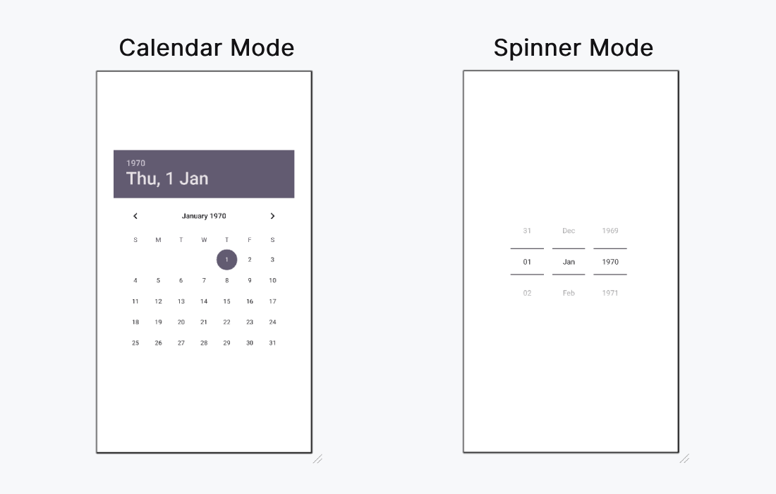
The Android DatePicker is a user interface component that allows users to select a date, including the day, month, and year. This control helps ensure that users select valid dates in an application. DatePicker offers two display modes:
You can implement DatePicker in two ways:
This flexibility makes DatePicker a versatile and user-friendly solution for date input in Android applications.
| XML Attributes | Description |
|---|---|
| android:datePickerMode | Used to specify the mode of datepicker(spinner or calendar) |
| android:calendarTextColor | Used to specify the color of the text. |
| android:calendarViewShown | Used to specify whether view of the calendar is shown or not (also used with spinner) |
Below are the steps to be followed:
We can use android:datePickerMode to choose which the mode for the DatePicker. The possible values are "calendar" and "spinner". This article demonstrate how to implement both type of modes.
activity_main.xml:
First of all, we declare a variable datePicker to access the DatePicker widget from the XML layout.
val datePicker: DatePicker = findViewById(R.id.datePicker)then, we declare another variable today to get the current get like this.
datePicker.init(
 today.get(Calendar.YEAR),
 today.get(Calendar.MONTH),
 today.get(Calendar.DAY_OF_MONTH)
)
To display the selected date from the calendar we will use
{ view, year, month, day ->
 val msg = "You Selected: $day/${month+1}/$year"
 Toast.makeText(this@MainActivity, msg, Toast.LENGTH_SHORT).show()
}
We are familiar with further activities in previous articles like accessing button and set OnClickListener etc.
MainActivity.kt: