How to Create a Graph in PowerPoint: Step by Step Guide
Last Updated : 24 Feb, 2025
Have you ever struggled to explain complex data in a presentation? A well-designed graph can turn raw data into clear, visual insights, making it easier for your audience to understand and engage with your message.
Whether you're analyzing financial trends, presenting business reports, showcasing research findings, or illustrating marketing data, adding graphs in PowerPoint helps you communicate information more effectively. With PowerPoint’s built-in tools, you can create bar charts, line graphs, pie charts, and scatter plots in just a few clicks—no advanced skills required!
This guide will walk you through the step-by-step process of creating and customizing graphs in PowerPoint, so you can make your presentations visually appealing, data-driven, and impactful.
Graphs make your presentation more data-driven and visually engaging. Here’s why you should use them:
Enhances clarity – Converts complex data into easy-to-understand visuals.
Boosts engagement – Captures audience attention better than plain text.
Simplifies decision-making – Helps viewers quickly analyze trends and patterns.
Looks professional – Gives your slides a polished and structured look.
Whether you need a bar chart, line graph, pie chart, or column chart, PowerPoint offers built-in tools to help you create stunning and informative graphs effortlessly.
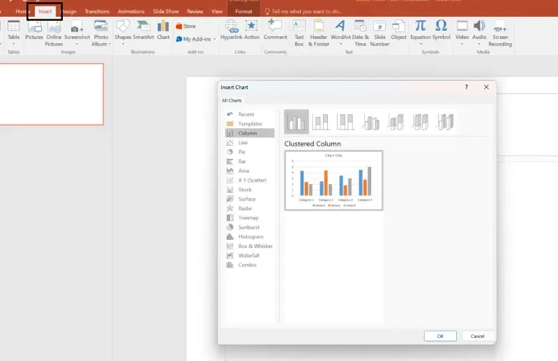
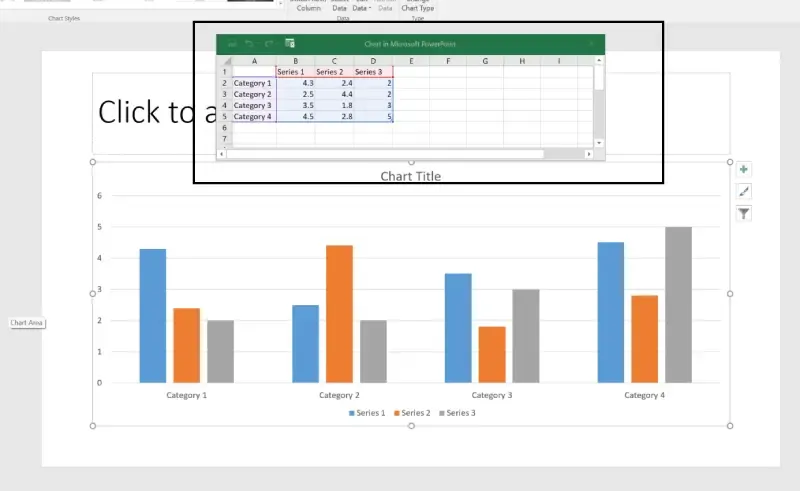
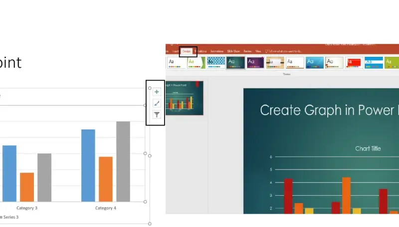
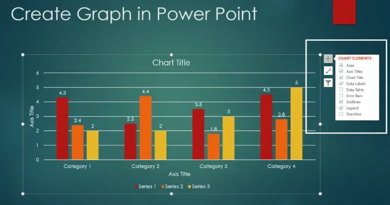
How to Create a Graph in PowerPoint (Step-by-Step Guide)
Follow these simple steps to insert and customize graphs in PowerPoint.
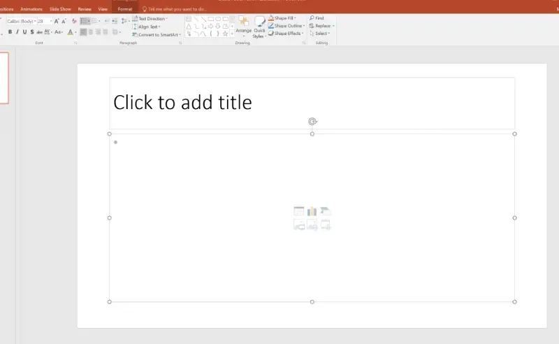
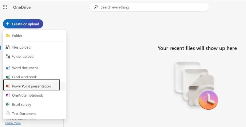
Step 1: Open PowerPoint and Select a Slide
Launch Microsoft PowerPoint and create a new presentation or open an existing one.
Select the slide where you want to insert a graph.
Common Issues When Creating Graphs in PowerPoint (and Fixes!)
1. Graph is not updating with new data Ensure all cells in the Excel sheet are correctly filled.
2. Text and labels are too small Increase font size using the Chart Format options.
3. Graph looks distorted when resizing Hold the Shift key while resizing to maintain the correct proportions.
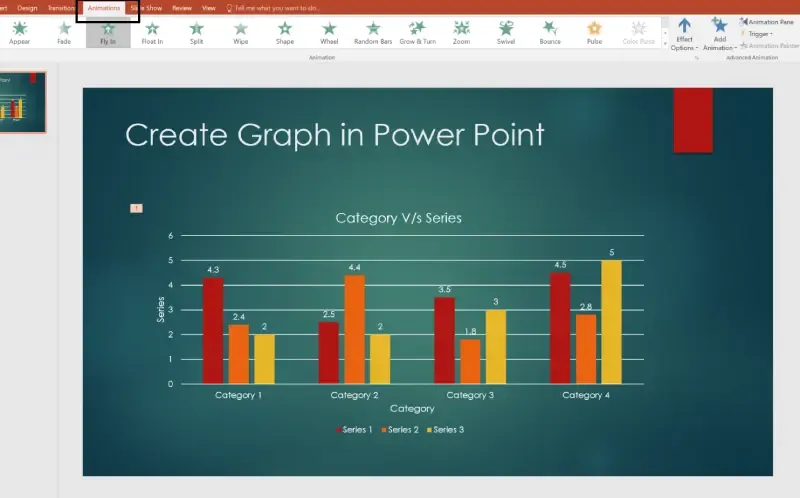
4. Animation is too fast or slow Adjust the duration settings in the Animations tab.
Conclusion
Creating graphs in PowerPoint is a great way to make your presentations more clear, engaging, and easy to understand. Graphs help you show trends, compare data, and highlight key points in a way that’s simple for your audience to follow.
With PowerPoint’s easy-to-use tools, you can quickly add and customize charts to match your presentation’s style. Whether you’re sharing business insights, financial reports, or research findings, a well-designed graph makes your message stronger and more impactful.
Start using graphs in your PowerPoint presentations today and make your data stand out!
