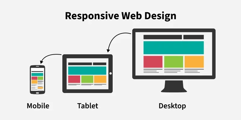
Responsive Web Design ensures websites automatically adapt to different screen sizes, providing a smooth and user-friendly experience across all devices.
Content adapts by resizing or hiding based on the device.
Improves user experience and reduces user drop-off.
Uses a single flexible layout.
Implemented using HTML and CSS, including HTML5 and CSS3.
Techniques for Building Responsive Web Design
Responsive web design focuses on adapting layouts and content to ensure a seamless user experience across all screen sizes and devices.
Use Fluid Grids
Use fluid grid systems instead of fixed-width layouts so the design adapts to different screen sizes.
Apply percentage-based widths to ensure elements resize proportionally across devices.
Use Flexible Images
Ensure images and media scale properly within their containers.
Use CSS properties like max-width: 100% to prevent content from overflowing the layout.
Apply Media Queries
Use CSS media queries to target different screen sizes and device orientations.
Modify layouts, fonts, and colors based on screen width, height, or resolution.
Improve usability by applying styles such as larger text on smaller screens.
Prioritize Touchscreens
Make buttons and interactive elements large enough for comfortable touch interaction.
Place navigation elements in easily accessible areas to improve mobile usability.
Test Responsiveness
Test the website on multiple devices and browsers for consistent behavior.
Use tools and emulators to preview performance across different screen sizes.
Make necessary adjustments based on testing results to improve usability.
Benefits of Responsive Web Design
There are several benefits of using a Responsive Web Design:
Reduces Bounce Rate: Keeps users engaged by displaying correctly on all devices.
Mobile-Friendly Design: Automatically adjusts layout for smaller screens.
Increases Website Traffic: Allows easy access across multiple devices.
Enhanced User Experience: Provides a consistent and smooth experience.
Improved SEO Performance: Better usability helps achieve higher search rankings.
Principles of Responsive Web Design
Responsive web design focuses on building websites that provide a smooth and visually appealing experience across all devices. Below are the principles to follow:
1. Viewable on Multiple Devices
Ensure the website works properly on mobiles, tablets, and desktops.
Design layouts that adapt to different screen sizes automatically.
2. Easy to Understand
Keep the layout clean and well-organized for better usability.
Arrange content and features clearly to avoid user confusion.
3. Consistency
Maintain the same fonts, colors, and design elements across devices.
Provide a uniform experience whether viewed on phone, tablet, or PC.
4. User Engagement
Enable interactive features suited to each device, such as swipe gestures on mobile.
Make navigation intuitive to improve user satisfaction and trust.
Best Practices for Responsive Web Design
Some of the best practices for a responsive web design that you can follow are:
Mobile-First Approach: Design for small screens first, then scale up for larger devices.
Accessible Content: Use semantic HTML, keyboard support, and alt text.
Responsive Media: Ensure images and media resize across screen sizes.
Landscape Optimization: Optimize layouts for landscape orientation.
Stay Updated: Follow modern responsive design trends and updates.
Applications of Responsive Web Design
Some of the applications of Responsive Web Design are:
E-commerce Websites: Provides smooth shopping experience across devices.
Educational Platforms: Enables learning access anytime on any device.
Business Websites: Maintains consistent brand presence and accessibility.
Blogs & News Websites: Ensures better readability and content presentation.
Web Applications: Allows dashboards and tools to work on all screen sizes.
Portfolio Websites: Showcases work effectively across devices.
