 |
VOOZH | about |
|
VOOZH | about |
What is typography? It's an art and technique that breathes life into written words. Typography encompasses everything from the design of a logo's typeface to the style of text on a T-shirt. It involves choosing typefaces and fonts, designing text layouts, and modifying font styles to enhance readability and visual appeal. This guide looks into various aspects of typography, including logo typeface design, cursive and handwriting styles, and the use of typography in different media like posters, artworks, and T-shirts.
Whether it's for branding, creating compelling typography art, or developing unique typefaces for digital and print media, typography is a fundamental element of graphic design that shapes how we interpret and interact with text.
Table of Content
Typography simply is a technique in user interface design to create readable, appealing, attractive, and easy-to-eye text for users to read. Typography plays an integral role in any website's design.
Good typography is soothing to the eyes and creates a long-lasting impression on the minds of the user.
| Aspect | Typeface | Font |
|---|---|---|
| Definition | Design of a set of characters | Specific size, weight, and style of a typeface |
| Example | Arial, Times New Roman | Arial 12-point bold |
| Use | Describes the look of the text | Used to implement the typeface in specific sizes and styles |
Typefaces simply are the way of designing typography. Typefaces are distinct styles of writing for any font. It includes design for everything every set of characters - from letters, numbers, and punctuation marks, to symbols.
Typefaces define the visual appearance of character and hence the visual appearance of the entire typography. It is one of the most important parts of typography that sets the tone of the text.
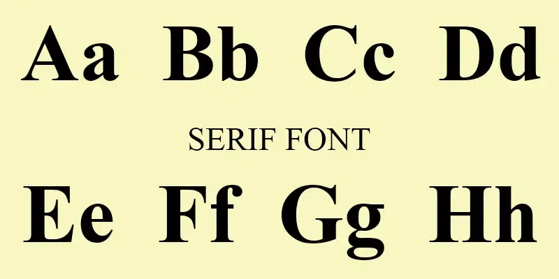
Serifs are the oldest font styles whose characteristics are the small feet at the end of a stroke on the letter. Serifs help the reader follow the letter easily making them highly clear and readable. Serif fonts convey a very traditional vibe you can find these fonts being used in long-form copies for example, on books, magazines and newspapers.
Going back in history, characters used to be created by chiseling on stone, and the chisel created small feet at the end of each stroke. This is how Serifs were born.
Example: Times New Roman
There are multiple types of Serif font styles, most important ones are:
To read more about Sans Serif Fonts click Serif Fonts
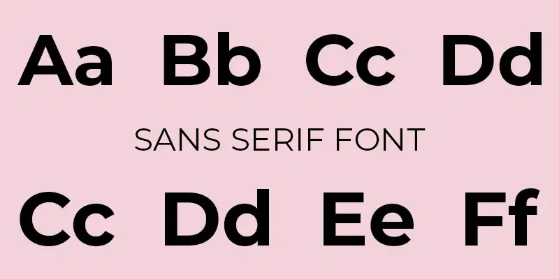
"Sans" in the word Sans-Serif in French basically means "without", therefore, sans-serif typefaces are those that lack serifs. San-serifs fonts are simpler to look and are mostly used as body copy, display and headlines. Sans-Serifs fonts are considered as clean, minimal and modern looking. They were first used in the 15th century.
Example: Helvetica
There are multiple types of San-Serif font styles, most important ones are:
To read more about Sans Serif Fonts click Sans Serif Fonts
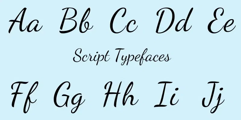
Script Typefaces are designed to emulate the flow and flourish of handwriting. They range from elegant, formal styles to more relaxed and whimsical variations. These typefaces often feature connected letters and varying strokes that mimic the movements of a pen or brush on paper. They can be further categorized into two main types:
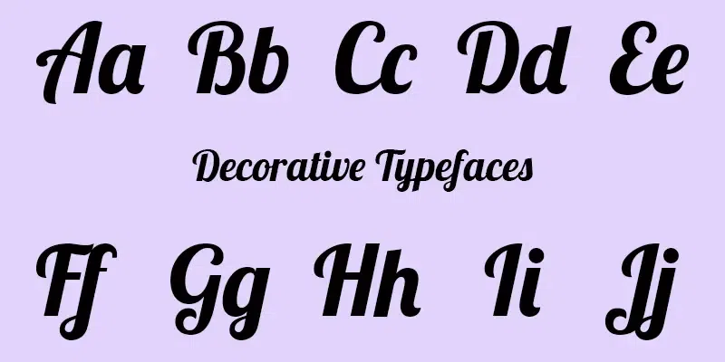
These are highly stylized fonts designed for maximum impact and are not suitable for body text. They come in an array of styles—from retro and funky to modern and edgy—and are used to attract attention and set a mood or theme. Because of their unique and striking features, display typefaces are best used in small doses, such as for titles, headers, and other standout elements in a design. They can convey a variety of moods and associations, making them a favorite choice for branding, promotional materials, and other applications where a strong visual impact is needed.
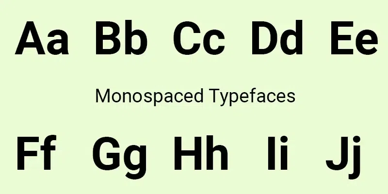
Unlike most typefaces, which are proportionally spaced (each character occupying a width that corresponds to its size), every character in a monospaced font occupies the exact same amount of horizontal space. This uniform spacing is reminiscent of a typewriter and is crucial for aligning characters in certain technical materials such as computer code and tabular data. The consistent spacing helps to make code easier to read and debug. Monospaced fonts are also popular in environments that require text alignment in vertical columns, and they bring a nostalgic, mechanical feel to any layout.
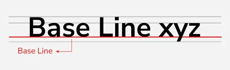
It is an invisible imaginary line on which all the characters sit. Helps in measuring x-heights and line heights in typography. Using baseline we check the ascender and descender of a character.
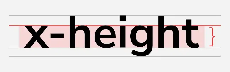
As the name suggests, it is the height of the lowercase alphabet letter “x”. It is measured without any ascender or descender.
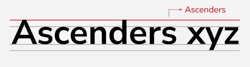
A portion of a lowercase letter that is raised upwards from the letter’s body. Ascender is measured using x-height. For example, the lowercase letter “f” has an ascender.
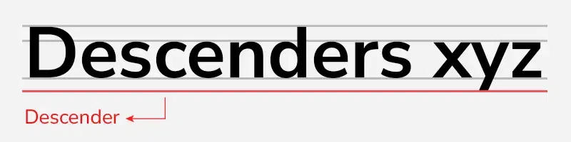
A portion of a lowercase letter that is extended downwards from the letter’s body. It is also measured using x-height. For example, the lowercase letter “p” has a descender.
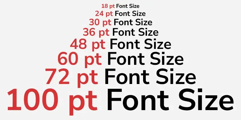
Also called “Point size”, determines the distance between the top of the ascender and the bottom of the descender. Basically is the overall size of a font. As per the W3C recommendation, it is good to use relative font sizes( in ems). As it allows ease in scaling up or down fonts based on the screens and browser settings.
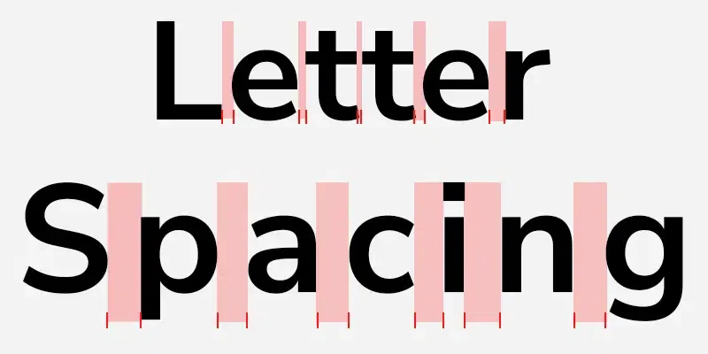
It is the spacing given to each letter in a particular section like a sentence or paragraph. It can be normal, tight, and loose. Letter spacing is also known as tracking.
It is good to keep in mind while using letter spacing that while using uppercase text, increase the letter spacing and when using larger fonts, decrease the letter spacing. This leads to better readability and legibility. Also, keep the letter gap reduced when the font weight is increased.
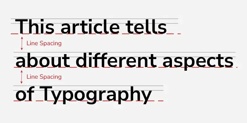
The vertical spacing between lines that are measured through the baseline is called line spacing. It is also known as leading and in CSS it is called line height. It is preferred to use more leading when using white or light text on a dark or black background.
To learn about the difference between typeface and fonts click here
When it comes to UI design for websites and applications, there are certain very important fonts that most of the UI designers use. Here is a list of most common font families that you will need to create a good typography UI design so that you can save your time searching for fonts online:
Choosing the right font for your brand involves a few straightforward steps:
Here are a few best practices you should follow for perfect typography in your interface design:
We have to make sure that the font properties especially the font color go well with the other visuals in the design, as well as we must make sure that the font matches the mission we want to communicate through the website or application.
A lot of fonts being used on a page makes it stressful for the users to look in. Many UI designers recommend to only use two fonts in a website or an application, rather change other properties if the fonts to make them distinct. You can do that by changing various properties of the font like, font weight, color, line height, spacing etc.
Contrast can be created by using two distinct fonts rather than similar ones, by changing the font weight, by changing the text spacing, or through font color and background color. While creating typography, we should also take in account how the typography is going with the overall contrast of the design.
Make sure that the text line-length/line-width is not too long. The problem with longer lines of text is that it becomes harder to read on a screen. Therefore, make sure that you have a good size to check your line length.
There are so many plugins like Count text in Adobe XD, Font Fascia in Figma, etc. that you can use to enhance your work flow, increase your productivity and improve your output.
Line height simply is the spacing between two adjacent base lines. An 100% line height will make your text look cluttered and compact. A perfect range of line height is somewhere between 120% to 180%.
A very important practice in typography for web design is to make sure that you are using readable font sizes. When it comes to body and paragraph text a minimum of 16 to 17 points is the perfect font size. Use at least 15 pixels for long text and at least 14 pixels for dense interfaces. This is the font size that takes most of your webpage/application's font.
Whenever you are using large headings make sure that when you design the mobile version of the application/website, you scale those large headings down. Adjust the font size accordingly for the mobile version of the application or the website.
Typography is a double edged sword, make sure you don't make these mistakes to get the best out of your typography:
Typography plays essential role in communicating with the users, it is not just about text decorations but it also improves the visual appeal of the website or application. In this article we discussed about Typography which is a technique in user interface design to create readable, appealing, attractive and easy on eyes text for the users to read. We learned about tips and tricks as well as best practices for typography. We have learned about the best fonts out there. We hope that this article helped you improve your understanding about typography and you got to learn something new from the article.