
Google Antigravity 2.0 and Cursor 3.0 are both built around an agentic coding experience in which the tool can plan a project, create files, make design decisions, run commands, and refine the result with minimal supervision.
I wanted to see how well those promises held up with something more demanding than a basic landing page, so I gave both platforms the same prompt to build a complex website from scratch.
Both produced working websites, but only one approached the task list like a senior developer who understood the bigger picture rather than simply checking requirements off the list.
Forget Cursor and Claude Code, Google Antigravity is the perfect example of vibe coding
Stop coding, start commanding.
A word on the prompt
Let’s set the rules
I asked both Cursor 3.0 and Google Antigravity 2.0 to build a complex website for Redstone, a diamond manufacturing company with more than 30 years of industry experience.
Both tools recently underwent a major design and functional makeover, with an agentic approach front and center.
I did not want either tool to produce another generic luxury storefront filled with rings, necklaces, and oversized product photography. Redstone was positioned as a B2B diamond supplier serving jewelers, designers, retailers, and international buyers.
My prompt included almost every section I would expect to see on a professional company website. Both tools had to create a premium hero section, a company overview, an explanation of the four Cs, featured diamond inventory, a manufacturing process, certifications, testimonials, and a detailed footer.
I also requested working filters for shape, carat, color, clarity, and price, as well as interactive product cards and diamond data.
The design brief called for generous white space, elegant typography, subtle animations, and premium imagery built around deep red, charcoal, white, and muted gold.
To keep the comparison fair, I used the default coding agent on each platform: Composer in Cursor and Gemini in Google Antigravity. I didn’t switch to a third-party model.
This was also a strict one-shot test. Each platform received the same prompt once, and I judged the initial website it produced without submitting another prompt to fix the design, add missing features, or correct its interpretation.
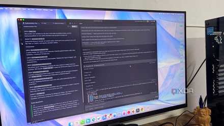
Cursor
Impressed with the speed
The first thing that stood out to me about Cursor was its speed. Once I submitted the prompt, Composer moved through the project quickly and produced a complete, working website without making the process feel drawn out.
More importantly, the speed did not come at the expense of functionality. The navigation worked, the inventory filters responded correctly, the product cards were interactive, and Cursor covered nearly every requirement I had listed in the prompt.
I was also pleased with the copywriting. The headings, descriptions, calls to action, and supporting text felt relevant to a diamond manufacturer. Cursor clearly understood the purpose of Redstone.
However, the visual execution did not leave the same impression. The overall theme was clean and decent, but it never felt premium. The colors and spacious layout were appropriate, yet the final design lacked refinement and personality.
The hero section was the biggest missed opportunity. It looked functional but bland, lacking a striking visual or a memorable focal point to immediately establish Redstone’s identity.
The iconography also felt generic. Overall, Cursor delivered the structure, functionality, and relevant copy with impressive efficiency, but the design needed a stronger creative direction.
Google Antigravity
Wins the round for me
Google Antigravity took a little longer than Cursor to complete the website, but the result immediately felt more considered. The black-and-red theme, with a well-designed hero section, gave Redstone a stronger identity than a basic white luxury template.
The design felt cohesive from top to bottom rather than like a collection of individual sections assembled from a template.
I liked Antigravity’s treatment of the four Cs. Instead of placing cut, clarity, color, and carat inside four predictable cards, it divided the section into visual areas that made each factor easier to understand.
The manufacturing process section was another highlight. Antigravity presented the journey from rough diamond selection to final inspection through a neat vertical timeline.
It gave the section a natural flow and made the process easy to scan without oversimplifying it. The iconography was also far more polished than Cursor’s.
The copywriting could have been tighter in a few places. Some descriptions were longer or more promotional than necessary, and I would revise them before presenting the website to a client.
Reworking a few paragraphs takes far less effort than redesigning a bland hero section. That is why Google Antigravity is the winner for me.
From prompt to polished website
Cursor and Antigravity both proved that agentic coding tools can build far more than a basic landing page from a single prompt.
Cursor behaved like a fast and capable coding assistant, while Antigravity approached the project more like a professional developer who understood both the technical requirements and the broader brand vision.
Of course, this is just one example. I will continue to push both the apps to their limits as they release new models in the future.
Google Antigravity
Antigravity is a Gemini-powered IDE tool that takes on VS Code and Cursor.