
We have all seen the vibe coding demos where an AI model spins out a beautiful, simple landing page in ten seconds flat. It’s impressive, sure, but any engineer knows there is a massive difference between a flashy prototype and a production-ready, complex website.
I wanted to see how the latest generation of AI developer tools handles the messy reality of architecture and edge cases. I put three of the biggest names to test: Claude Code, Codex, and Antigravity.
Before diving into results, it helps to understand exactly what I forced these tools to build. I didn’t just ask for a basic HTML landing page or a simple generic template. I tasked each tool with a multi-page website for a luxury architectural firm called ‘Rajhans.’ I backed in ‘Senior Dev’ traps with complex, custom UI engineering.
I used Claude Code, Antigravity, and Perplexity Computer to build a portfolio — there was a clear winner
The results were surprising.
Codex
Slow, low-fidelity junior wireframes
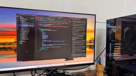
I started the experiment by throwing the prompt at Codex. Since I wanted a production-ready build, I maxed out the settings to 5.5 Extra High mode. That was my first mistake.
The latency was brutal. The generation took so long to kick off that I felt like I was waiting for a server deployment in 2012. After staring at a frozen progress bar for a long time, I lost patience, killed the run, and dropped the settings down to Medium just to get the tokens flowing.
When the code finally arrived, it was a basic, bare-minimum job. For a luxury architectural website, visual polish is everything. Codex missed that memo. It delivered a layout without images or placeholder logic and left the screen looking like a naked wireframe.
The entire UI lacked detail. It lacked fluid typography, smart layout math, and the design sophistication I asked for. It didn’t think like an architect; it thought like an overwhelmed junior developer rushing to hit a deadline.
It spit out functional syntax, but the actual user experience was hollow.
Google Antigravity
Lightning-fast, premium-client-ready visuals
If Codex felt like a step backward, moving over to Google Antigravity 2.0 was a major shift. Right off the bat, it was the fastest of the bunch. Driven by the new Gemini 3.5 engine, it didn’t just trickle out lines of code; it launched them onto the screen.
What surprised me most was the interface. Unlike the previous traditional IDE UI that looked like another VS Code fork, Google has completely changed the game with the version 2.0 update. It now looks a lot like Claude Code and Codex, with an option to revert to the traditional interface anytime (Google offers two Antigravity variants).
When it came to executing the luxury architecture website prompt, Antigravity delivered something genuinely impressive. It chose a palette: a sleek black and gold theme that screams premium. The visual polish was miles ahead of Codex.
It didn’t sweat the custom layout logic either, as the transitions were buttery smooth, and the multi-step form animations felt premium.
However, the menu layout felt a bit cramped; it needed more generous padding and space to breathe like a high-end editorial site. Furthermore, the generated image assets were basic at best, and the layout could have leaned much more heavily into rich imagery rather than relying so much on the color blocks.
Ultimately, it’s a solid 8 out of 10. Despite minor spacing and asset gripes, it created a highly production-grade build that I can showcase to a client.
Claude Code
Detailed-obsessed senior system architect
Then came Claude Code (Opus 4.8), and this is where the ‘Senior Developer’ behavior showed up. If Antigravity nailed the visual detail, Claude Code dominated the engineering and attention to detail.
Instead of shying away from asset handling like Codex, Claude Code leaned into it and created a heavily image-centric website wrapped in an Ivory theme.
The layout felt premium, and the animations were smooth and intentional. What really separated itself, though, was in the execution of the small stuff. The typography scaling was flawless, and the spacing between elements was spot on.
Save on AI tools and software deals for developers
It actually understood how to use white space to give a luxury brand room to breathe and avoided the cramped layout issues I saw with Antigravity. It hit every single one of my semantic HTML requirements.
If I have one critique, it’s with the generated image assets themselves. While they were high-quality, the AI’s creative direction was slightly off. Instead of the hyper-minimalist, sleek modern architecture I was expecting from Rajhans, the assets leaned towards beautifully rendered but older, classic buildings.
Still, in terms of sheer execution, it is a solid 9 out of 10. While you could argue that the visual aesthetic was a bit off, the technical execution felt like it was written by a senior developer.
Beyond auto-complete
Building a complex website using three different AI tools instantly showed me who the real senior developer was. Codex was slow and handed me a basic, naked wireframe with zero design details. It shoots my MacBook's temperature high as well.
Antigravity 2.0 was the fastest and served up a stunning black-and-gold luxury layout with smooth animations. But it was the Claude Code that took the crown for me. It nailed the small details and completely understood the assignment.