
I've never really had any particular gripes with Figma, it's probably the best design tool on the market. I have it open most days and most of my coursework and personal projects live in it. But I always go poking around for an open-source equivalent for whatever tool I'm using. There's Penpot, which is practically a mirror of Figma, it's my top open-source Figma alternative recommendation. However, it's still paywalled. I recently came across OpenPencil, which is an incredible open-source Figma alternative with a great AI-powered workflow. But the search didn't stop there…
Quant-UX popped up on my radar shortly after, despite it being around for years now. It's a completely free and open-source design tool, and it has a couple of built-ins that Figma doesn't.
I replaced Adobe, Figma, and Canva with one free tool, and I'm not paying for design software again
It's an all-kill design tool
What exactly is Quant-UX
It has something Figma doesn't
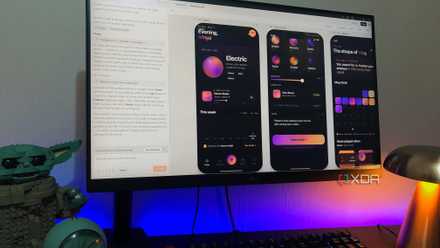
Quant-UX is a free, open-source tool that handles prototyping, user testing, and analytics in the same place. It runs in the browser so you can sign up and start working without installing anything. There's also the option to self-host it if you'd rather run it on your own server, but the hosted version is likely what most people will use, and it's the same tool either way. It's been around longer than I realised - development started back in 2017.
The core idea is that you build interactive prototypes, share them via a link, and get actual usage data back from whoever tests it. So instead of just designing screens, you're designing something testable. There's an Examples section with working templates - shopping flows, login screens, dashboards, that kind of thing - which is genuinely useful if you're the type who freezes at a blank canvas (this is me). And it has the usual design system features like tokens, master screens, and reusable components, plus a built-in AI assistant with BYOK. If you've got existing work in Figma, you can import it too, so you're not starting from zero (but keep in mind it flattens all layers, so it'll be for reference only, not editing continuation).
The interesting thing about Quant-UX is that it leans into the UX research side of things more than anything. Normally, you'd combine a tool like Maze with Figma for user testing, but Quant-UX actually has it baked in already.
I started using Claude Design and haven't opened Adobe or Figma since
A design tool that lives where I already work
The design canvas is a smidge underwhelming
But it's more than workable
I won't lie, when I first tried out the design canvas I felt a little underwhelmed. The feature set is about half of what I'm used to seeing in a UI/UX design tool. You get the essentials - shapes, text, images, basic alignment, position and size controls, constraints, borders, simple effects like shadow and blur, and a layers panel - but a lot of the deeper controls you'd reach for in something like Figma or Penpot just aren't there. The typography controls are pretty thin, the pre-made elements list is quite short, and it lacks advanced vector editing.
That said, once I actually started building, I realised I wasn't reaching for the missing stuff as much as I expected to. The canvas covers enough ground for me to put together real screens and what it lacks in design depth it pretty much makes up for everywhere else...
Prototyping and testing actually go together
This is where Figma falls short
The biggest selling point of Quant-UX is the prototyping. In Figma, prototypes are basically click-throughs of static frames. A dropdown is a hotspot that jumps to another frame where you drew it open, and inputs don't accept typing. In Quant-UX, the widgets are real - inputs accept text, dropdowns actually open, modals overlay properly, and state can persist across screens. For example, a cart counter going from 0 to 1 after clicking Buy is one action in Quant-UX. In Figma it'd be a separate frame for every cart state.
You can also run form validation and conditional logic, so when a tester moves through the prototype, what they're using behaves much closer to a real product than a slideshow of screens. Figma actually doesn't have native user testing implemented this way, not even on the paid tier. You can plug in third-party tools like Maze, and there's a UserTesting Figma plugin too, but those are all paid platforms layered on top.
Quant-UX bakes the whole loop in. You define your tasks upfront, share the prototype link with testers, and Quant-UX records every session - clicks, time on screen, where they got stuck, and so on. There's also A/B testing built in if you want to compare two versions side by side.
Score Software & AI Deals for Design Tools and Subs
The data side is where the heatmaps come in. Quant-UX automatically pulls everything from those test sessions into an analytics canvas, and you can see this data through click heatmaps showing where people tapped. There are also view heatmaps showing which screens got seen at all, dwell time per screen, success rates per task, and the merged user journey so you can see the common paths versus the outliers. You can also pull up individual screen recordings to watch sessions back.
So you're not just replacing Figma here, you're replacing Figma plus Maze with one tool, and the analytics show up attached to the actual prototype rather than in a separate dashboard you have to switch to. There's no built-in tester recruitment, so you're bringing your own people to the test.
I tried Claude Design, Replit, and Figma Make for UI design, and one pulled miles ahead
Same prompt, three very different vibe-coding tools
Closer to a real product than Figma gets you
I think the design canvas can get a little more love, but everything else Quant-UX gives you is genuinely impressive, especially the prototyping and testing combo that you'd usually have to pay for across two separate tools. As a design learner, having this entire research part of the design process for free is hard to overstate.