 |
VOOZH | about |
|
VOOZH | about |
A core aspect of a great web experience is dynamic functionality. Dynamic functionality includes user actions that change websites and applications’ behavior, appearance, or content. Some examples include changing a button’s background color on hover, adding a border to an input field on focus, switching between light and dark mode, and changing the color of a nav link when active. These subtle micro-interactions significantly improve the UX of the products we build. In this article, we will learn how to add dynamic styles and class names to elements in Vue.js. Let’s get started.
👁 How to add dynamic styling and class names in Vue.jsJump ahead:
tabsThe Replay is a weekly newsletter for dev and engineering leaders.
Delivered once a week, it's your curated guide to the most important conversations around frontend dev, emerging AI tools, and the state of modern software.
A basic knowledge of Vue.js and CSS is required to follow along with this article. It’s important to note that this is not a beginner article on how to style Vue.js applications. Instead, this article focuses on how to add dynamic styles to Vue applications. Now, when it comes to styling Vue.js components, different options exist; let’s explore them.
This method is helpful in scenarios where we want to apply the same styles across all the components of our application. One example is when we want all <p> elements to have the same style. To achieve this, we can attach the styles to the <style> tag in the root component, the App.vue file. Alternatively, we can also achieve this by importing a global style sheet into the entry point for our application, the main.js file.
While using inline styles is generally frowned upon, it is also a styling method we can explore. It involves applying the styles we want directly to the style attribute of HTML elements.
The array syntax involves defining distinct styles, like border-style and text-style objects. These objects are then passed into an array, which we dynamically bind to the target element via Vue’s :style binding. This is an excellent method to use in cases where we want to group styles into different categories.
This method is similar to inline CSS styling. However, with this method, the styles are wrapped in an object. Also, instead of using the HTML style attribute, object syntax uses the :style binding. To learn more about the different ways to style Vue.js applications, check out our guide to styling a Vue.js application using CSS.
Dynamic styling involves creating styles that change based on user input and actions. Dynamic styles are important because they give users useful visual cues that help them understand how the state of their application has changed. A common example of dynamic styling is seen in form fields. When a user clicks a form field, the border or outline of the file changes, making it easier for the user to detect which input is in focus. Another example is form submission errors. When a user submits a form with errors, the affected inputs usually have a red border applied to them, and the error message is also displayed in red.
This dynamic style makes it easier for the user to spot where the error is and make the necessary correction. It would be frustrating to use applications if their styles were not dynamic and if the styles did not change in response to users’ actions. Dynamic styles are important because they greatly improve the usability of applications.
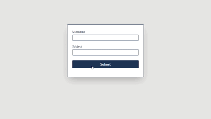
The first demo will cover how to apply dynamic classes to form. When a user submits the form, an error message will appear. The message will have a red color applied to it, and the input field with the error will have a red border. The GIF below shows the dynamic styles we will create:
👁 Adding Dynamic Classes in Vue.js Apps
Let’s start with creating the validation logic for the form:
<script type="text/javascript">
export default {
 data() {
 return {
 errors: {},
 username: null,
 subject: null,
 };
 },
 methods: {
 validateForm(e) {
 this.errors = {};

 //check if username is empty
 if (!this.username) {
 this.errors.username = "Username is required";
 }

 //check if subject is empty
 if (!this.subject) {
 this.errors.subject = "Subject is required";
 }

 e.preventDefault();
 },
 },
};
</script>
We begin setting up the validation logic by defining three states: errors, username, and subject. The errors is an object that will hold any input field errors while username and subject will hold the values of the inputs.
Next, we create a validateForm method, which checks the form for any errors when the user submits. The method checks if any of the fields are empty, and if they are, it populates the errors state with the appropriate error message. Now, let’s define the HTML structure for the form and pass in the logic we created:
<template>
 <div class="container">
 <form @submit="validateForm">
 <div class="formRow">
 <label>Username</label>
 <input
 :class="errors.username && 'input-error'"
 type="text"
 name="username"
 v-model="username"
 />
 <span v-if="errors.username" :class="errors.username && 'error'">{{
 errors.username
 }}</span>
 </div>
 <div class="formRow">
 <label >Subject</label>
 <input
 :class="errors.subject && 'input-error'"
 type="text"
 name="subject"
 v-model="subject"
 />
 <span v-if="errors.subject" :class="errors.subject && 'error'">{{
 errors.subject
 }}</span>
 </div>
 <div class="formRow">
 <button>Submit</button>
 </div>
 </form>
 </div>
</template>
Here, we pass validateForm to the form’s submit handler. There are two input fields, username and subject, and two dynamic styles. The first style is attached to the input-error class, giving the input fields a red border if they have errors. The second style is attached to the error class, giving the error message a red color.
When any fields have errors, we dynamically attach the input-error class to them. We also conditionally display the error message for the respective fields and dynamically apply the error class to the message. Here are the CSS classes we used to style the form dynamically:
.input-error {
 border-color: #e63946;
}
.error {
 color: #e63946;
 font-size: 1rem;
 margin-top: 0.3rem;
}
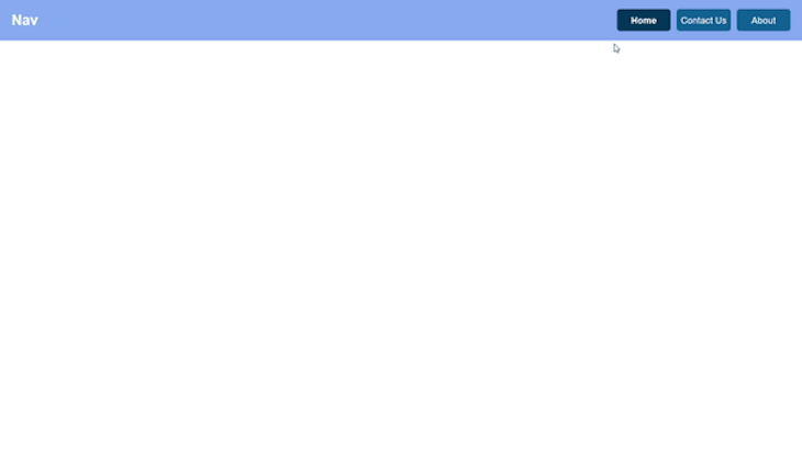
tabsThe next demo is one where the styles of tab components will change when someone clicks any of the tabs. The GIF below shows the desired effect we want to create:
👁 Employing Dynamic Style Tabs in Vue.js
Let’s see how to implement this in code:
<script>
export default {
 data() {
 return {
 isHomeActive: true,
 isContactUsActive: false,
 isAboutActive: false,
 };
 },
 methods: {
 selectTab(tab) {
 this.isHomeActive = false;
 this.isContactUsActive = false;
 this.isAboutActive = false;

 switch (tab) {
 case "Home":
 this.isHomeActive = true;
 break;
 case "Contact Us":
 this.isContactUsActive = true;
 break;
 case "About":
 this.isAboutActive = true;
 break;
 default:
 break;
 }
 },
 },
};
</script>

<template>
 <main>
 <body id="app-body">
 <section class="nav-bar">
 <h1 class="title">Nav</h1>
 <ul class="tabs-list">
 <li
 @click="selectTab('Home')"
 :class="isHomeActive ? 'active tab-item' : 'tab-item'"
 >
 Home
 </li>
 <li
 @click="selectTab('Contact Us')"
 :class="isContactUsActive ? 'active tab-item' : 'tab-item'"
 >
 Contact Us
 </li>
 <li
 @click="selectTab('About')"
 :class="isAboutActive ? 'active tab-item' : 'tab-item'"
 >
 About
 </li>
 </ul>
 </section>
 </body>
 </main>
</template>
Let’s break down the code above. The isHomeActive, isContactUsActive, and isAboutActive variables will track which tab is active and which isn’t. The selectTab(tab) method is responsible for updating the state of the tabs when we click any of them. We passed the selectTab method to the click event of the different tabs.
Lastly, we dynamically style the tabs if any of them are active. When a tab is active, we apply the active class to it. Otherwise, we apply the tab-item class. Here’s the corresponding CSS for the styles:
.active {
 font-weight: 600;
 background-color: rgb(1, 54, 89);
}

.tab-item {
 display: flex;
 justify-content: center;
 align-items: center;
 width: 31%;
 color: white;
 background-color: rgb(11, 93, 148);
 border-radius: 6px;
}
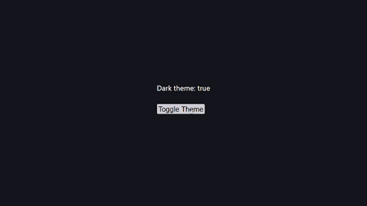
Adding dynamic themes to applications is a common trend in websites and web applications. Let’s see how to add dark mode in this demo. We’ll use the useDark and useToggle composition utilities from VueUse to set it up:
Let’s see how this works in code:
<script setup>
import { useDark, useToggle } from "@vueuse/core";
const isDark = useDark();
const toggleDark = useToggle(isDark);
</script>

<template>
 <div>
 <p>Dark theme: {{ isDark }}</p>
 <button @click="toggleDark()">Toggle Color Mode</button>
 </div>
</template>

<style>
.dark {
 background: #16171d;
 color: #fff;
}
</style>
Here, we started by importing useDark and useToggle from vueuse/core. useDark is a reactive dark mode Hook that stores our chosen preference in local storage while useToogle is a Boolean switcher. We used useDark to create a dark mode state and useToggle to toggle the theme. After that, we passed the toggleDark() function to the button’s click event handler.
Notice that we don’t explicitly apply the
darkclass to the component, yet it works. This is becauseuseDarkautomatically applies it for us.
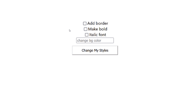
For the last demo, we will create a button and update its styles based on the state of some checkboxes. The GIF below shows what we will build:
👁 Examples of Styles Available for the Vue.js App
Let’s set up the variables for the different styles:
<script>
export default {
 name: "App",
 data() {
 return {
 showBorder: false,
 boldFont: false,
 italicFont: false,
 bgColor: "",
 };
 },
};
</script>
Here, we set up some variable styles. The showBorder variable toggles the button’s border. The boldFont variable toggles the button’s boldness. The italicFont variable toggles the button’s font. Lastly, the bgColor variable changes the button’s background color. With the style variables ready, let’s work on the HTML structure and add the dynamic classes:
<template>
 <div id="app">
 <!-- border input -->
 <div>
 <input
 type="checkbox"
 id="showBorder"
 name="showBorder"
 v-model="showBorder"
 />
 <label for="showBorder">Add border</label><br />
 </div>

 <!-- bold input -->
 <div>
 <input type="checkbox" id="boldFont" name="boldFont" v-model="boldFont" />
 <label for="boldFont">Make bold</label><br />
 </div>

 <!-- italic input -->
 <div>
 <input
 type="checkbox"
 id="italicFont"
 name="italicFont"
 v-model="italicFont"
 />
 <label for="italicFont">Italic font</label><br />
 </div>

 <!-- background color input -->
 <div>
 <input type="text" v-model="bgColor" placeholder="change bg color" />
 </div>

 <!-- button -->
 <button
 :class="[
 'btn-bg',
 showBorder ? 'btn-border' : '',
 italicFont ? 'btn-italic' : '',
 boldFont ? 'btn-bold' : '',
 ]"
 >
 Change My Styles
 </button>
 </div>
</template>
Here, we used the style variables we created earlier to set up v-models for the input fields. This means that the value of the variables will be updated based on the value of the inputs. Next, we conditionally applied the btn-border, btn-italic, and btn-bold classes to the button based on the value of their respective variables. Lastly, we applied the btn-bg class to the button. While its value is dynamic and will come from the text input‘s value, it is not a conditional class like the others.
Here’s the corresponding CSS for the styles:
<style>
.btn-border {
 border: 2px solid blue;
}
.btn-italic {
 font-style: italic;
}
.btn-bold {
 font-weight: bold;
}
.btn-bg {
 background-color: v-bind("bgColor");
}
</style>
In this article, we’ve explored how to dynamically style Vue.js applications to help us create unique user experiences. Editing the appearance and behavior of our applications goes a long way toward improving the usability of our applications.
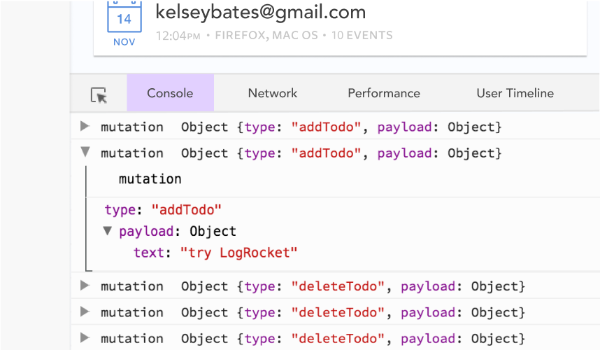
Debugging Vue.js applications can be difficult, especially when users experience issues that are difficult to reproduce. If you’re interested in monitoring and tracking Vue mutations and actions for all of your users in production, try LogRocket.
👁 LogRocket Dashboard Free Trial BannerLogRocket lets you replay user sessions, eliminating guesswork by showing exactly what users experienced. It captures console logs, errors, network requests, and pixel-perfect DOM recordings — compatible with all frameworks.
With Galileo AI, you can instantly identify and explain user struggles with automated monitoring of your entire product experience.
Modernize how you debug your Vue apps — start monitoring for free.
Build dynamic LLM routing in Next.js with OpenRouter, TanStack AI, task classification, model fallbacks, and cost-aware routing.
TSRX adds first-class control flow, conditional hooks, and scoped styles to React via a TypeScript compiler extension — no new framework required.
Learn how to build a full React Native auth system using Better Auth and Expo — with email/password login, Google OAuth, session persistence, and protected routes.
Compare the top AI development tools and models of June 2026. View updated rankings, feature breakdowns, and find the best fit for you.
Would you be interested in joining LogRocket's developer community?
Join LogRocket’s Content Advisory Board. You’ll help inform the type of content we create and get access to exclusive meetups, social accreditation, and swag.
Sign up now