 |
VOOZH | about |
|
VOOZH | about |
This article was published as a part of the Data Science Blogathon
Seaborn is a Python data visualization library based on the Matplotlib library. It provides a high-level interface for drawing attractive and informative statistical graphs. Here in this article, we’ll learn how to create basic plots using the Seaborn library. Such as:
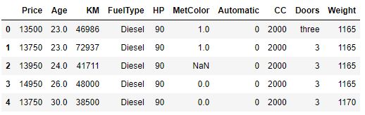
Here I’m going to use the dataset called Toyota Corolla, which is a cars dataset. You can find the dataset here. Here’s the head of the dataset-
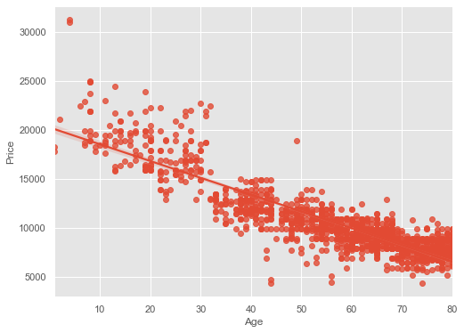
Scatter plots can be used to show a linear relationship between two or three data points using the seaborn library. A Scatter plot of price vs age with default arguments will be like this:
plt.style.use("ggplot")
plt.figure(figsize=(8,6))
sns.regplot(x = cars_data["Age"], y = cars_data["Price"])
plt.show()
Here, regplot means Regression Plot. By default fit_reg = True. It estimates and plots a regression model relating the x and y variable.
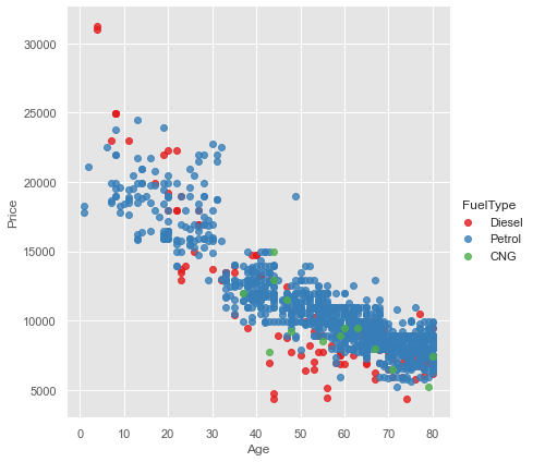
Age and Price are 2 numerical variables so, what if you want to add one more categorical variable. Let’s say you have a Scatter Plot of price vs age column and you want to do it by fuel type. So for that, you have to use a parameter called hue, including other variables to show the fuel types categories with different colors. So there is a function in seaborn libraries called lmplot this helps us to add another categorical variable in the numerical variables Scatter Plot.
sns.lmplot(x='Age', y='Price', data=cars_data,
 fit_reg=False,
 hue='FuelType',
 legend=True,
 palette="Set1",height=6)
We need to put the legend = True, to know which FuelType is which colorand palette, that is color scheme. We use “Set1” as a palette here.
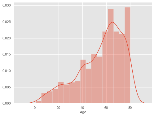
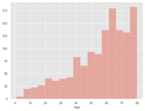
In order to draw a histogram in Seaborn, we have a function called distplot and inside that, we have to pass the variable which we want to include. Histogram with default kernel density estimate:
plt.figure(figsize=(8,6))
sns.distplot(cars_data['Age'])
plt.show()
For the x-axis, we are giving Age and the histogram is by default include kernel density estimate (kde). Kernel density estimate is the curved line along with the bins or the edges of the frequency of the Ages. If you want to remove the Kernel density estimate (kde) then use kde = False.
plt.figure(figsize=(8,6))
sns.distplot(cars_data['Age'],kde=False)
plt.show()
After that, you got frequency as the y-axis and the age of the car as the x-axis.
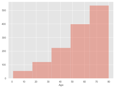
If you want to organize all the different intervals or bins, you can use the bins parameter on the distplot function. Let’s use bins = 5 on the distplot function. It will organize your bins into five bins or intervals.
plt.figure(figsize=(8,6))
sns.distplot(cars_data['Age'],kde=False,bins=5)
plt.show()
Now you can say that from age 65 to 80 we have more than 500 cars.
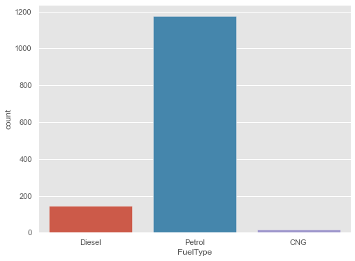
Bar plot is for categorical variables. Bar plot is the commonly used plot because of its simplicity and it’s easy to understand data through them. You can plot a barplot in seaborn using the countplot library. It’s really simple. Let’s plot a barplot of FuelType.
plt.figure(figsize=(8,6))
sns.countplot(x="FuelType", data=cars_data)
plt.show()
In the y-axis, we have got the frequency distribution of FuelType of the cars.
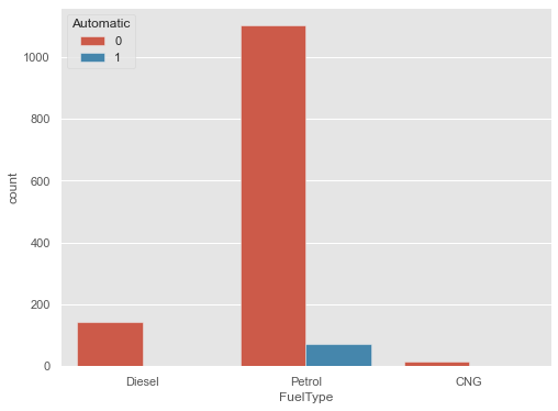
We can plot a barplot between two variables. That’s called grouped barplot. Let’s plot a barplot of FuelType distributed by different values of the Automatic column.
plt.figure(figsize=(8,6))
sns.countplot(x="FuelType", data=cars_data,
 hue="Automatic")
plt.show()
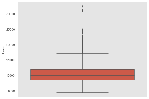
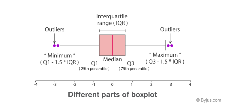
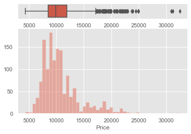
Box and whiskers plots are used for analyzing the detailed distribution of a dataset. Let’s plot Box and whiskers plot of the Price column of the dataset to visually interpret the “five-number summary”. Five Number Summary includes minimum, maximum, and the three quartiles(1st quartile, median and third quartile).
plt.figure(figsize=(8,6))
sns.boxplot(y=cars_data["Price"])
plt.show()
Here, IQR is interquartile range:
IQR = Q3-Q1
Anything above the whiskers is called Outliers. Outlier or extreme values lies above 1.5 times the median values.
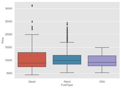
Boxplot for Price of the cars for various FuelType
plt.figure(figsize=(8,6))
sns.boxplot(x=cars_data["FuelType"],
 y=cars_data["Price"],
 )
plt.show()
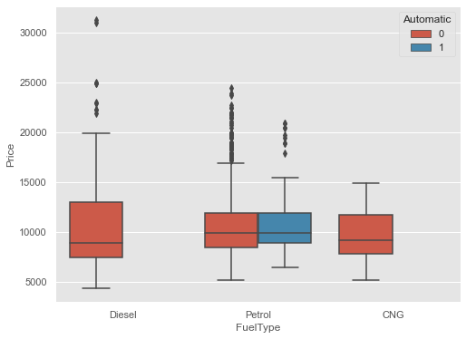
Grouped box and whiskers plot of Price vs FuelType and Automatic
plt.figure(figsize=(8,6))
sns.boxplot(x="FuelType",
 y="Price",
 data=cars_data,
 hue="Automatic"
 )
plt.show()
Higher upper Whiskers means we have more number of cars which have a higher price.
Let’s plot box and whiskers plot and histogram on the same window. First, we need to split the plotting window into two parts. For that:
f, (ax_box,ax_hist) = plt.subplots(2, gridspec_kw={"height_ratios":(.15,.85)})
Here, we pass 2 as the number of windows we want to create.
Let’s now create two plots on the same window:
f, (ax_box,ax_hist) = plt.subplots(2, gridspec_kw=
 {"height_ratios":(.15,.85)})
sns.boxplot(cars_data["Price"], ax=ax_box)
sns.distplot(cars_data["Price"], ax=ax_hist, kde=False)
plt.show()
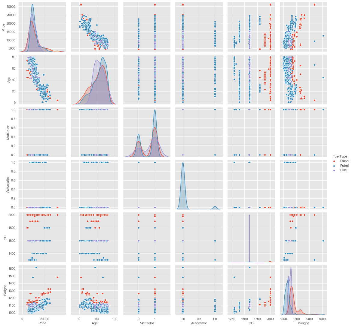
A pair plot is used to plot pairwise relationships between columns in a dataset. Create scatterplots for joint relationships and histograms for univariate distribution or relationships. It will show the relationship between all the different variables in a particular dataset. In a pair plot, we can pass hue as a parameter. hue is the parameter on which we want to calculate the pairwise plot. Let’s plot a pair plot by passing FuelType as a hue. Here hue = FuelType because we want to do this pairwise plot by using FuelType on all the rest of the columns.
Here we can see scatter plot and histogram is plotted. Scatter plot is the default in pair plot. And Histogram is plotted when there is the same variable in both the x-axis and y-axis. When we get the same variable in both the x-axis and y-axis we get a histogram which is a univariate distribution, “uni” means only one and for histogram, we get only one variable in both the x-axis and y-axis.
I hope you enjoyed the article. If you have anything to know related to the article, feel free to ask me in the comment section.
Currently, I am pursuing my bachelor’s in Computer Science, and I am very enthusiastic about Machine Learning, Deep Learning, and Data Science.
I am an undergraduate student, studying Computer Science, with a strong interest in data science, machine learning, and artificial intelligence. I like diving into data in order to uncover trends and other useful information.
GPT-4 vs. Llama 3.1 – Which Model is Better?
Llama-3.1-Storm-8B: The 8B LLM Powerhouse Surpa...
A Comprehensive Guide to Building Agentic RAG S...
Top 10 Machine Learning Algorithms in 2026
45 Questions to Test a Data Scientist on Basics...
90+ Python Interview Questions and Answers (202...
8 Easy Ways to Access ChatGPT for Free
Prompt Engineering: Definition, Examples, Tips ...
What is LangChain?
What is Retrieval-Augmented Generation (RAG)?
Edit
Resend OTP
Resend OTP in 45s