 |
VOOZH | about |
|
VOOZH | about |
Advanced Exploratory Data Analysis (EDA) helps in understanding the structure and characteristics of a dataset before applying machine learning models. It involves analysing data to discover patterns, detect anomalies and study relationships between variables. This analysis provides insights that help in preparing the data for further modeling and analysis.
Descriptive statistics give us a clear picture of the distribution, spread and central tendency of the data. These measures allow us to summarize the data in ways that make it easier to analyze and interpret. Below are some essential descriptive statistics used in EDA:
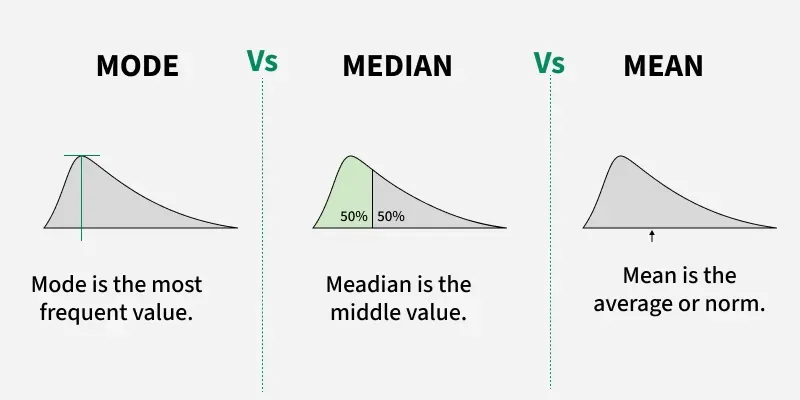
The mean is the average of the data points, calculated by summing all values and dividing by the total number of observations.
Example: If we want to understand the average monthly sales of a store over the course of a year, we would calculate the mean sales to see the typical revenue generated each month.
The median is the middle value of the dataset when arranged in ascending order. It is robust to outliers, meaning that extreme values do not significantly affect the median.
Example: In a dataset of household incomes, where a few individuals have very high incomes, the median provides a better representation of the typical household income than the mean would.
The mode is the most frequent value or category in the dataset.
Example: A company might want to know which product was sold the most during a promotional campaign. By calculating the mode, they can easily identify the most frequent product sold.
Standard deviation measures the amount of variation or dispersion from the mean. A low standard deviation means the data points are close to the mean, while a high standard deviation indicates a greater spread of data points.
Example: If an e-commerce website experiences major traffic spikes on certain days, the standard deviation will indicate how much the daily traffic varies from the average, helping to identify whether the site’s traffic is consistent or highly variable.
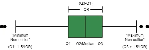
The IQR is the difference between the 75th percentile (Q3) and the 25th percentile (Q1) of the data. It represents the spread of the middle 50% of the data and is helpful for identifying outliers.
Example: In a class of students, if we want to focus on the range of scores that represent the middle 50% of students and exclude extreme values (such as a few students who scored abnormally high or low), we would use the IQR.
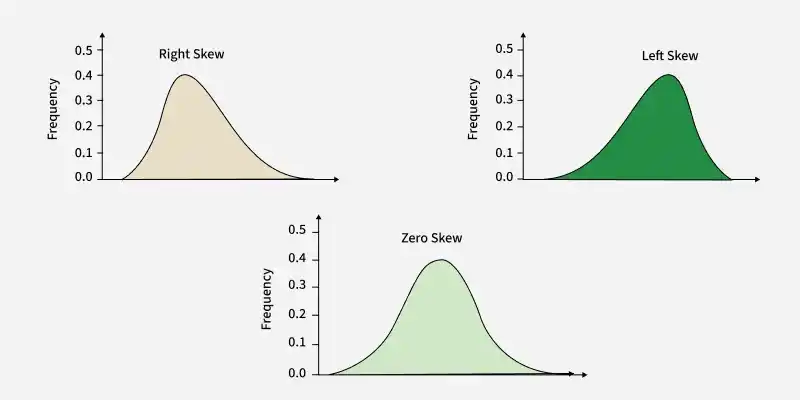
Skewness measures the asymmetry of the data distribution. It indicates whether the data leans toward the right (positive skew) or left (negative skew). In simple terms, it tells us whether the data is more on one side than the other.
Example scenario: A retail analyst might use skewness to analyze monthly sales data for a product. If the data is skewed (e.g., higher sales during holiday periods), the analyst may decide to use a log transformation to stabilize variance before applying machine learning models.
Kurtosis measures the tailedness of a distribution, indicating whether data has heavy or light tails compared to a normal distribution. High kurtosis suggests more extreme outliers, while low kurtosis indicates fewer extreme values.
Example scenario: A risk manager analyzing daily stock returns might calculate kurtosis to identify potential for extreme loss days. If the kurtosis is high, the manager might use techniques to account for those outliers, such as robust statistics or adjusting risk models to reflect the volatility.
Visualization is a critical step in EDA, as it helps to identify patterns, trends and anomalies in the data. Selecting the right type of visualization is crucial to gaining meaningful insights.
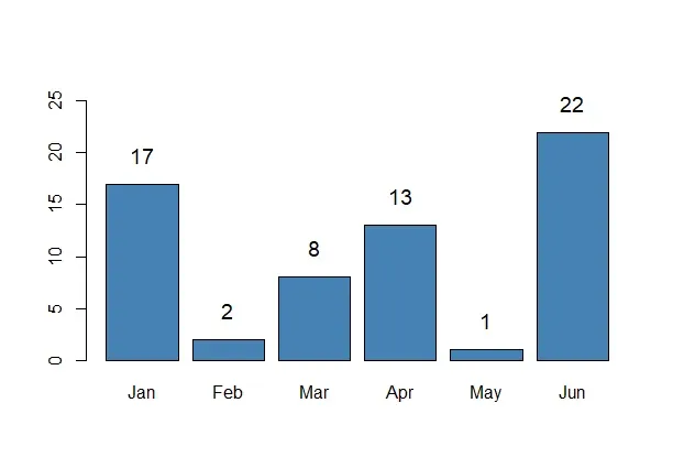
A bar plot displays the frequency or proportion of categories in categorical data, helping to compare the size of different categories.
Example scenario: A marketing department might use a bar plot to compare the number of purchases across different product types over a month, helping identify which product lines are most successful.
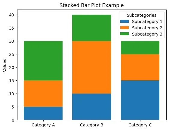
A stacked bar chart shows the composition of categories, broken down into sub-categories. It helps to understand the proportion of each sub-category within a main category.
Example scenario: A regional sales manager might use a stacked bar graph to break down product sales by region, enabling better strategic decision-making based on the regional performance of each product line.
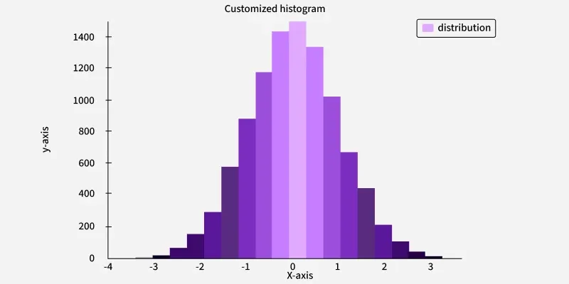
Histograms show the distribution of continuous data by grouping the data into bins. The height of each bar represents the number of data points in each bin.
Example scenario: A website could use a histogram to analyze the distribution of time spent on the site by visitors, helping identify trends such as how long users typically stay before leaving.
Box plots provide a graphical summary of the minimum, first quartile (25th percentile), median (50th percentile), third quartile (75th percentile) and maximum values of a dataset. They also help identify potential outliers.
Example scenario: A real estate analyst might use a box plot to show the variation in home prices by region, helping identify markets that may be more volatile or have high-value properties.
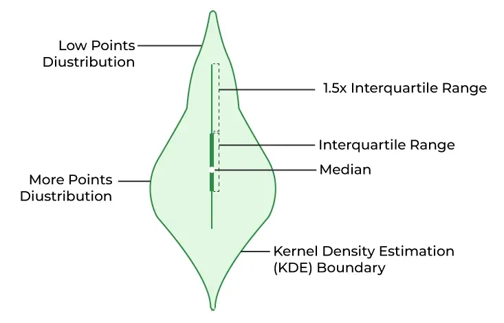
Violin plots combine aspects of both box plots and density plots. They display the distribution of data and its probability density, allowing us to compare distributions and the spread of data more thoroughly.
Example scenario: A healthcare analyst might use a violin plot to compare the distribution of blood pressure readings in different age groups, revealing both the spread and density of the data.
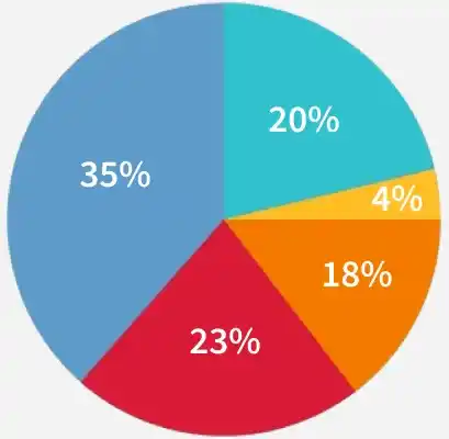
Pie charts show the proportion of a whole, where each segment represents a category's share of the total. They are best used when we want to show simple proportions.
Example scenario: A marketing team might use a pie chart to represent the share of each product category in the total sales helping stakeholders quickly understand the breakdown.
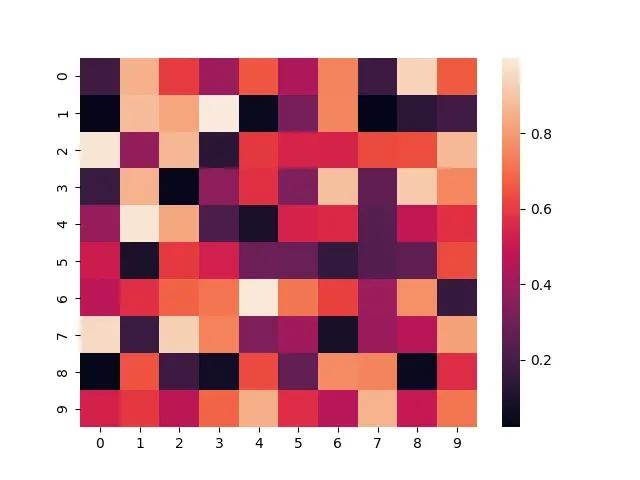
A heatmap is used to display the correlation between numerical features in a dataset. Each cell represents the correlation coefficient between two variables, with color intensity showing the strength of the correlation.
Example scenario: A data analyst working on a customer satisfaction survey might use a correlation heatmap to see how different satisfaction metrics (such as product quality, customer service and delivery time) correlate with overall satisfaction.
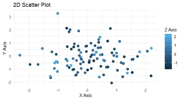
A scatter plot visualizes the relationship between two continuous variables by plotting each data point as a dot on a two-dimensional plane. It’s especially useful for identifying trends or correlations.
Example scenario: A real estate agent could use a scatter plot to compare square footage with price, helping visualize how larger homes tend to be priced higher.
When dealing with multiple features, it’s important to understand how different variables interact with one another. Exploring these interactions can uncover relationships that aren’t obvious when looking at individual variables.
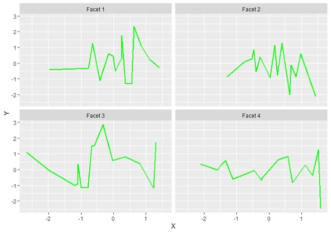
Facet grids split the data into multiple subplots based on a particular feature, allowing us to compare different subsets of the data.
Example: A facet grid might be used to analyze how product sales differ across different seasons. Each facet could show a separate plot for each season, allowing us to see seasonal trends.
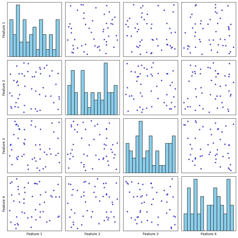
A pair plot creates a grid of scatterplots for every pair of variables in a dataset, which allows us to visualize potential relationships between them.
Example: A pair plot could be used to explore how different variables, like price, customer age and frequency of purchase, relate to each other in an e-commerce dataset.
Outliers are data points that differ significantly from the rest of the data and can distort statistical analyses. Identifying these anomalies is a key part of EDA.
A Z-score measures how many standard deviations a data point is away from the mean, helping us identify outliers in normally distributed data.
Example: A company might use Z-scores to identify unusual sales days that deviate significantly from the average, such as a spike in sales caused by a special promotion.
These machine learning algorithms identify outliers by analyzing data points' distance from others. They work well with high-dimensional data.
Example: An e-commerce platform could use Isolation Forest to detect fraudulent transactions, flagging those that deviate from typical purchase patterns.
Feature engineering is the process of transforming or combining raw data into meaningful features that improve the performance of machine learning models. The goal is to enhance the model’s ability to understand patterns and make more accurate predictions.
Log transformation helps to normalize data that is skewed, especially when the distribution has a large positive skew. It reduces the influence of extreme outliers by compressing large values.
Example: If we have a dataset of household incomes, we might apply a log transformation to make the distribution more symmetric, as incomes are often highly skewed with a few extremely high-income outliers.
Polynomial features create new features by combining existing ones through polynomial terms, such as squares or cubes. This allows linear models to capture non-linear relationships.
Example: If we're predicting house prices and there’s a non-linear relationship between the square footage of a house and its price, adding polynomial features (e.g., square footage squared) can help capture that complexity.
Interaction features are created by combining two or more features to capture the combined effect that they might have on the target variable. These features are valuable when we believe that the impact of one feature depends on the value of another feature.
Example: A retailer could create an interaction feature between age and income to model the likelihood of purchasing high-end electronics. Younger consumers with high incomes might behave differently from older consumers with similar incomes and the interaction term would capture this nuanced relationship.
Dimensionality reduction techniques are essential when working with high-dimensional data, as they help simplify the data while preserving the most important patterns and structure. Reducing the number of features makes it easier to visualize data, remove noise and improve the efficiency of machine learning algorithms.
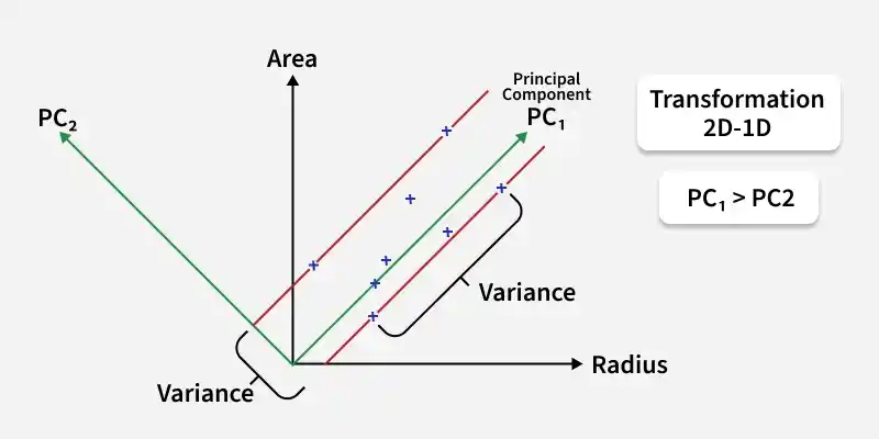
PCA is a linear technique that reduces the dimensionality of data by transforming the original features into a smaller set of uncorrelated features called principal components. These components capture the maximum variance in the data.
Example: In a dataset with a large number of features representing customer behavior in an e-commerce platform, PCA can help reduce the dimensions and create new features (principal components) that capture the main patterns in customer behavior.
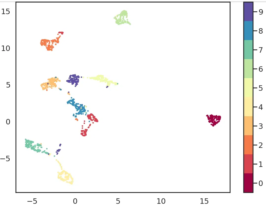
t-SNE is a non-linear dimensionality reduction technique used to visualize high-dimensional data in two or three dimensions by preserving pairwise similarities between data points in a lower-dimensional space.
Example: In a dataset containing features like customer age, income and purchase history, t-SNE could be used to visualize how customers cluster based on purchasing behavior in a two-dimensional plot, helping us identify customer segments.
UMAP is a non-linear dimensionality reduction technique similar to t-SNE, but it is faster and preserves both local and global data structures. It works by constructing a graph of the data and embedding it into a lower-dimensional space while retaining the original structure as much as possible.
Example: A data scientist might use UMAP to visualize the features of customer interactions with an online store, reducing high-dimensional data into two or three dimensions to uncover trends or clusters that might indicate potential marketing strategies.