 |
VOOZH | about |
|
VOOZH | about |
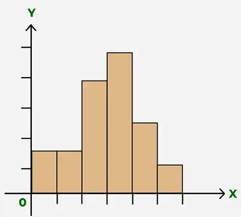
A histogram is a graphical representation used in statistics to show the distribution of continuous numerical data. The data is grouped into class intervals (bins), and the height of each bar shows the frequency of values.
A histogram helps us understand the shape of the data, such as peaks, spread, and whether the data is symmetric or skewed.
There are various variations of the histograms based on their shapes:
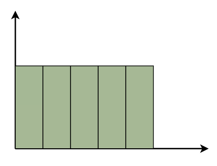
A uniform histogram is a histogram in which all the bars are nearly equal in height, showing that the data is evenly distributed among all class intervals.
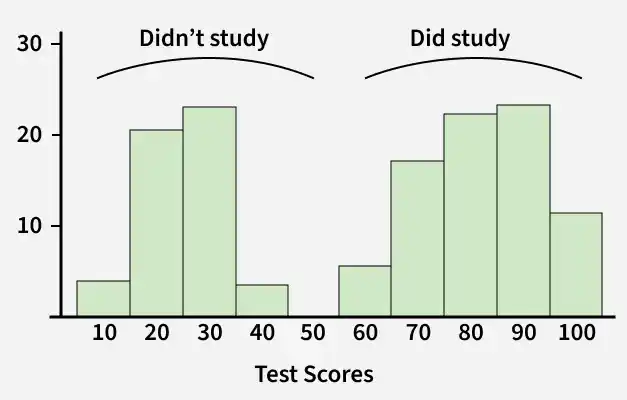
A histogram is called bimodal if it has two distinct peaks. This shows that the data consists of observations from two different groups or categories, and each group has its own centre or pattern of values.
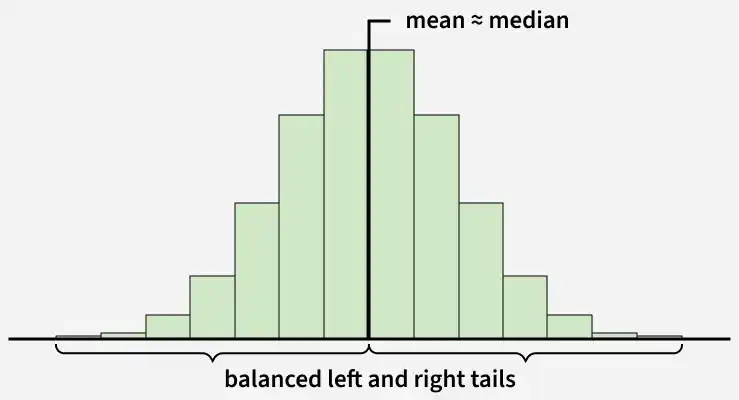
A symmetric histogram is also called a bell-shaped histogram. It is said to be symmetric when a vertical line drawn through the centre divides the histogram into two identical halves. The left and right sides are equal in size and shape, showing a balanced distribution of data.
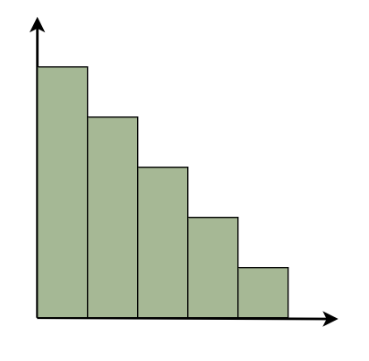
A right-skewed histogram is a histogram in which the bars extend more towards the right side. This means that most of the data values are on the left side, while a few very large values lie on the right.
For example: In a histogram showing family incomes, most families may have lower incomes, but a few very rich families stretch the data towards the right.
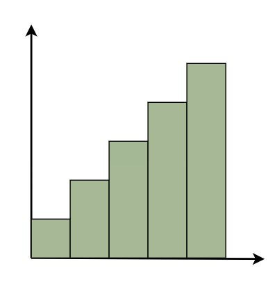
A left-skewed histogram shows bars that extend towards the left side. This means that most of the data values are on the right side, while a few very low values lie on the left.
For example: In a histogram showing test scores, most students may score high marks, but a few students with very low scores stretch the distribution towards the left.
A frequency histogram is a graph that shows how often values occur in a data set. Each bar shows a group of values, and its height shows how many times the values appear.
Example: Let’s say we have the ages of 12 people: Ages: [12, 15, 17, 18, 18, 19, 21, 22, 24, 25, 25, 26]
Frequency Table
Range(Bins) | Frequency |
|---|---|
10-14 | 1 |
15-19 | 4 |
20-24 | 3 |
25-29 | 4 |
A relative frequency histogram is a graph that shows the proportion or percentage of data values in each class interval instead of the exact number. Each bar represents the relative frequency of the data, which helps us understand the distribution pattern easily.
For example: In a class of 20 students, it might show that 25% scored between 70 and 80 marks.
Example: Given the test scores of 10 students:
Scores: 55, 60, 62, 70, 75, 78, 80, 82, 85, 90
The frequency table for the scores is as follows:
Relative Frequency Table
| Interval (Bins) | Frequency | Relative Frequency |
|---|---|---|
50–59 | 1 | 1/10 = 0.10 |
60–69 | 2 | 2/10 = 0.20 |
70-79 | 3 | 3/10 = 0.30 |
80-89 | 3 | 3/10 = 0.30 |
90-99 | 1 | 1/10 = 0.10 |
A cumulative frequency histogram is a graph that shows the total number of observations up to a certain value, with the cumulative frequency increasing as we move along the graph.
Cumulative Frequency Table
The cumulative frequency table below shows the distribution of test scores for 10 students:
| Interval | Frequency | Cumulative Frequency |
|---|---|---|
50-59 | 1 | 1 |
60-69 | 2 | 1 + 2 = 3 |
70-79 | 3 | 3 + 3 = 6 |
80-89 | 3 | 6 + 3 = 9 |
90-99 | 1 | 9 + 1 = 10 |
A cumulative relative frequency histogram is a graph that shows the percentage of data values that fall below a given value, with each bar representing the total of relative frequencies up to that point.
Example: Suppose you have exam scores from 10 students: Scores: 55, 60, 62, 70, 75, 78, 80, 82, 85, 90
| Interval | Frequency | Cumulative Frequency | Relative Frequency | Cumulative Relative Frequency |
|---|---|---|---|---|
50-59 | 1 | 1 | 0.10 | 0.10 |
60-69 | 2 | 3 | 0.20 | 0.30 |
70-79 | 3 | 6 | 0.30 | 0.60 |
80-89 | 3 | 9 | 0.30 | 0.90 |
90-99 | 1 | 10 | 0.10 | 1.00 |
Follow the steps given below to construct a histogram:
A histogram is used in the following situations:
Example 1: Present the following information as a histogram:
Marks | 0-10 | 10-20 | 20-30 | 30-40 | 40-50 |
|---|---|---|---|---|---|
No. of students | 30 | 70 | 40 | 28 | 55 |
Solution:
We take the Marks on the graph's horizontal axis and, based on the first column of the data, set the scale to 1 unit = 10. We pick number of students on the vertical axis of the graph and use the second column of the table to determine the scale: 1 unit = 10. Now we'll create the relevant histogram.
👁 3
Example 2: Present the following information as a histogram:
Marks | 5-10 | 10-15 | 15-20 | 20-25 | 25-30 | 30-35 | 35-40 | 40-45 |
|---|---|---|---|---|---|---|---|---|
No. of students | 10 | 15 | 18 | 26 | 35 | 42 | 54 | 62 |
Solution:
We take the Marks on the graph's horizontal axis and, based on the first column of the data, set the scale to 1 unit = 10. We pick number of students on the vertical axis of the graph and use the second column of the table to determine the scale: 1 unit = 5. Now we'll create the relevant histogram.