 |
VOOZH | about |
|
VOOZH | about |
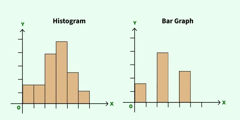
A Bar graph or a Histogram is a tool used for visual representation of data. Representing the data in a bar graphs or histograms, makes it easy to understand the concepts and relationships among data.
A Histogram is used to display the distribution of continuous data by grouping values into intervals, or bins. Whereas, a Bar graph is used to compare discrete categories, with rectangular bars representing the frequency or value of each category.
The pictorial representation of data in groups, either in horizontal or vertical bars where the length of the bar represents the value of the data present on the axis. They (bar graphs) are usually used to display or impart the information belonging to 'categorical data' i.e., data that fit in some category.
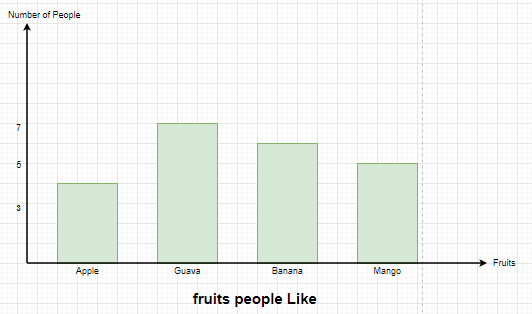
To read a Bar graph, we need to ask questions to ourselves looking at the displayed graph. Let's understand reading a Bar graph through a fundamental example,
Different types of fruits are liked by People,
👁 Bar graphsWhat does the X-axis and Y-axis on the graph are representing?
The X-axis represents the different types of fruits like apple, guava. while Y-axis represents the Number of people.
What is the Common base for the Bars?
The bars are showing a common base of category of fruits.
What is the scale used on the Y-axis?
The scale used is normal, i.e; 1 Unit = 1 person
Overall, what kind of information the bar graph displaying?
The bar graph is displaying the number of People liking different types of fruits.
Looking at the bar Graph, can one answer, how many people like Mango?
Yes, By observing the length of the bar, one can tell that there are 5 people who like Mango.
To compare two sets of data we simply need to compare the heights of the bars that represent that specific data. Also to get the exact value represented by each bar we can look at the value on the y axis corresponding to that height.
The bar with more height represents more value and the bar with less height represents less value.
It can be concluded the following just by looking at the graph:
Histograms are the tools used for graphical representation of data with the help of bars, the heights of the bars may vary due to different data. The histogram is similar to a bar graph, but histogram groups numbers into different ranges. The length of each bar tells how many fall into each range, and it can be decided which ranges are to be used.
It organizes the numbers into groups, or "bins," and shows how many numbers fall into each group with bars. This makes it easy to see patterns, like which numbers appear most often or how the data is spread out.
Feature | Bar Graph | Histogram |
|---|---|---|
Dimensionality | One dimension | Two dimensions |
Representation of frequency | Length of the bars | Area of the bar |
Significance of Bar Width | No special significance | Represents interval or bin |
Spacing between bars | Bars are separated with equal spaces | Bars are touching each other |
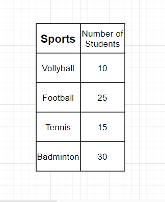
Bar Graph Questions:
Question 1: Draw the Bar Graph for the following table,
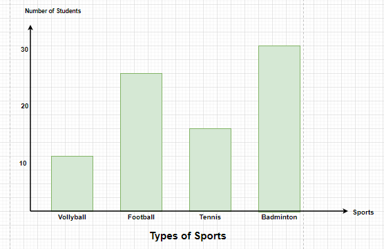
👁 Bar graphsSolution:
The Bar Graph for the following table is,
👁 Bar graphs
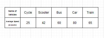
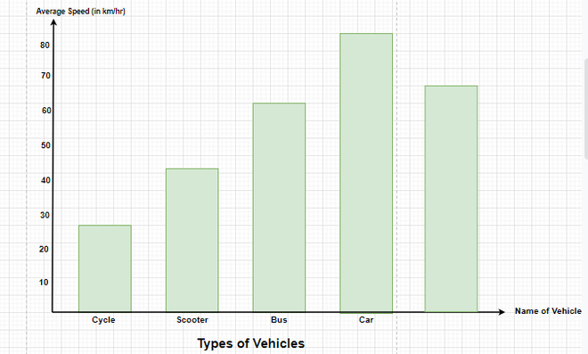
Question 2: The average speed of some vehicles is shown below, Represent it through a bar graph.
👁 Bar graphsSolution:
The average speed mentioned in the table is the frequency that decides the length of each bar graph, therefore, if the graph is vertical, the Average speed will be shown on the y-axis and the types of vehicles will be shown on the x-axis.
👁 Bar graphs
Histogram Questions:
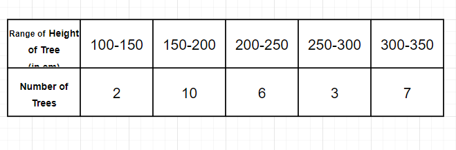
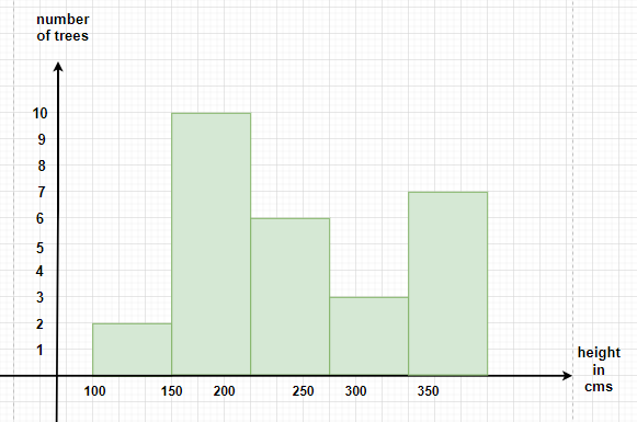
Question 1:In a Park, there are 28 trees of different heights, the heights can be measured in centimeters and the range of the trees lie between 100-350 cm. Draw the Histogram for the following data,
👁 HistogramsSolution:
Since the height of the trees are lying between 100-350, we shall start by marking the heights on x-axis in groups of 50cm each and the number of trees will be mentioned on y-axis.
Therefore, if a tree has a height of 230 cm, it will lie in the rectangle 200-250.
👁 Histograms
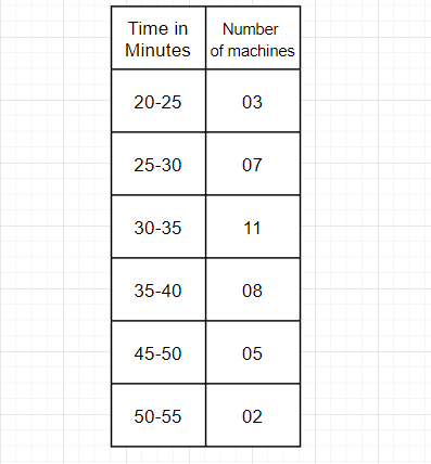
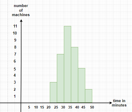
Question 2:In the below-given table, the number of machines working in a factory for their fixed amount of time is shown. Draw the Histogram for the following data.
👁 HistogramsSolution:
The Histogram for the table mentioned above will have class intervals of 5 minutes on x-axis and the number of machines used should be on y-axis
👁 Histograms