Time series data is data indexed in time order, typically collected at regular intervals. It shows how things change at different points, like stock prices every day or temperature every hour.
It is used in industries such as finance, pharmaceuticals, social media and research.
Analyzing and visualizing this data helps us find trends, seasonal patterns and behaviors.
These insights support forecasting and guide better decision-making.
The main goal is to study data in time order to extract meaningful patterns and predictions.
Concepts in Time Series Analysis
Trend: Long-term direction of data (increasing, decreasing, or stable).
Seasonality: Repeating patterns at regular intervals.
Moving average: Smooths short-term fluctuations to highlight trends.
Noise: Random variations without a clear pattern.
Differencing: Computes difference between values at a given interval.
Stationarity: A time series whose statistical properties (mean, variance, autocorrelation) remain constant over time.
Order: The order of differencing refers to the number of times the time series data needs to be differenced to achieve stationarity.
Autocorrelation: Autocorrelation is a statistical method used in time series analysis to quantify the degree of similarity between a time series and a lagged version of itself.
Resampling: Resampling is a technique in time series analysis that is used for changing the frequency of the data observations.
Types of Time Series Data
Time series data is defined by time-based indexing rather than being strictly continuous or discrete. It can contain both continuous and discrete values depending on the dataset.
Continuous Time Series: Data recorded at regular intervals with a continuous range of values like temperature, stock prices, Sensor Data, etc.
Discrete Time Series: Data with distinct values or categories recorded at specific time points like counts of events, categorical statuses, etc.
Visualization Approaches
Use line plots or area charts for continuous data to highlight trends and fluctuations.
Use bar charts or histograms for discrete data to show frequency or distribution across categories.
Practical Time Series Visualization with Python
Let's implement this step by step:
We will be using the stock dataset which you can download from here.
To better understand the trend of the data we will use the resampling method which provide a clearer view of trends and patterns when we are dealing with daily data.
df_resampled = df.resample('ME').mean(numeric_only=True): Resamples data to monthly frequency and calculates the mean of all numeric columns for each month.
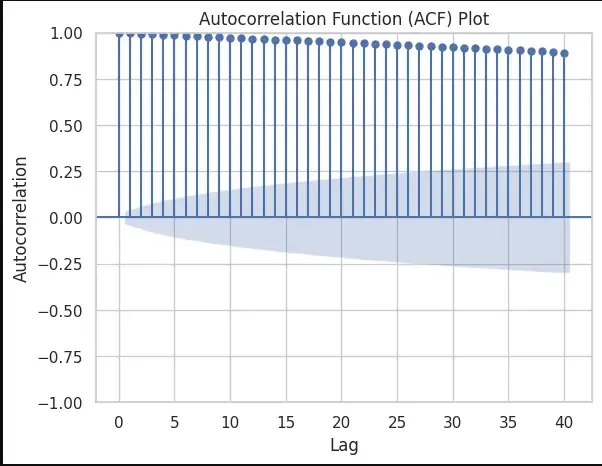
Step 6: Detecting Seasonality with Autocorrelation
We will detect Seasonality using the autocorrelation function (ACF) plot. Peaks at regular intervals in the ACF plot suggest the presence of seasonality.
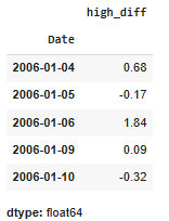
df['High'].diff(): helps in calculating the difference between consecutive values in the High column. This differencing operation is used to transform a time series into a new series that represents the changes between consecutive observations.
This calculates the moving average of the High column with a window size of 120(A quarter), creating a smoother curve in the high_smoothed series. The plot compares the original High values with the smoothed version.
Step 10: Original Data vs. Differenced Data
Printing the original and differenced data side by side we get:
Hence the high_diff column represents the differences between consecutive high values. The first value of high_diff is NaN because there is no previous value to calculate the difference.
As there is a NaN value we will drop that proceed with our test:
Output:
👁 time10 Differences between consecutive high values
