 |
VOOZH | about |
|
VOOZH | about |
Jetpack Compose is a modern toolkit for building native Android UI. Jetpack Compose simplifies and accelerates UI development on Android with less code, powerful tools, and intuitive Kotlin APIs. Compose is built to support material design principles. Many of its UI elements implement material design out of the box. In this article, we will explain how you can create Material design buttons using Jetpack Compose.
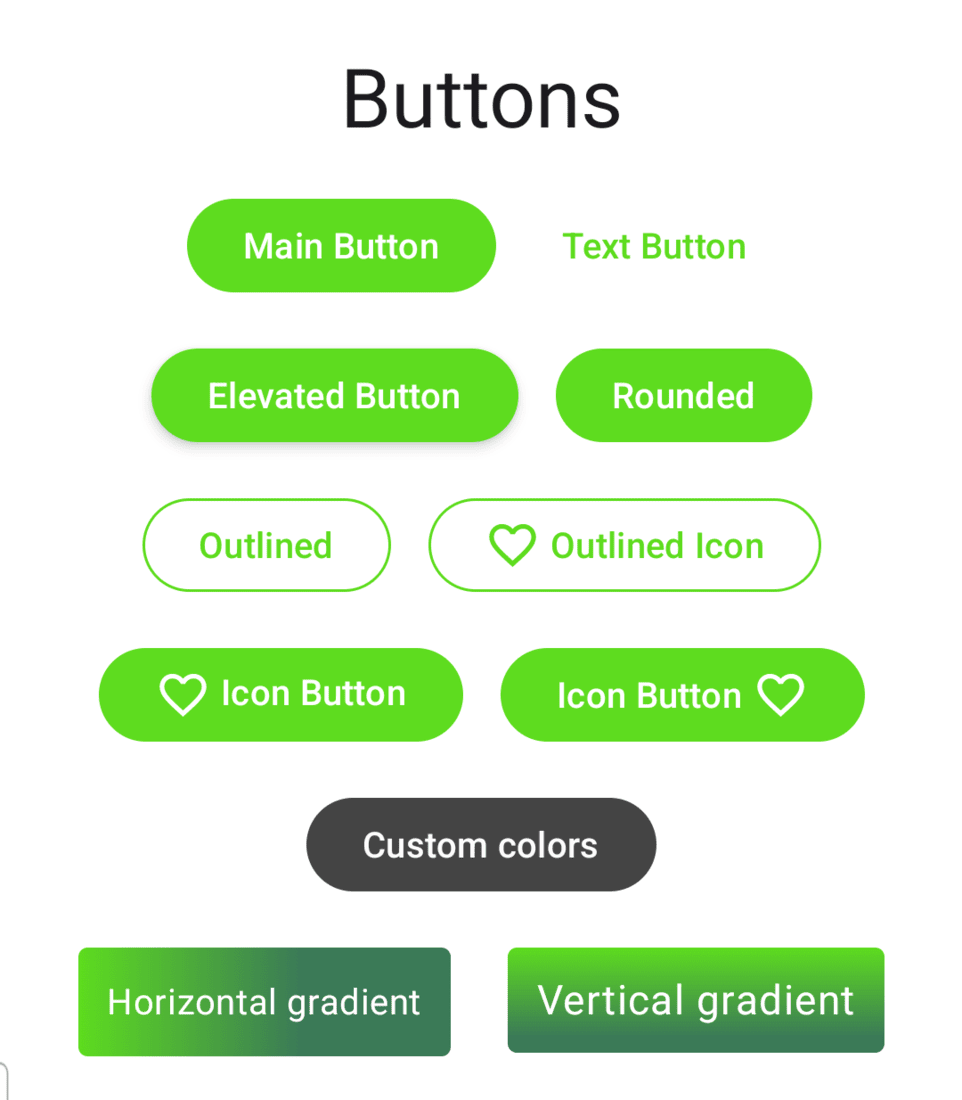
Below is the sample picture to show what we are going to build.
To create a new project in the Android Studio, please refer to How to Create a new Project in Android Studio with Jetpack Compose.
Navigate to app > kotlin+java > {package-name} > ui.theme > Color.kt and add the following color codes at the end.
val Green40 = Color(0xFF5EDC1F)
val GreenGrey40 = Color(0xFF3B7A57)
val Olive40 = Color(0xFF708238)
Note :You may add your own colors. But you need to update that in the Themes.kt as well.
Navigate to app > kotlin+java > {package-name} > ui.theme > Theme.kt and add the following color code under lightColorScheme() and darkColorScheme().
private val DarkColorScheme = darkColorScheme(
 primary = Green40,
 secondary = GreenGrey40,
 tertiary = Olive40
)

private val LightColorScheme = lightColorScheme(
 primary = Green40,
 secondary = GreenGrey40,
 tertiary = Olive40
)
Go to the MainActivity.kt file and refer to the following code. Below is the code for the MainActivity.kt file. Comments are added inside the code to understand the code in more detail.