 |
VOOZH | about |
|
VOOZH | about |
Angular PrimeNG is a UI component library for Angular Applications. It offers many pre-built themes and UI components for a variety of tasks like inputs, menus, charts, Buttons, etc. In this article, we will Angular PrimeNG Drag and Drop Component.
The Drag and Drop directives (pDraggable and pDroppable) apply drag and drop behavior to any element.
Angular PrimeNG Drag and Drop Draggable Attributes:
Angular PrimeNG Draggable Events:
Angular PrimeNG Drag and Drop Droppable Attributes:
Angular PrimeNG Droppable Events:
Syntax:
import {DragDropModule} from 'primeng/dragdrop';// For Dragging <div class="grid"> <div class="col-6" drag-column> <p-table [value]="..." responsiveLayout="..."> <ng-template pTemplate="header"> .... </ng-template> <ng-template pTemplate="body" let-person> .... </ng-template> </p-table> </div> // For Dropping <div responsiveLayout="scroll"> <p-table [value]="..."> <ng-template pTemplate="header"> .... </ng-template> <ng-template pTemplate="body" let-person> .... </ng-template> </p-table> </div> <p-toast [preventOpenDuplicates]="true"></p-toast>
Creating Angular Application and Installing the Module:
Step 1: Create an Angular application using the following command.
ng new appname
Step 2: After creating your project folder i.e. appname, move to it using the following command.
cd appname
Step 3: Finally, Install PrimeNG in your given directory.
npm install primeng --save
npm install primeicons --save
Project Structure: The project Structure will look like this after following the above steps:
Steps to run the application: Run the below command to see the output
ng serve --save
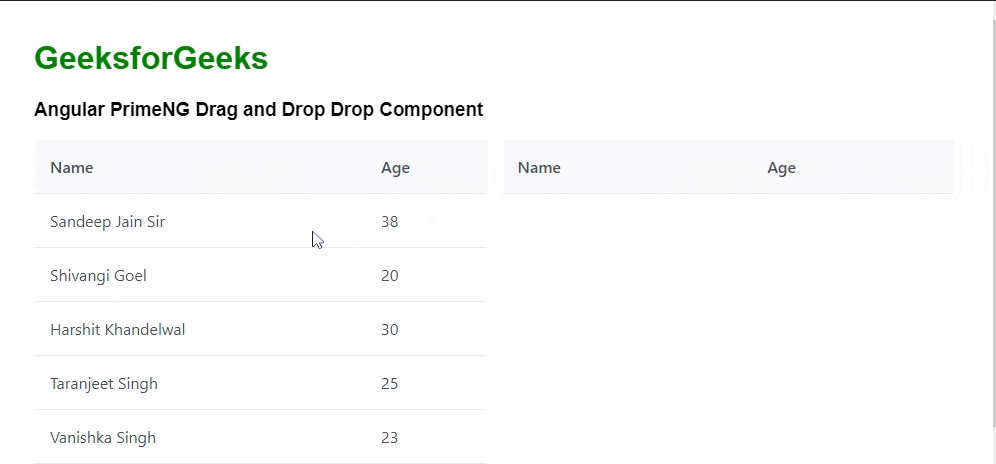
Example 1: The below example illustrates the use of the Angular PrimeNG Drag and Drop Component.
Output:
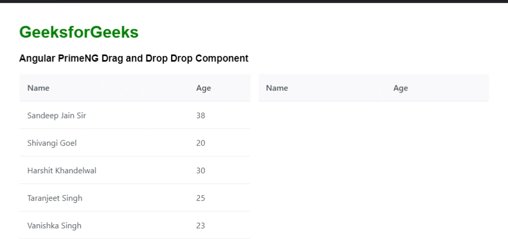
Example 2: Below is another example that illustrates the use of the Angular PrimeNG Drag and Drop Component. Here we have used pDroppableDisabled="true" attribute property to disable the dropping of element.
Output:
Reference: https://www.primefaces.org/primeng/dragdrop