 |
VOOZH | about |
|
VOOZH | about |
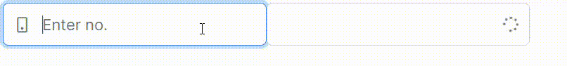
PrimeNG is a popular UI component library for Angular, and it includes a range of customizable components to enhance user experience. One such component is the IconField. It helps in creating input fields with icons like search, loading spinners, or custom SVGs, offering flexibility in how forms and interactive fields are designed.
In this article, we’ll explore how to implement and use the IconField component from PrimeNG.
The IconField component in PrimeNG is a wrapper that allows you to combine an input field with an icon. This component enhances user interaction by adding visual icons, such as search icons, loading spinners, or other custom icons, within the input field. It is especially useful for search bars, password inputs (with "show/hide" eye icons), and any field that could benefit from a graphic hint.
Syntax:
<p-iconField iconPosition="">
 <p-inputIcon styleClass="" />
 <input type="text" />
</p-iconField>
IconField, InputIcon, and InputText are components in PrimeNG that manage different user interface elements associated with input fields and icons.
The purpose of the IconFieldModule is to manage fields in which data is represented or interacted with using icons. It offers a simple method for incorporating icons into form fields and other input elements.
Features: Enables icons to be added to text fields and other interactive components to offer more functionality or context.
The primary function of the InputIconModule is to integrate icons with input fields. This module lets you insert icons within of input fields; these symbols are typically used to give a visual cue as to what kind of input is requested (for example, a search icon inside of a search box).
Features: Allows for the integration of icons into input components and can be customized to blend in with the application's general look.
The purpose of the InputIconModule is to construct basic text input fields using the InputTextModule. It offers a uniform method for adding text input elements to forms and other application components.
Features: Manages text input, including formatting, validation, and placeholders, among other configurations.
If you haven’t installed Angular CLI yet, install it using the following command
npm install -g @angular/cling new style
cd style
"dependencies": {
 "@angular/animations": "^18.0.0",
 "@angular/common": "^18.0.0",
 "@angular/compiler": "^18.0.0",
 "@angular/core": "^18.0.0",
 "@angular/forms": "^18.0.0",
 "@angular/platform-browser": "^18.0.0",
 "@angular/platform-browser-dynamic": "^18.0.0",
 "@angular/platform-server": "^18.0.0",
 "@angular/router": "^18.0.0",
 "@angular/ssr": "^18.0.0",
 "express": "^4.18.2",
 "primeicons": "^7.0.0",
 "primeng": "^17.18.9",
 "rxjs": "~7.8.0",
 "tslib": "^2.3.0",
 "zone.js": "~0.14.3"
}
npm install primeng --save
npm install primeicons --save
Example: Below mentioned is code example of app component having a HTML file and ts file to display IconField.
To start the application run the following command.
ng serve --open