 |
VOOZH | about |
|
VOOZH | about |
PrimeNG is a popular UI component library for Angular applications that provides a wide range of pre-built components, including icons. With Angular 17, PrimeNG icons can be easily integrated into your project. In this article, we'll walk you through how to set up and use PrimeNG icons in your Angular 17 application.
ng new Prime-Iconnpm install primeicons"dependencies": {
"@angular/animations": "^17.2.0",
"@angular/common": "^17.2.0",
"@angular/compiler": "^17.2.0",
"@angular/core": "^17.2.0",
"@angular/forms": "^17.2.0",
"@angular/platform-browser": "^17.2.0",
"@angular/platform-browser-dynamic": "^17.2.0",
"@angular/platform-server": "^17.2.0",
"@angular/router": "^17.2.0",
"@angular/ssr": "^17.2.0",
"express": "^4.18.2",
"primeicons": "^7.0.0",
"primeng": "^17.16.0",
"rxjs": "~7.8.0",
"tslib": "^2.3.0",
"zone.js": "~0.14.3"
}
@import "primeicons/primeicons.css";app.component.html:
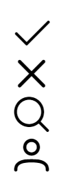
The below mentioned code displays <i> tag having 4 classes as 4 icons of primeicons i.e, check , times, search, user.
app.component.html:
The below mentioned code displays <i> tag having 4 classes as 4 icons of primeicons i.e, check , times, search, user having differentiated colors as blue, yellow, green and orange.
app.component.html
The below mentioned code displays <i> tag having 2 classes as 2 icons of primeicons i.e, spinner and cog which moves in a circular position like loading icon.