 |
VOOZH | about |
|
VOOZH | about |
Angular Material is a UI component library that is developed by the Angular team to build design components for desktop and mobile web applications.
In order to use it, we need to have angular installed in our project, after having it you can enter the below command and can download it.
Installation syntax:
ng add @angular/material
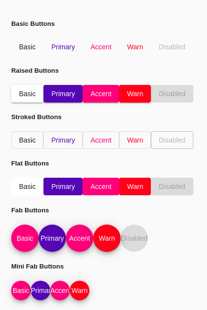
Types of Buttons in Angular material: Buttons present in angular material are called as <mat-button>. They are many types of mat-buttons available in angular material, they are:
Button Name | The tag used for the buttons | Explanation |
Basic Buttons | <mat-button> | These are the normal default button |
Raised Buttons | <mat-raised-button> | These buttons appear to be raised i.e., they have a kind of box-shadow |
Stroked buttons | <mat-stroked-button> | These buttons don't have any background theme color. |
Flat Buttons | <mat-flat-button> | These buttons are very flat i.e. they don't have any kind of animation and only have a ripple effect. |
Fab Buttons | <mat-fab> | These buttons are circular buttons. |
Mini Fab Buttons | <mat-mini-fab> | These buttons are also circular but compared to fab buttons they are small. |
Approach:
Code Implementation: In this example, we will implement all types of <mat-button> in angular.
app.module.ts:
app.component.html:
Output: