 |
VOOZH | about |
|
VOOZH | about |
A responsive table in CSS automatically changes to fit any screen size. It stays easy to read on small screens, like phones, by scrolling or adjusting columns as needed. To make a responsive table in CSS, place it inside a <div> with overflow-x: auto;. This lets the table scroll sideways on small screens, so all content stays visible.
In this approach, we are using Media Queries to make the table responsive. Media query switches the table layout to a vertical display when the screen becomes narrower than 600px. Each cell's content is preceded by a data label for clarity. This approach ensures readability and accessibility on small screens by stacking the table cells vertically.
Output
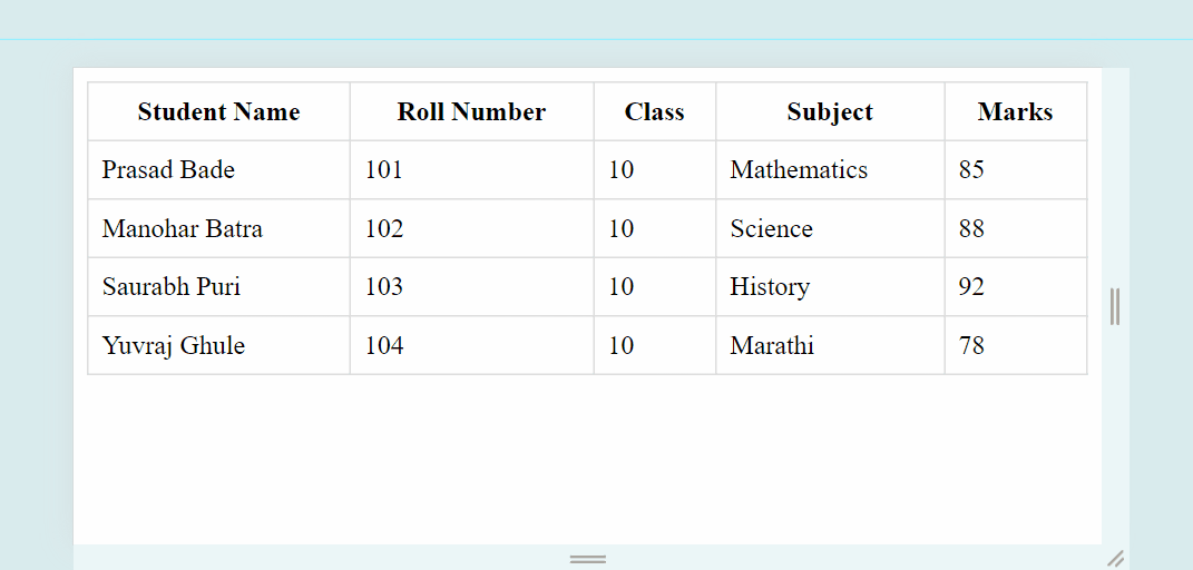
In this approach, we will use the overflow-x property and set it to auto to enable horizontal scrolling on small screens. This property value (auto) instructs the browser to show a horizontal scrollbar only when the content overflows, allowing users to scroll horizontally to view the hidden content.
Output: